

Website analytics is a very important factor in the success of your website.
Analyzing data from website analytics can help you to figure out what content and features are most popular with your visitors, which will allow you to make informed decisions.
It will also give you a better understanding of how people interact with different parts of your site, so it’s easier to create a more user-friendly experience for them.
In this article, I’ll be discussing heatmaps that have been integrated into some types of website analytics and explaining why they’re helpful when analyzing the data from your site.
What are heatmaps?
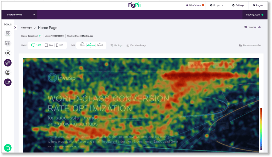
Heatmaps are graphical representations of the page, overlaid with color. They show you where visitors click or otherwise interact with your webpage.
You can then find out what content or features are most popular with your visitors and understand how they interact with different parts of your site.
Heatmaps are a great way of getting more insights from your website analytics.
They can provide you with more information about where people click on your page, as well as the number of times they’ve clicked there. This allows you to find out what they’re looking at and how it relates to other parts of the site.
This will allow you to make informed decisions that will improve your website for visitors and help you achieve better results from your marketing efforts.
In order to use heatmaps effectively, it’s a good idea to have some software that can actually show them for you so that it’s easier to understand their implications.
There are free options available, but if you need something professional, FigPii has several advanced features for advanced analysis of the data.
The information gathered from heatmaps will allow you to make informed decisions about your website and create better experiences for visitors.
Heatmaps are a great way of getting more insights from your website analytics, but it’s important to use them in conjunction with other types of data (like A/B testing) in order to get the most out of them.
If you want help with analyzing this type of data or running any necessary tests, FigPii can provide you with high-quality results by taking care of it all for you, so that you can focus on the big picture rather than getting caught up in the details.
Heatmaps work by overlaying a page with a color based on the number of times it’s been clicked. This allows you to see what your visitors are clicking and how it relates to other parts of your website.
For instance, when you see that there is one particular spot on your website where all of the visitor’s clicks are clustering, this might be an area that needs more attention or explanation.
You can then use this information for better decision-making and create a more user-friendly experience for visitors by addressing their needs through this form of data analysis.
You can also use heatmaps in conjunction with other types of data, like A/B testing, in order to get the most out of them.
Examples of how to use them in your site’s analytics
Heatmaps can be used very effectively by those with a website that has this option.
It’s not just the number of clicks that matters, but also where they’re clicking and how many times. This allows you to see what type of content is good and what is not so good on your page – and which things people are looking at most often.
The heatmap will allow you to make informed decisions about your website and create better experiences for visitors.
Here are some examples of how heatmaps can help:
● You notice a visitor’s cursor hovering over an area without clicking it once – the heatmap will show you where they were looking, so you can find out if there is something above the content that might have caught their interest.
● The heatmap shows a high concentration of clicks on an image, so you can either use it as a strong call-to-action or convert the image into its own page for better user engagement.
● You notice that there are multiple hotspots with lots of clicks – this is something that might need more explanation to visitors who are not able to figure out right away what they’re doing there. A great way to resolve this issue would be by adding tooltips for each hotspot.
Heatmaps allow you to get better analytics about your web pages and create better experiences for your visitors by allowing them to see where people click most often.
They can also give you information like how many times people hover over a certain area or how many times they have clicked it.
This will allow you to see if there is something that needs more explanation or an area that might need more focus.
For example, when you have a visitor clicking all over your page without interacting with anything, you can spot that right away in the heatmap and figure out what they’re looking at.
You can then use this information for better decision-making and create a more user-friendly experience for visitors by addressing their needs through this form of data analysis.
Additionally, you can use heatmaps in conjunction with other types of data, like A/B testing, in order to get the most out of them.
You can also use them in your site’s analytics to see where people click most often.
For example, you might see a high concentration of clicks on an image, which may need more explanation or focus for visitors who are not immediately able to figure out what they’re doing there. You may resolve this by adding tooltips for each hotspot.
Heatmaps allow you to get better analytics about your web pages and create better experiences for your visitors by allowing them to see where people click most often.
Examples of how to use them in your site’s analytics:
● In one of the heatmaps, you notice a visitor’s cursor hovering over an area without clicking it once – the heatmap will show you where they were looking, so you can find out if there is something above the content that might have caught their interest.
● The heatmap shows a high concentration of clicks on an image, so you can either use it as a strong call-to-action or convert the image into its own page for better user engagement.
● You notice that there are multiple hotspots with lots of clicks – this is something that might need more explanation to visitors who are not able to figure out right away what they’re doing there. A great way to resolve this issue would be by adding tooltips for each hotspot.
After seeing these examples, many people want to know how to get their own website’s analytics up and running with some good, useable heatmaps.
Thankfully, this is easier than it looks – the following points will help you get started:
● First things first – find out where your visitors are coming from and what their main goal for being on your site is. This way you can pick a solution that fits well with your marketing strategy and brand identity.
● If you have a WordPress site, there are a number of plugins available to help generate heatmaps. Like FigPii.
● Whether you use a plugin or not, it’s important to understand how much data those plugins can provide, as well as how easy it is to navigate through them. You may want something that allows you to customize which events should be displayed in the heatmaps, or perhaps you want to see how many times a user has hovered over something.
● Heatmaps are often used in conjunction with A/B testing, so make sure to pick one that works well when combined with your favorite A/B testing plugin.
Conclusion
Heatmaps are an excellent way of understanding how your customers are interacting with the content on your website.
They can be used in conjunction with A/B testing, making it easier to understand which pages require more focus and what areas need a better explanation for visitors who aren’t able to figure out right away what they’re doing there.
If you want a great analytics package that is easy-to-use and provides all the information you’ll need about web page clicks, we recommend FigPii’s Heatmap plugin, but make sure to do some research before you commit!