

Heat maps are a great way to visualize data.
You can use them in a variety of applications, but the most common is to show where people scroll or click on a webpage or application screen. This can be very useful for understanding user behavior, especially when the heat map is overlaid with other data.
This article will explain how to interpret a heat map for your website so you can better understand what areas of content your visitors find valuable and which ones need more work.
This article will utilize the FigPii heat map tool to provide a clearer understanding. With that said, let’s see the types of website heatmaps you can use for different purposes.
What is a heat map?
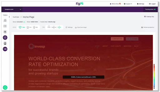
A heat map is a visual representation of data that shows the most popular parts of a website. The concept is simple: bright red represents areas of high traffic, and blue represents areas with little to no traffic.
(Source)
A website heatmap helps you identify the most critical areas on your website, so you can improve them in ways that will help you generate more revenue. They also help you identify sections of your site that receive little attention – which can help you decide whether or not they need to be fixed or removed entirely.
Types of heat maps
There are three major types of heat maps:
- Click heat maps: They show where users click on a page and are helpful in identifying areas of interest. This is also known as a click density map or a click distribution map.
For instance, FigPii click maps let you know the number of clicks an element on your site got using a warm-to-cold color design.
While warm colors indicate more clicks, colder colors indicate fewer clicks.
(Source)
- Scroll depth heat maps: These show how far down the page users scroll on a single visit. They help you identify low-hanging fruit, like content that isn’t engaging users enough to make them scroll below the fold.
For instance, you will get data visualization of the scroll depth of a user, scroll movement per page on average, and the overall number of scrolls across different areas on each page.
(Source)
- Mouse movement maps: Mouse movement maps show where users click on your website by using color gradients – darker colors represent areas with high click rates, and lighter colors represent areas with low click rates.
For example, you can easily understand which messages, designs, and content got the highest or lowest number of hovers.
(Source)
While these are major types of heatmaps, some web analytics tools also offer eye-tracking heatmaps. These heatmaps show you exactly where users are looking when they visit your site – whether it’s an image or text – so you can see what areas of your pages are getting attention from visitors.
Understand the different areas of the heat map
There are several different areas in a heat map:
Your main goals should be focused on these areas:
- Hot spots: These are areas with the most activity – they’re usually the most popular sections of your website. You can identify hot spots by looking at which parts of the page are colored red or orange.
- Cold spots: These are sections of the page where there isn’t much activity going on — they’re typically less popular than hot spots. You can identify cold spots by looking at which parts of the page aren’t colored red or orange.
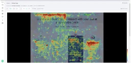
For instance, in this heat map by FigPii, the Red color showcases a high user engagement area. If this area is big, you should examine it to find out why visitors are highly engaged in that area.
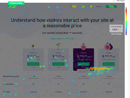
Orange color indicates less concentration, something to have a look at. Yellow indicates minimal activity. Pay attention to it if it’s an area of main concern. Green signifies less movement on the specific area of the page.
Look at the size of each area.
The size of each area is also important in interpreting heat maps. For example, if there’s a lot of red in the upper left corner of your page, that could be because visitors are focusing their attention on the top left corner of the page – which might not be where you want them to focus their attention.
Here are some examples of what you might see:
- A large dark spot indicates a problem with your website. The visitor was trying to do something on your site and was unable to find it or complete it.
- A small dark spot indicates that visitors aren’t interested in what’s there. Perhaps it doesn’t meet their needs or expectations. Or perhaps there’s too much information on one page, which can make it difficult to find what they’re looking for quickly and easily.
- A bright spot indicates that visitors found exactly what they were looking for right away, which means they were able to complete their goal quickly and efficiently by using your site as intended!
Break down the data into different metrics.
The best way to read a heatmap is by using it to break down the data into different metrics.
Usually, heat maps let you break down the data into the following metrics:
- Device type and operating system: This shows you which devices people use to view your site, so you can make sure it’s optimized for each device. For example, if you have a mobile version of your site, you’ll want to see which devices are visiting it most often. If your website is optimized for mobile devices, then you’ll want to know how many users are viewing your site on a desktop computer versus a tablet or smartphone.
- User behavior: This lets you see what parts of the page are popular among users. You can also use heat maps to track how far people scroll down on your page, where they click, and how many people exit from a page before leaving your site.
- Returning visitors or new visitors: New visitors are typically defined as users who have not visited this site before. Returning visitors are users who have visited the site once before. The difference between these two groups is important for understanding your user base and where you should focus your efforts.
- Look for patterns in the data: How many times do people click on an area? Are there any areas that receive more clicks than others? Do certain colors stand out as being clicked on more than others? Do some areas get more clicks than others? And so on…
Determine what customers looked at most (Hot Spots)
Identify the hottest spots by the color or size of the squares on your heat map. These are the areas where customers spent most of their time looking at when they visited your site.
For instance, if you have an ecommerce website, look at what was being sold in each of those hot spots, and figure out if there was something specific about that product or service that makes it more appealing than other items on your site. If so, consider offering discounts or promotions for that product or service to boost sales.
Or, if you notice that visitors spend most of their time looking at certain pages or sections of your website, it’s a good indication that these parts need improvement or additional content so that visitors don’t have any doubts about what they should do next when revisiting those pages.
Determine whether customers are clicking on images or other elements (using click maps)
If you have a heat map on your site, you can use it to see where customers are clicking and what they’re interested in. The more you know about these things, the better you can tailor your content and marketing efforts.
For example, if you have an eCommerce website and visitors are clicking on the “buy now” button more than any other element, then you know they are interested in your products.
Here are some questions to ask yourself when creating your own heat maps:
- What parts of the page get the most attention? Where do customers spend the most time on each page? Are there certain elements that draw more attention than others? For example, if you have a gallery of images, you may find that people tend to click on them more often than on other parts of the page.
- Are there any areas that don’t get much attention at all? This may indicate that those areas aren’t relevant or interesting to potential customers, so it might be worth rethinking how you present them on your site.
Check whether customers are scrolling down your site (Scroll Maps)
Scroll maps tell you where people are not scrolling down a web page, but they don’t tell you why they aren’t scrolling down the page. You need to do further research to find out why customers aren’t scrolling down your site (and then fix it).
For example, let’s say your scroll map indicates that most people didn’t scroll past the “Blog” section. This gives you an indication that you need to improve the content in that section so that it’s more interesting to your customers and gets them interested enough to continue reading.
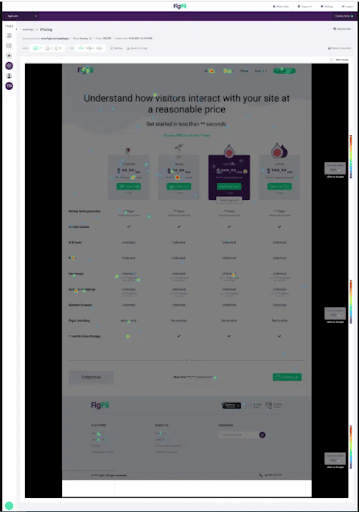
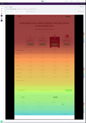
Here’s a sample scroll map for our pricing page:
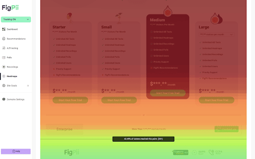
The scroll map shows us that nearly 70% of our visitors have viewed all four pricing tiers, which is great. But after that, only about 46% are scrolling to the Enterprise plan. That means there’s some improvement in terms of placing the Enterprise pricing tier.
Over to You!
Heatmap data is great to help you see how the user structure is on your web pages and landing pages, find out where website visitors were clicking (click map), and how they were able to navigate your site. It can also give you actionable insights into site visitors and user interactions.
A lot of people think that the heatmap tool is only important for e-commerce website performance, but it can provide just as much value to information-driven websites like a blog or news sites.
For better results, you can even use heatmap data in tandem with other analytics tools like Google analytics.