

88% of online consumers are less likely to return to a site after a bad experience.
This is a cause of serious concern.
As an online retailer, it’s important for you to understand how visitors interact with your website or a particular page. After all, how will you optimize their user experience without knowing how they behave on your site in the first place?
One effective way to do this is by creating a heatmap.
Heatmaps provide valuable insights into user behavior, allowing you to identify areas of high and low engagement, user frustration, and opportunities for improvement.
In this article, we will guide you through the steps to create and analyze a heatmap for your Shopify website. We’ll also learn how to view heat maps to gauge your website performance and gain actionable insights into how website visitors navigate.
Step 1: Setting up a heat mapping tool
Explanation of heat mapping tools
Heat mapping tools are a great way to understand how people interact with your website. They give you an overview of where exactly people click and hover, as well as where they spend the most time on your page.
Naturally, this can be useful in determining where you should focus your efforts when optimizing your site or even help you decide what items to display on a landing page or web page.
There are multiple types of heatmaps you can use for different purposes.
The three major ones include:
- Click maps: A click map tracks and displays where customers click on your website or app, allowing you to see which links, buttons, and images are getting the most attention.
- Scroll maps: A scroll map will track how far down the page users scroll. This helps identify where your visitors are spending the most time and which parts need improvement.
- Move maps (Mouse movement heatmaps): These tools track mouse movements, indicating which areas on your webpage users are hovering over or clicking on.
Aside from these, some web analytics tools offer more heatmaps like:
- Eye-tracking maps: Eye-tracking heatmaps show where users are looking on the page, indicating which elements are capturing their attention and which they may be overlooking.
- Confetti maps: These maps display the location and density of clicks on a page. The reason behind calling them “confetti” is that they show the location of each click in a multi-colored, confetti-like pattern.
- Dynamic heatmaps: Some website heatmap tools even offer dynamic heatmaps. Unlike static heatmaps, which display a snapshot of data at a particular point in time, dynamic heatmaps update in real-time or near real-time as new data becomes available.
You stand a chance to gain a comprehensive insight into how users interact on your site if you use these heatmaps in tandem (especially the main three).
Pick a heat mapping tool for your Shopify website.
Before you start with the analyzing process, you have to pick a heat mapping tool.
When choosing a heat mapping tool for your Shopify store, there are a few things you should consider.
For starters, you should look for a tool that comes with a diverse range of heat maps. It should have all three major heat maps we discussed, including click maps, scroll maps, move maps, and more.
It’s also important to consider other features like real-time data, advanced filtering options, an easy-to-use interface, and integration with other tools.
Advanced filtering options include the ability to filter data by time, visitor type, device, location, and other criteria to get a more detailed analysis of user behavior.
Also, does it work with Shopify?
Shopify doesn’t have a heat map tool built into their platform, so when choosing one, it’s important that it works with Shopify websites.
This may sound obvious, but some tools only work with other ecommerce platforms like Magento or WooCommerce. If your store isn’t one of those platforms, then this could be an issue for you. Make sure the tool you choose will work seamlessly with your site without any issues.
For example, FigPii provides native integration with Shopify, making it easy to install without any coding required.
Based on the above features, FigPii is an excellent heat mapping tool for your Shopify website (we may be biased, but the features vouch for themselves).
The 14-day free trial is another bonus!
Aside from FigPii, there are many different types of heat mapping software available, with varying price points and features. Some products focus on heatmaps alone, while others include other analytics tools as well.
For a more detailed breakdown of the top Shopify heatmap tools, you might want to follow this guide.
Step 2: Configuring the heat mapping tool
Setting up tracking parameters
To track user activity on your website, you need to set up some tracking parameters.
Here are some of the key parameters you’ll need to configure:
- Page Views: This option enables tracking of page views on your Shopify store. Make sure this option is turned on.
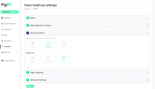
- Device Type: It refers to the type of device that visitors are using to access your website. Are visitors accessing your site on desktop devices? A tablet? Or mobile devices? Most heatmap apps have desktop as well as mobile heat maps.
- Visitor Type: It refers to whether visitors to your website are new or returning visitors. You can use this information to analyze visitor behavior and determine which groups are more likely to engage with your website and make a purchase. For returning visitors, you can this information to personalize the user experience by showing personalized product recommendations or offering loyalty discounts.
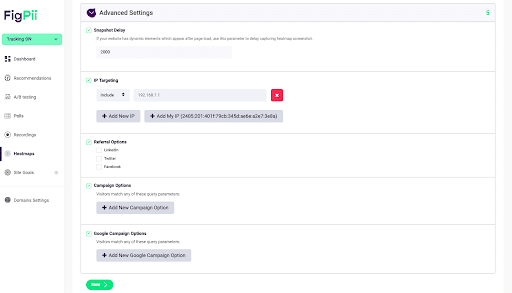
- Other Advanced Options: Rather than just scratching the surface, many heat mapping software also offers advanced tracking parameters. These parameters include IP targeting, campaign options, referral options, and Google campaign options.
For the uninitiated, here’s a quick overview: - IP targeting: IP targeting allows you to track visitors based on their IP address. This helps you track visitors from specific regions or countries, allowing you to tailor your website content.
- Campaign options: Campaign tracking allows you to track visitors who come to your website from specific marketing campaigns, such as email or social media campaigns. This can help you measure the success of your marketing efforts and optimize your campaigns for better results.
- Referral options: Referral tracking allows you to track visitors who come to your website from other websites or search engines. This can help you understand where your traffic is coming from and optimize your SEO strategy for better search engine rankings.
- Google campaign options: Google campaign tracking allows you to track visitors who come to your website from Google Ads campaigns, allowing you to measure your advertising campaign’s success.
The heat map is only as good as the tracking parameters that you set up in the software. The more information you provide about what’s happening on your website, the better the results will be.
Selecting the page to analyze
The next step is to select the page that you want to analyze.
Most heat maps allow you to analyze either a specific web page or multiple web pages simultaneously.
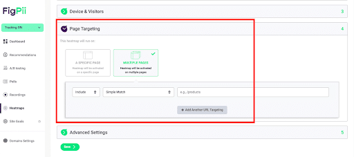
To make the most out of it, you need to ensure that you are analyzing the right page.
This may sound simple, but it’s actually quite important.
Here are some factors to consider when selecting pages to analyze in your heat map tool:
- High-Traffic Pages: Start by analyzing the pages on your website that receive the most traffic. This will give you a good starting point for understanding user behavior and identifying areas of your website that may need improvement.
- Landing Pages: Analyze landing pages to understand how visitors interact with your website when they first arrive. This information can help you optimize your landing pages for better user engagement and conversion rates.
- Checkout Pages: Heat map tools can provide insights into how users are interacting with your checkout process, such as where they are dropping off or encountering issues.
- Low-Performing Pages: Finally, analyze low-performing pages on your website to understand what’s stopping them from performing well. You’ll be able to pinpoint areas of a low engagement or high bounce rates, allowing you to optimize them for a better user experience.
- The nature of the content on that page: For example, if you are analyzing a product page, it may be helpful to look at how visitors interact with the images and descriptions of products. For other pages, such as blog posts or landing pages, this may not be as important.
- The goal(s) of your site: If your goal is to increase awareness or encourage more conversions, then it would make sense to analyze these metrics over time and measure their impact on other metrics like bounce rate and conversion rate.
Step 3: Analyzing the results
Identifying areas of high and low engagement
When analyzing a heatmap, look for areas with high engagement (for example, if there are a lot of clicks in an area) as well as low engagement (for example, if there are no clicks in an area).
This will help you identify what areas need improvement so that customers can find what they are looking for more easily.
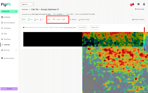
For example, in the heat map below, there’s relatively higher engagement around the section that asks for pricing. On the other hand, there’s low engagement around the subscription section. 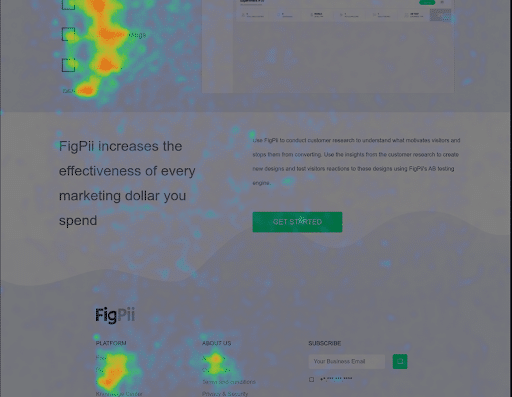
If the aim is to get more subscribers, then now the company knows they need to somehow improve that section.
Areas of low engagement on your heat map may indicate where customers are experiencing friction, confusion, or lack of interest. These areas may be pages with high bounce rates, low click-through rates, or low dwell time.
Pro Tip: Compare the data you analyze using your heatmaps with other data sources to gain a better understanding of customer engagement.
For example, you may find that area of low engagement on your heat map also has high exit rates on Google Analytics. These insights can help you identify areas that need improvement to optimize customer engagement and drive conversions.
Identifying areas of user frustration
Here are a few indirect ways to identify areas of user frustration using heatmaps:
- Areas that have high click density with low engagement: Are there areas of your website with high-click density but low engagement (such as low dwell time or low conversion rates)? Maybe the users are trying to click on elements but are not receiving the information or action they expected.
- Areas with high scroll depth without interaction: This may indicate that users are scrolling through a page without finding the information they need. This could lead to user frustration and cause them to abandon the page.
For example, over 60% of visitors scrolled till the end of the page in the heatmap below.
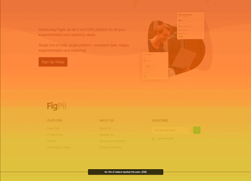 However, it’s not nearly enough to determine whether everything’s right with your web page. You need to further check whether it has received any clicks to see if people are actually engaging with your site.
- Check for areas with a high bounce rate: A high bounce rate indicate a lack of relevance or value to the user. If your heat map shows a high bounce rate on specific pages, this could suggest that users are not finding what they need – leaving the site in frustrated.
- Look for clusters indicating repeated clicks or hovers: Do you notice a cluster of repeated clicks or hovers on certain elements or pages? This doesn’t always bode well for you. This could actually mean that users are experiencing difficulty finding the information they need or are encountering technical issues that are causing frustration.
Overall, heat maps alone may not provide direct insight into user frustration.
However, analyzing heat map data in conjunction with other analytics and feedback tools can help you identify areas of your website that could be causing user frustration.
Identifying areas for improvement
The most common use for heatmaps is to identify areas that need improvement.
This can be anything from:
Poorly placed navigation elements
Too many form fields
Confusing call-to-action buttons
Here are some tips to identify areas for improvement on your ecommerce site using a heatmap:
Look for the most frequently clicked areas: The most clicked areas are likely candidates for improving the user experience. Use them as starting points for improving your website design and content.
Check for gaps in your heatmap results: If there are large gaps in your heatmap results, it means users aren’t able to find what they’re looking for easily. Or they might even have trouble navigating your website. This can be due to poor labeling on your website – something you can easily fix by making changes to your site’s content or structure (i.e., moving things around).
Compare heatmaps between different devices and browsers: You might notice that users interact differently with certain parts of your website, depending on their device or browser. This is useful information if you want to make sure that everyone has the same experience when using your site, regardless of what they’re using.
Get Your Shopify Store Heat Up with Heat Maps!
The more information you have about your website visitors, the better.
By knowing where your customers look and how they navigate around your store, you’re able to make changes that get your customers interested in what you have to offer.
In conclusion, creating a heat map for your Shopify website can provide valuable insights into user behavior and help you optimize your site for better engagement and conversions.
By following the steps outlined in this article, you can easily set up and configure a heat mapping tool, create and analyze heat maps, and optimize your site’s user experience.
Note that it’s important to remember that heat map analysis should be an ongoing process – with continuous monitoring and iteration.