

In digital marketing, the call to action (CTA) is not just a button or a line of text; it’s a key point that prompts users to take action and guides them toward making a decision.
An effective CTA goes beyond mere words on a screen—it’s a beacon leading users to conversion.
The power of a compelling CTA cannot be overstated; it transforms passive browsing into active engagement, turning visitors into leads and leads into customers.
Understanding the mechanics of how CTAs influence user behavior is essential for any marketer aiming to boost conversion rates.
At its core, a CTA leverages psychological triggers—such as urgency, curiosity, and the fear of missing out—to nudge users towards a specific action. Whether it’s signing up for a newsletter, downloading a guide, or making a purchase, the right CTA can significantly amplify the effectiveness of your digital marketing efforts.
With a good call to action, marketers unlock the potential to drive more significant interactions, foster deeper connections with their audience, and, ultimately, achieve their business objectives with precision and efficiency.
What is a call to action?
A Call To Action (CTA) is a directive used in marketing materials to prompt an immediate response or encourage an immediate sale. It’s an explicit instruction designed to provoke an immediate reaction from the potential customer, typically using an imperative verb such as “Call now,” “Find out more,” or “Visit a store today.”
The purpose of a CTA is twofold: to tell someone what they should do next and to motivate them to do so. The impact of CTAs on website visitors is profound. When visitors land on a website, they’re often seeking direction.
A well-placed and effectively designed CTA can catch their attention and guide them towards taking a desired action, such as subscribing to a newsletter, downloading a white paper, or purchasing.
By providing clear directions, CTAs reduce visitors’ cognitive load, making it easier for them to make decisions and take action.
Types of Call to Action
- Lead Generation: Encouraging sign-ups or information collection.
- Sales Conversion: Directing users to make a purchase.
- Content Sharing and Promotion: Motivating users to share content or follow social media.
- Event Registration: Inviting users to sign up for events or webinars.
- Resource Downloads: Offering downloadable resources like e-books or whitepapers.
How to Write a Good Call To Action
Crafting a compelling call to action (CTA) is crucial for converting website visitors into leads or customers. Here’s how to make your CTAs compelling and action-driven:
-
Use Action-Oriented Language
Start your CTA with a verb that compels action, such as “Download,” “Subscribe,” “Join,” or “Start.” This direct approach leaves no doubt about what action you want the user to take. For instance, “Download Your Free Guide” is more compelling than a vague “Click here.”
-
Create a Sense of Urgency
Encouraging immediate action can significantly increase your conversion rates. Use time-sensitive language like “Offer ends soon,” “Limited availability,” or “Act now.” This tactic plays on the fear of missing out (FOMO) and can push users to take action sooner rather than later.
-
Offer Clear Value
Your CTA should clearly state what the user gains by taking action. Highlight the benefit directly in the CTA. For example, “Get My Free eBook” clearly states that the user will receive something valuable in exchange for their click. This clarity helps set expectations and emphasizes the value proposition.
-
Personalize When Possible
Tailoring the CTA to the user’s experience or the page content can significantly increase its effectiveness. Use data insights to customize CTAs based on user behavior, such as “Continue Watching” for a video platform or “Recommended for You” for e-commerce. Personalization makes the call to action more relevant and engaging to the individual user.
-
Keep It Short and Sweet
A concise CTA is a powerful CTA. Aim for clarity and brevity, ensuring your message is understood at a glance. Limit your CTA to a few words that pack a punch, focusing on the action you want the user to take. For example, “Buy Now” or “Sign Up Free” are straightforward and to the point, making it easy for users to know exactly what to do next.
25 Call To Action Examples
-
Lead Generation CTAs
Lead Generation CTAs are designed to gather information from visitors, such as email addresses, to build a database of potential customers. These CTAs typically offer something of value in exchange for the user’s contact information, like free trials, eBooks, or webinars. The goal is to nurture these leads through the sales funnel until they’re ready to purchase.
Example 1: Trello: “Sign Up- It’s Free”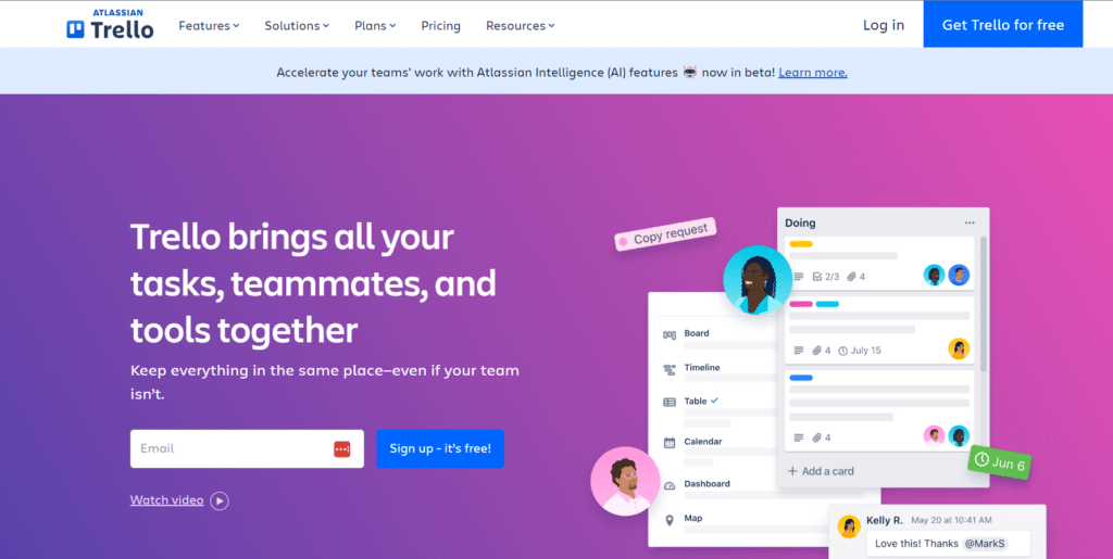
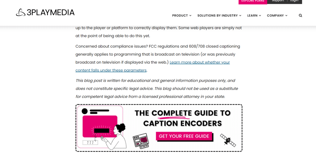
Example 2: 3PlayMedia: “Get Your Free Guide”
-
Sales Conversion CTAs
Sales Conversion CTAs directly encourage visitors to make a purchase or complete a transaction. They are often seen on product pages, in shopping carts, or during special promotions. They use urgent and compelling language to motivate the user to act immediately.
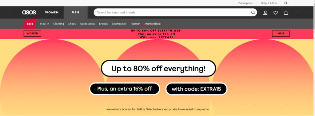
Example 3: Asos: “Up To 80% off everything”
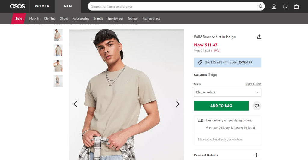
Example 4: Asos PDP: “Add to Bag”

-
Content Sharing and Promotion CTAs
This category focuses on CTAs encouraging users to share content or follow a brand on social media platforms. The objective is to increase the brand’s reach and engagement by leveraging the user’s network.
Examples include “Share This Article” or “Follow Us on Instagram.” These CTAs help amplify content visibility and foster community growth.
Example 5: Webfx: “Share This Article”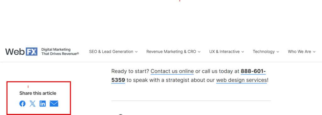
Example 6: “Follow Us on Social Media”


-
Event Registration CTAs
Event Registration CTAs prompt users to sign up for events like webinars, workshops, or conferences. These CTAs need to communicate the value and details of the event clearly, making it irresistible for the target audience to join. They play a crucial role in increasing attendance and engagement for the event.
Example 6: EsemLab: “Reserve My Seat”


Example 7: Rekrut: “Register Now”
-
Resource Downloads CTAs
Resource Downloads CTAs offer users access to valuable resources in exchange for their actions. These resources include eBooks, whitepapers, case studies, or guides that provide in-depth information on a particular topic.
The aim is to provide users with useful content while establishing the brand’s authority and expertise.
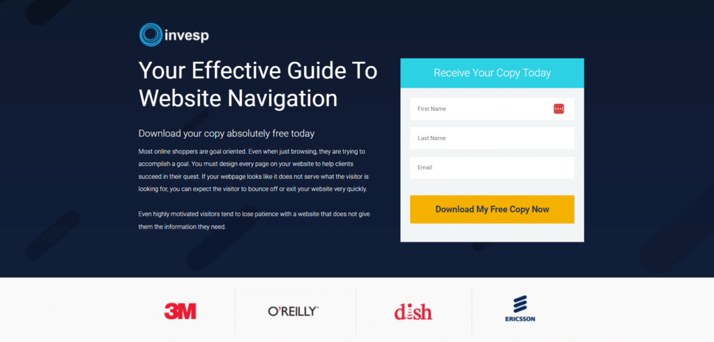
Example 7: Rekrut: Invesp: “Download Your Free Ebook”
Example 8 Tableau: “Get the Whitepaper”
-
Innovative and Creative CTAs
Innovative and Creative CTAs break away from conventional formats to capture the user’s attention and provoke action through creativity and originality. These CTAs might use unique language, interactive elements, or unconventional design to stand out and engage users in a memorable way.
Example 9 Ampliz: “See It in Action”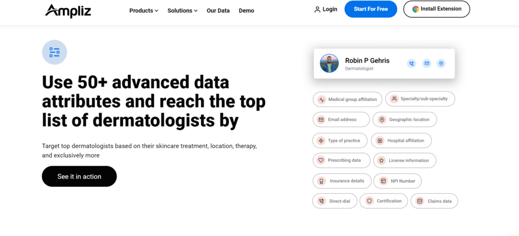
Example 10 “Why Wait? Explore Now”
-
CTAs for Feedback and Surveys
These CTAs encourage users to provide feedback or participate in surveys. The goal is to gather insights from users about their experiences, preferences, or opinions, which can inform improvements to products, services, or content.
These CTAs contribute to a brand’s continuous improvement and customer satisfaction efforts.
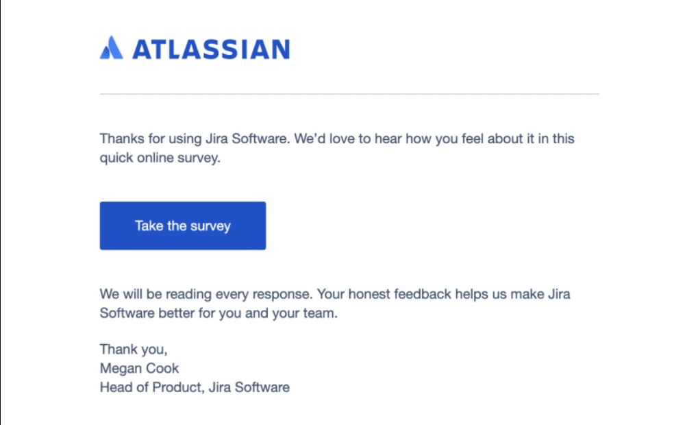
Example 11 Atlassian: “Take The Survey”

Example 12 “Write a Review”
-
Subscription and Membership CTAs
Subscription and Membership CTAs are designed to encourage users to subscribe to a service or become a member of a community. These CTAs often highlight the benefits of subscription or membership, such as exclusive content, special offers, or community access, to motivate users to join.
Example 12 Invesp: “Subscribe”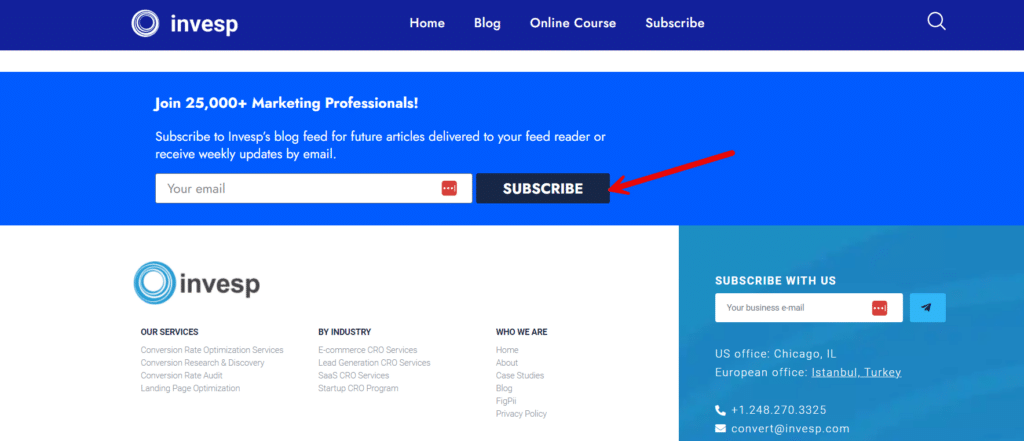
-
Trial and Demo CTAs
Trial and Demo CTAs allow users to try a product or service before making a purchase decision. These CTAs aim to reduce the perceived risk of trying something new by allowing users to experience firsthand benefits, ultimately leading to higher conversion rates.
Example 13 Create: “Start Free Trial”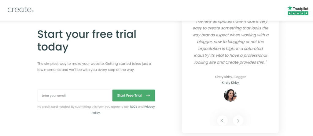
-
Navigation and Exploration CTAs
Navigation and Exploration CTAs guide users through a website or platform, encouraging them to discover more content, features, or products. These CTAs enhance the user experience by making it easy for users to find relevant information and engage deeper with the brand.
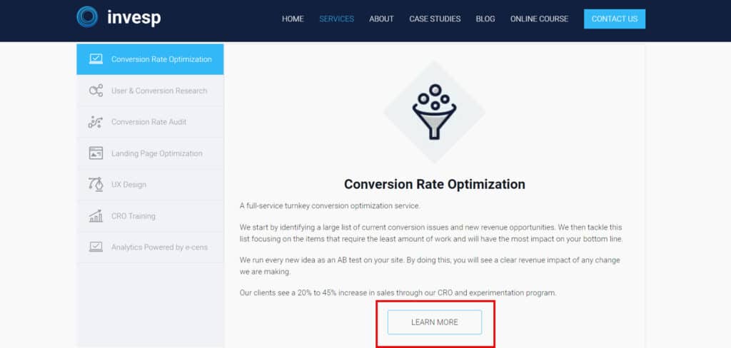
Example 14 “Learn More”
-
Social Proof and Testimonials CTAs
These CTAs leverage social proof by encouraging users to view testimonials, reviews, or case studies from other customers. Highlighting positive experiences from peers can build trust and credibility, influencing others to take action based on the endorsement.
Example 15 “Read More About Our Customers”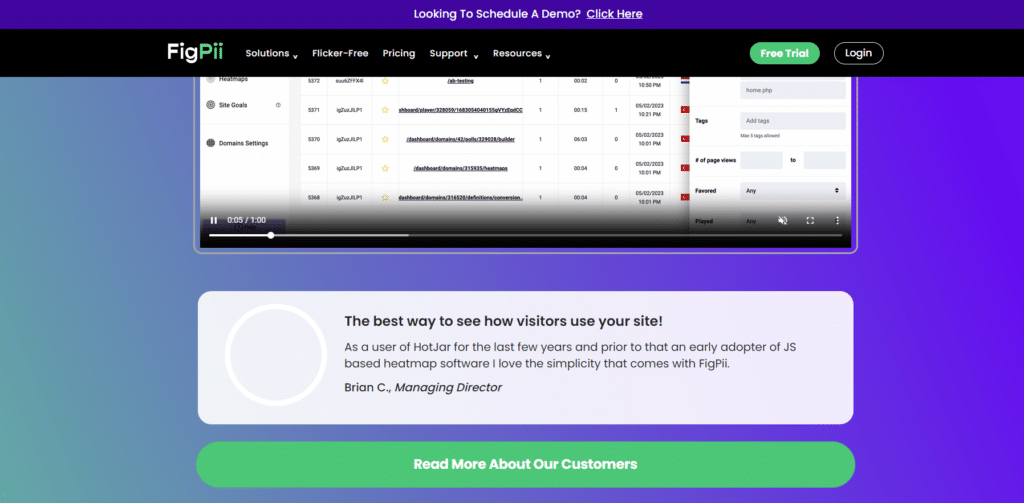
CTA Design Best Practices
This section delves into the best practices for CTA design, ensuring that your CTAs are seen and acted upon.
These guidelines, covering everything from color choices to placement strategies, will help you craft CTAs that significantly boost user engagement and conversion rates.
Whether you’re aiming to increase newsletter sign-ups, drive sales, or promote content sharing, adhering to these design principles will enhance the effectiveness of your digital marketing efforts.
-
Visibility and Contrast
A Call to Action (CTA) must stand out for it to work. Achieving this involves using colors that grab attention and evoke the desired emotion or action. Green, symbolizing “go” or “start,” works well for sign-up buttons, while red can create a sense of urgency for sales or limited-time offers.
Equally important is the contrast between the CTA and its background. Your CTA should pop against the surrounding elements, ensuring it’s immediately visible to users. This combination of the right color and stark contrast makes your CTA hard to miss and more likely to be clicked.
-
Size and Shape
Size and shape matter significantly for CTAs, especially buttons. They should be large enough to ensure easy interaction on mobile devices, adhering to the “thumb-friendly” zone concept.
This means designing buttons that can be easily tapped without the risk of hitting the wrong target, enhancing the user experience across devices.
Additionally, incorporating rounded corners in your button design can subtly draw the eye inward, making the button appear more inviting and clickable. This design choice softens the visual impact and can make users more inclined to click.
-
Placement
Strategic placement of your CTAs can significantly influence their effectiveness. To capture immediate attention, position your most crucial CTAs “above the fold,” meaning they can be seen without scrolling. This ensures that users are immediately aware of the primary action you want them to take upon landing on your page.
-
Mobile Responsiveness
Ensuring your CTAs are mobile-responsive is non-negotiable. CTAs must be visible and accessible across all devices, from the expansive screens of desktops to the compact displays of smartphones.
This inclusivity ensures that no matter how your audience accesses your content, the path to conversion is always clear and straightforward.
Additionally, given the touch interface prevalent on mobile devices, it’s crucial to design CTAs that are easily tappable. This means considering the size and spacing of your buttons to prevent misclicks and enhance user experience.
A mobile-responsive CTA not only caters to the convenience of your users but also significantly increases the likelihood of achieving your desired action, be it a sign-up, download, or purchase.
-
Testing and Optimization
To maximize your CTAs’ effectiveness, engaging in regular testing and optimization is crucial. This process involves experimenting with various designs, wording, and placements to identify which combinations yield the highest conversion rates.
By conducting A/B tests, for instance, you can compare two versions of a CTA to see which one performs better, providing valuable insights into user preferences and behaviors.
Additionally, leveraging analytics tools to track users’ interactions with your CTAs can uncover patterns and trends that inform further design improvements. These tools can help you understand which CTA colors attract more clicks, which phrases generate more engagement, or how the placement affects visibility and action.
-
Clarity and Specificity
For CTAs to be effective, they must be clear and specific. This means using action-oriented words that leave no room for doubt about what you want the user to do.
Phrases like “Download Now,” “Get Your Free Trial,” or “Subscribe Today” are direct and leave no ambiguity about the expected action.
Moreover, it’s essential to highlight the benefit or value the user will receive by clicking the CTA. This approach makes the action more appealing and can significantly increase the likelihood of conversion.
For example, instead of a generic “Click Here,” opt for “Download Your Free Guide to Better Health,” which clearly states what the user gains. Combining a specific action with a clear benefit creates a compelling reason for users to take the desired step.
-
Emotional Appeal
Incorporating emotional appeal into your CTAs can significantly enhance their effectiveness. Using language and design elements that connect with users emotionally makes the CTA more compelling and memorable. This emotional connection can motivate users to take action by tapping into their desires, fears, or sense of urgency.
To achieve this, consider using imagery, icons, or emotive language that resonates with your target audience’s feelings or aspirations.
For example, a CTA for a charity organization might use heartwarming images and language like “Help a Child Today” to evoke empathy and compassion. Similarly, a fitness app might use energetic colors and phrases like “Start Your Journey to a Healthier You” to inspire motivation and positivity.
-
Minimize Friction
Reducing friction in the path to action is crucial for maximizing the effectiveness of your CTAs. The goal is to make the required action as straightforward and effortless as possible, minimizing the number of steps or the amount of information needed from the user.
Simplifying the process encourages more users to complete the desired action, whether it’s signing up for a newsletter or making a purchase.
One way to minimize friction is to streamline forms to ask only for essential information or use one-click technologies that leverage existing user data.
For example, instead of a lengthy sign-up process, offer a “Sign up with Facebook” or the “Sign up with Google” option to expedite it.
-
Consistency and Branding
For CTAs to truly resonate, they must align with your brand’s visual identity and messaging. This consistency reinforces brand recognition and trust as users become familiar with your brand’s style and tone.
Ensure your CTA designs—colors, fonts, and style—reflect your brand’s aesthetic, creating a seamless experience that users can instantly associate with your brand.
Moreover, the message of your CTA should harmonize with the surrounding content and overall campaign goals. This coherence ensures that users receive a unified message, enhancing the user experience and guiding them smoothly towards the desired action.
-
Use of White Space
Leveraging white space around your CTA effectively draws the eye and emphasizes it as the focal point on the page. This design strategy helps to ensure that your CTA button or link stands out clearly, making it more likely for users to notice and click on it.
Avoid crowding your CTA with too many elements. A cluttered space can overwhelm users and dilute the impact of your call to action, potentially leading to lower click-through rates. By giving your CTA room to breathe, you enhance its visibility and contribute to a cleaner, more user-friendly design that encourages engagement.
Crafting Your CTAs
To effectively guide users towards your marketing objectives, it’s essential to master the art of crafting compelling CTAs.
Drawing inspiration from the best CTA examples provided in this article can kickstart your journey toward creating more engaging and effective CTAs. These examples illustrate the diversity and adaptability of CTAs across different contexts and objectives.