

If you are into sports, you must have seen something similar to the image below.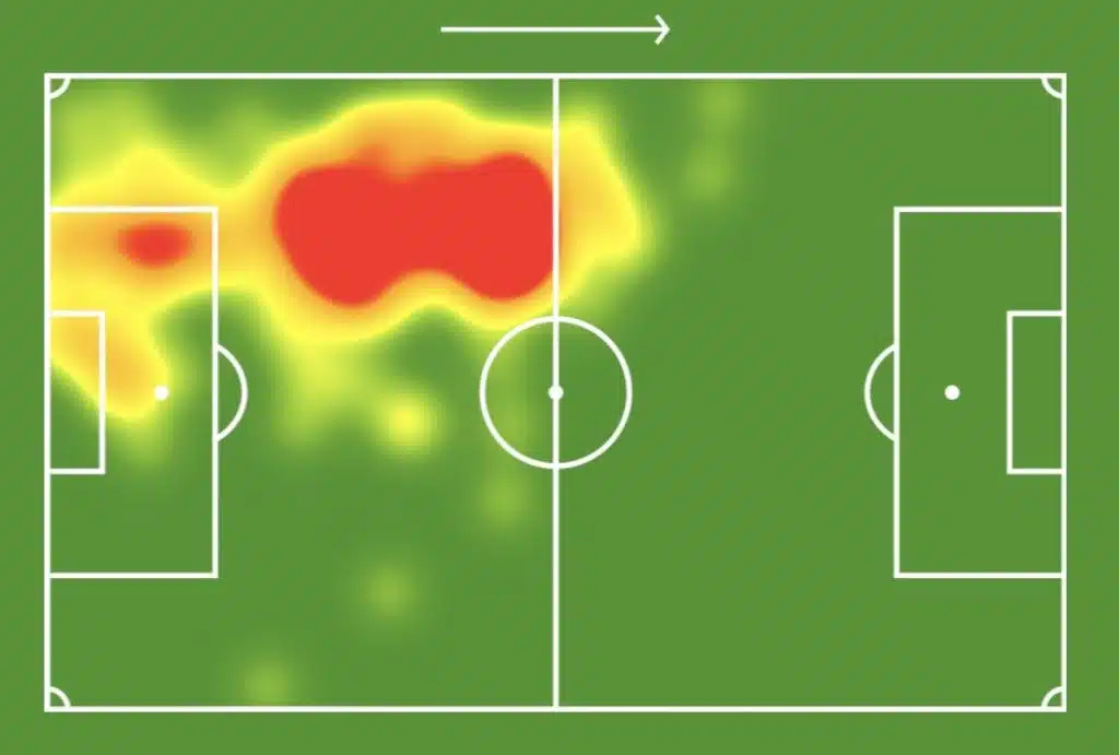
They are called heatmaps, analytical tools that show the activities of individual players during the game.
With heatmaps, coaches, fans, and players can easily see the parts of the field where they spent the most or least time playing. Sports analysts also use heatmaps to gauge players’ performances.
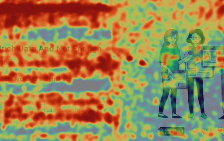
Heatmaps use a color scale (blue to red) to depict intense activity or inactivity in selected areas. The image above is the heatmap of a player; the section colored red shows that the player was mainly active during the game. The section that is colored yellow indicates activity but not as much as the red-colored section.
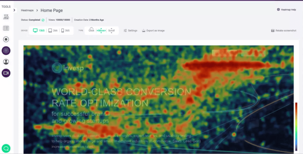
In marketing, the same analogy applies when using heatmaps as an analytical tool on websites. Heat maps help marketers, designers, and product teams understand user activity on their sites and provide an overview of the sections and elements of their websites getting the most attention.
Let’s formally define what a Heat map is.
What is a Heatmap?
Heatmaps are visual representations of user activity on your website. Heat maps help to provide visual data that reveal where users are clicking, how far they scroll, the content they engage with, and how well they engage with the content.
Heat maps use a color scale (from red to blue) to show which sections or elements of your website users interact with the least or the most.
Heatmaps date back to the 1800s when they were used in Paris as a shading map that visually represented social demographic changes. Although, they weren’t called Heatmaps until the 1990s. A software engineer, Cormac Kinney, used the term “heat map” to describe a tool he created to display financial market information graphically.
Red indicates an area you should monitor to understand why visitors are highly concentrated in that area.
Orange means less concentration, but clearly, it is enough to consider.
Yellow signifies minimal activity or data and is essential to note if it’s an area of priority.
Green, less movement on this area of the page
Types of Heatmaps?
There are different types of heatmaps, and each has its purpose. Still, when combined, these different heatmaps give a detailed insight into your users’ behavior. The common heatmaps are click-tracking, mouse-tracking, scroll maps, and eye-tracking heatmaps.
-
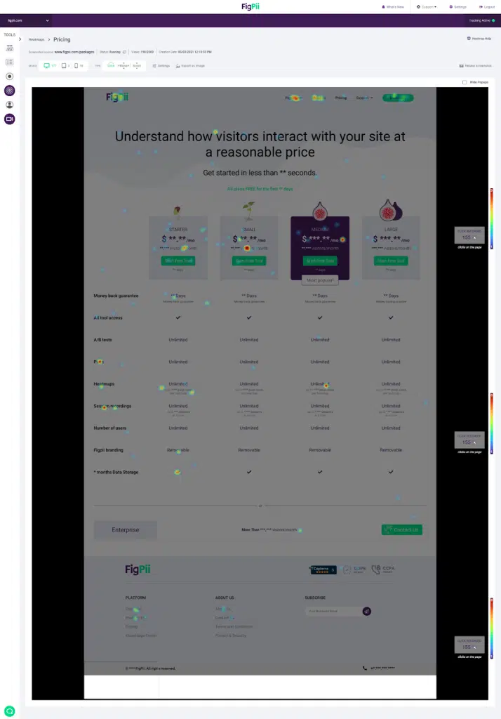
Click Tracking Heatmaps
As the name suggests, Click Tracking heatmaps visually represent where visitors are clicking on your site. On mobile devices, it shows elements of your site that users tap on.
As a business owner, your website has specific sections where user clicks or taps are important. Click tracking heat maps will provide visuals that’ll help you decide whether or not you need to make changes to influence users to engage with these specific sections.
-
Eye Tracking Heatmaps
Eye tracking heatmaps use sensor software to record the user’s eye behavior, including blinking, pupil dilation, and fixation length on a site’s element. Eye-tracking heat maps also reveal what your visitors are paying attention to by visualizing their mouse movements.
The only problem with eye-tracking technology is that it is expensive to acquire and requires users to wear special glasses. Also, unlike other heatmaps, eye-tracking heatmaps require physical usability sessions with users.
Alternatively, you can integrate less expensive eye-tracking software into your website to monitor users’ eye activity. However, they do not accurately represent the visitors’ eye activities since they rely on mouse movement.
-
Scroll Heat Maps
A scroll map is a website heat map that visualizes data on how visitors scroll when they are on your website. Scroll maps also reveal how far down your visitors scroll and the sections of the site they scroll through the most or least.
Scroll maps also help you determine how long a page should be to help you optimize conversions on your page since they show how far users scroll on it.
-
Mouse Tracking Heatmaps.
This heat map visually depicts visitors’ mouse movement while clicking, hovering, or scrolling on your website. Mouse-tracking heatmaps are also used in place of eye-tracking heatmaps sometimes, on the ideology that the position of a user’s mouse on a site is equivalent to where their eyes are focused.
Like most heat maps, mouse tracking heatmaps also Heat maps from mouse tracking make it easy to get an overview of the visitors’ activities on websites without having to go into details of statistical analysis.
How Does A Website Heat Map Work
Visitors come to your website to find a solution to their problem, which may involve purchasing your products, hiring your services, or casually browsing.
When they get to your website, they usually have to navigate through some website elements to get where and what they want.
While navigating your website, heatmaps record all their activities, including scrolls, taps, hovers, and clicks on different pages, and send it to a centralized server for processing.
As they interact with your website by moving their mouse, clicking on buttons, or scrolling through different pages, the website heatmap records this interaction and sends it to a centralized server for processing at regular intervals.
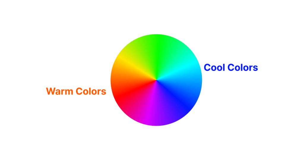
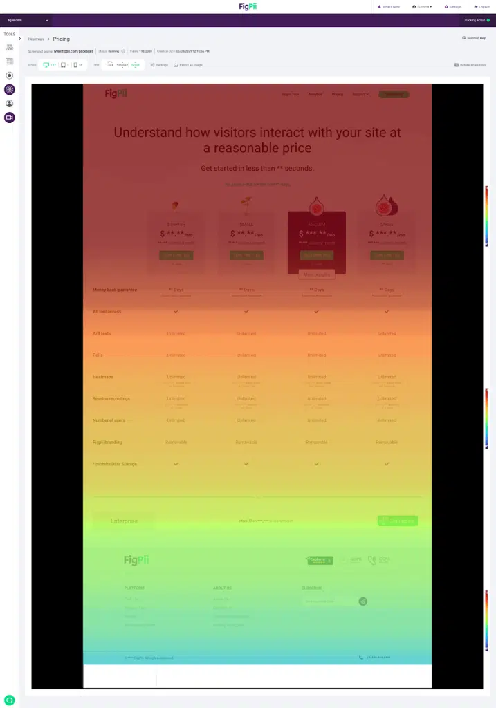
This centralized server combines multiple sessions of users’ activities across your website into individual heatmaps for all pages. So, you have resulting heatmaps depicting users’ activities for every website page. A website heat map typically looks like the image below, with the warmer colors showing a lot of user activity and the cooler ones signifying little interaction.
Benefits of heat maps
-
Understand how users navigate your site.
Visual representations from heatmaps can reveal everything you need to understand about how users navigate your site. Heatmaps will also show different navigational patterns used by site visitors, enabling you to detect patterns with friction. This will help you when redesigning navigations that will match users’ expectations.
-
It reveals underlying UX problems.
Heatmaps are a valuable tool for identifying UX problems on web pages. By visually representing user interactions, they can highlight areas where users are confused or frustrated.
For instance, if a heatmap shows excessive clicks on a non-clickable element, it signals a UX issue. This insight allows for targeted improvements on your web pages, enhancing user experience and potentially increasing conversions.
-
It gives a comprehensive insight when used with other analytical tools.
Session recordings allow you to record activities like mouse clicks, scrolls, and form interactions, which you can replay to understand what a visitor did on your site. Combining this with heatmaps gives you a more comprehensive view of interaction since you can see what elements visitors interact with on the site.
When data from heat maps are also combined with Google Analytics:
-
It helps you understand what’s working and what isn’t.
If you added a new element to your site to get users to interact with that element, heatmaps could show you whether or not users are interacting with this element.
-
Uncover hidden trends in website usage and user behavior.
Usually, website designs follow a user story/journey, which simulates how the user navigates from one point to another while on the site. However, we’ve seen cases where some users navigate the website in an entirely different way. Visualizations from heatmaps allow you to uncover trends in user behavior that would have gone unnoticed.
-
Direct Overview of Website Performance
A quick look at the heat map of a page from your site can reveal the performance of that page in regards to serving its intended purpose. Mouse tracking, click, and scroll heatmaps will show the section of your site where users are interacting. Eye-tracking heat maps will reveal where most visitors’ visual attention is directed.
-
Make better business decisions.
All the above benefits of heatmaps eventually translate into helping you make better business decisions backed by data. This begins with understanding the insights from the heatmaps and knowing how and what to change on your site that will ultimately help you increase conversions.
How Heatmaps Uncover Visitor Frustrations
Imagine you have an average of 10,000 traffic on your website daily, but your conversion rate is below average. Of course, you could conduct a survey and ask visitors what you can do better, right?
However, is it not better to see a comprehensive analysis of these visitors as they navigate every web page so you can observe their behavior and get to the bottom of their frustrations?
“I think heatmaps help you understand the areas of your website where visitors are struggling. They are not necessarily a usability testing tool, but they give you signals that people are struggling in a particular area.”
Khalid Saleh – CEO, FigPii
With heatmaps, you can uncover a lot of user frustrations, work on them, and ultimately improve your website conversion.
The data analysis from a scroll map can reveal how far your visitors are scrolling when they get on your site. If you observe that some important sections at the lower part of a page are getting very low user interactions, you might consider moving such areas to the top.
Scroll maps also reveal where visitors stop viewing the content of a page. This can be a sign to work on your content and positioning website elements so that the users see the important content first.
Mouse-tracking heatmaps reveal the website sections and elements that get users’ most or least attention. If you observe little or no activity in an area where activity is expected, this could be a problem with your CTA placement, copy, or design.
Click maps are very useful for revealing frustrations with buttons, CTAs, and conversion-related elements of your website. If your heatmap shows that users’ clicks are below average on CTAs or buttons, maybe it’s time to improve the CTAs, copies, and positioning.
“Dead clicks” are another user frustration click maps can uncover. Dead clicks happen when users click on a site element and expect something to happen, and nothing happens. Dead clicks can be pretty annoying.
If you observe that users are clicking on areas where you expect no clicks, this is a sign to review that section of your page to fix such problems.
Conclusion
Heatmaps are website analytics tools that can reveal much information about user activities, even on complex web pages. They present hours and tons of user activities on your website in a format that’s easy to understand.
Heatmaps reveal areas of the site that users struggle to use, which, if improved, can drive your conversion rates and engagements.
Heatmap Analysis FAQs
What Are the Common Challenges in Interpreting Heatmap Data?
- One common challenge is mistaking correlation for causation; just because users frequently interact with a part of your site doesn’t necessarily mean it’s effective or engaging.
- Another challenge is over-reliance on heatmaps alone; they should be used as part of a broader analytics strategy. Additionally, interpreting the context of user behavior can be tricky – understanding why users behave a certain way requires a combination of heatmap data, user feedback, and other analytics.
- Lastly, high-traffic areas on heatmaps might not always indicate positive engagement; they could also signify confusion or a usability issue.
How Often Should I Analyze My Heatmap Data?
The frequency of heatmap analysis should align with your website’s update cycle and traffic patterns. For dynamic websites with frequent changes, conducting a heatmap analysis after each significant update is advisable to understand the impact of those changes.
For more stable websites, a monthly or quarterly review can suffice. Analyzing heatmaps after running marketing campaigns or during peak traffic periods is also beneficial to gain insights into user behavior during these specific times.
Regular analysis helps identify trends and make informed decisions for continuous website optimization.
Are Heatmaps GDPR Compliant?
Heatmaps can be GDPR compliant, depending on how they are implemented and used. Under GDPR, any tool that collects and processes personal data must ensure user privacy and consent.
Website heatmap tools should anonymize user data, ensuring no personally identifiable information is captured.
Additionally, website owners should inform users about the use of heatmaps through their privacy policy and obtain consent where necessary.
Choosing heatmap tools that prioritize data privacy and offer options for compliance is crucial for adhering to GDPR standards.
How Accurate Are Heatmaps in Analyzing User Behavior?
Heatmaps are highly accurate in visually representing user behavior on a website. They track user interactions like clicks, scrolls, and mouse movements, offering a real-time snapshot of how users engage with different elements on a page.
However, the accuracy can be influenced by the sample size and the diversity of the user base. Larger and more varied user samples generally yield more reliable insights.
It’s important to note that while heatmaps show ‘what’ users are doing, they don’t explain ‘why’ – for this, combining heatmaps with other qualitative tools like user feedback can provide a more complete picture.

