

According to WebFX website, creating a CRO plan can boost conversions by 50%.
A successful CRO plan will help you make the right optimizations for your users.
However, Let’s First Explain What It a CRO Plan:
A Conversion Rate Optimization plan is the plan you make to increase your website’s conversion rate. Conversion Rate Optimization plans teardown websites to find obstacles to conversion, so they can later help in optimizing site pages to boost conversion.
You start by trying to understand user behavior; to find out why users go to your site, what stops them from converting, and what will push them to convert.
In this blog, we will focus on heat maps, which is one of the CRO tools used in quantitative research techniques, to find out what stops users from converting.
Heat maps can help you in placing your most important content. The data allows you to make intelligent content and page layout optimizations.
Types of Heat Maps:
There are several types of heat maps. However, there are three kinds that are considered as the most common ones, which happen to be the ones FigPii offers:
- Click heat maps:
They record data where visitors click their mouse on your landing pages, whether through desktop or mobile.
- Mouse movement heat maps:
They are the ones where visitors hover over their cursor the most.
- Scroll heat maps:
They record visitors’ scrolling behavior. They help you see the exact point where visitors scrolled on the page.
Now, What Can You Learn From Heat Maps?
According to Jennifer Rogina, in the ‘How Website Heatmaps Increase Conversion Rate‘ episode of her podcast ‘DIY SEO Tips with Jennifer Regina’, there are six insights that you can gain from heat maps. These insights will help you to a great extent, regardless of your website type:
- Optimize content length
With heat maps, you can figure out to what extent your users go on your blogs. Do they scroll to the bottom of your blog? Do they scroll on shorter ones?
Once figuring it out, you will know which length you will aim for.
- Improve menu item placement
Heat maps can help you know which menu items users click on. They can help you figure out which items on the menu are popular so you can rearrange them. Also, they will help you remove items that no one clicks on.
- Confirm Call-To-Action visibility
Using scroll heat maps will help you figure out which areas people scroll to when visiting your website. Users should not scroll too much to see your call to action buttons. They should be above the fold.
- Better determine split test winners
Using heat maps will provide more insights into your split tests. It will help you determine how the changes impact the user experience.
- Redesigning a page
Using click heat maps can help you find more ways people can click on unclickable items. Also, with scroll and mouse movement heat maps, you can determine whether the attention is going to the areas you hoped for. Moreover, you can know which elements are considered distractions to eliminate them.
- Optimize mobile usability
Using scroll heat maps, you can know where the fold is on mobile, likely much higher than the desktop version. You will also know whether your call to action button is above the fold on mobile, which you want to.
Also, with click heat maps, you will know what gets clicked on mobile, as clicks differ from desktop to mobile. Looking at click maps will help you visualize improvements.
Heat Maps According to FigPii and Invesp Specialists:
From a CRO perspective:
Whenever a new client joins, we go through Google Analytics first to know their most visited pages.
Afterward, we start writing reports that usually contain a brief about the most visited pages, depending on the goal.
This brief may include the number of people who scrolled to the end of the page, the top-clicked features, the overall clicks, and the number of clicks on each section.
After doing these reports, we start with the heatmaps and session recordings to understand how users interact with the clients’ pages. Doing them every month changes the way we report them.
We usually check heat maps for category pages, home pages, cart pages, or any other specific targeting pages. We launch mobile and desktop versions separately.
This data can tell us crucial information about the client’s website, like if the page is too long, what users need from what they are clicking on, etc.
However, according to my colleague Isabela Cvetko, Digital Marketing Specialist at Invesp, heatmaps are important, but they are not everything. She says:
Yes, they tell us something important, but they don’t tell us everything we need to know. That’s why we have to merge everything, Google Analytics, video recordings research, heat maps research and checking the pages individually. Then we decide which tests are the most important, which sections are vital, and what to change. We don’t create tests based on heatmaps only.
That’s where session recordings play an essential role along with heat maps, as they help detect problems. For example, when we launch a test, we use them if it is not performing as well as we hope. Through recordings, we see how people behave on the page.
On FigPii, we have filters to make it easy to go through session recordings to check for a particular test or data. For instance, you can filter them by page views, time spent, clicks, device (whether mobile/desktop), or country.
So, after conducting all of these, we pass it along to the development team to fix it if there is something unusual. Also, heat maps and session recordings can throw another question our way that needs a new test.
From a UX perspective:
According to Reza Jalaei, our Head of Customer Success at FigPii, it depends on why you have launched your heat map. Did you launch it just for the sake of launching it? Or do you have a redesign project in your mind?
For example, you are thinking about redesigning your homepage, you have to consider why you are launching a heat map? How far are you going to design? Are you just trying to understand what parts of the page are troublesome? Or is there more to it?
So, when you are thinking about a redesign, you can use heat maps to know which sections need a revamp, and that’s what we did at FigPii.
Here’s How We Used Heat Maps to Change Figpii’s Old Homepage Design:
We decided to redesign our homepage for many reasons.
The most important factor was that we had just released a new feature, so we wanted to mention it on the homepage.
Other than that, user interaction with the page was quite low, so we decided to redesign every section. It also lacked human touch so we added the team section.
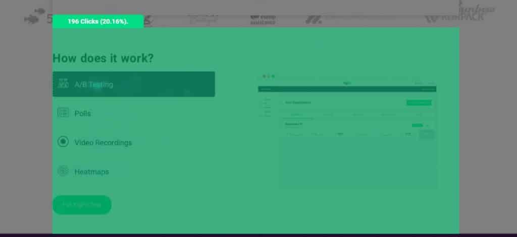
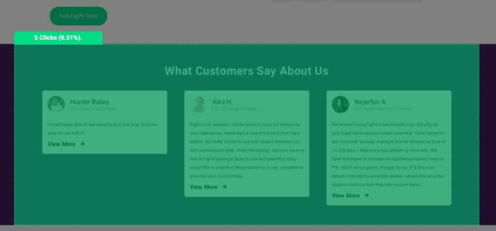
According to click heat maps:
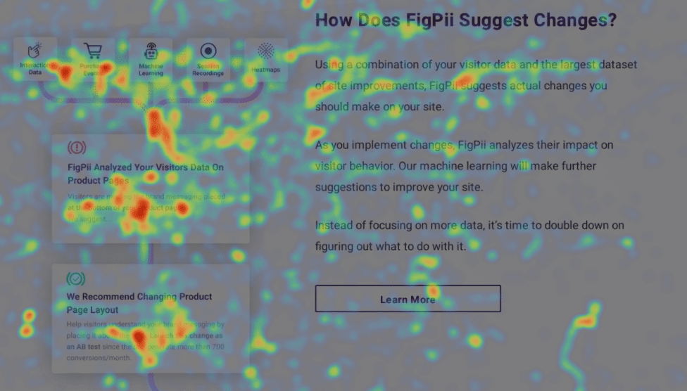
For example, in the screenshot below for the old design for FigPii’s Homepage, this section had almost 20% of interaction, so, here, you can keep in mind to preserve this kind of style while redesigning the page.
Also, the below example of the reviews section only got five clicks out of thousand people, which is not good. So, you start thinking should I have it here? And, if you want to keep it, then you should redesign it.
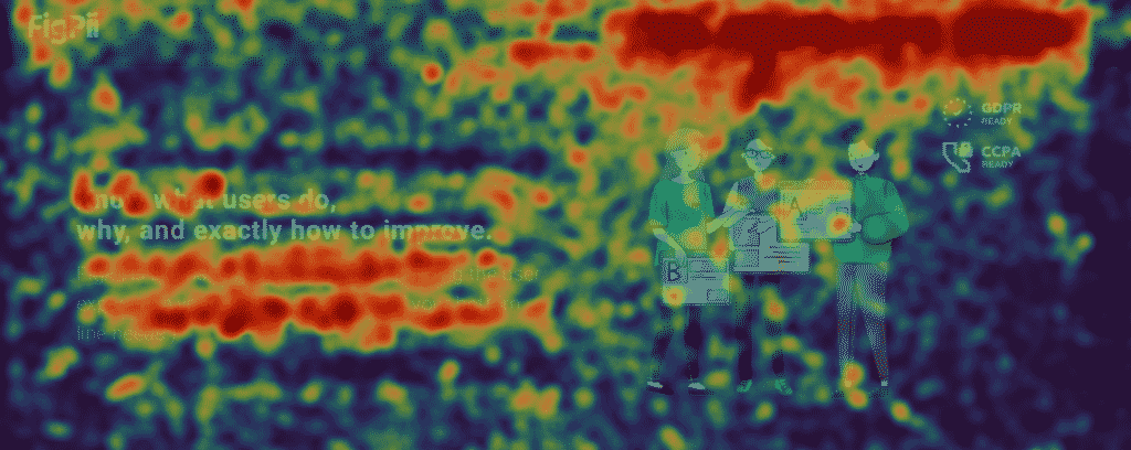
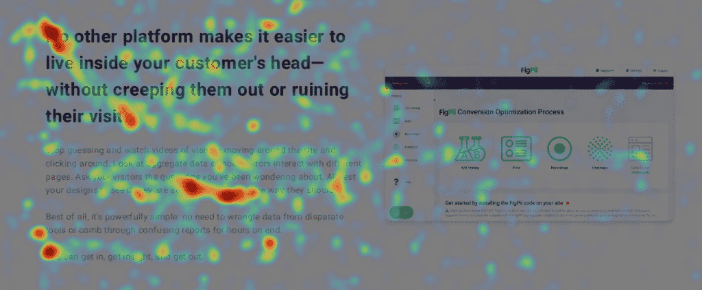
According to move heat maps:
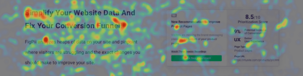
You can use move heat maps to monitor how users are reading things, because most of the time, people move their mouse when they are reading something on the page.
In the screenshot below, it appears that most users are reading everything included in this section, which means that there is space for more text here. So, if you put more or rewrite the text to be more explanatory, they will probably read it as well.
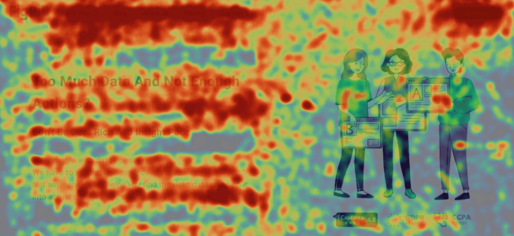
In the example below, the users aren’t reading the entire headline and are skipping it. Therefore, it is considered troublesome.
This means this section needs a redesign because no one is reading or interacting with it, and it is the top section after the hero section. That’s why it needs extra attention.
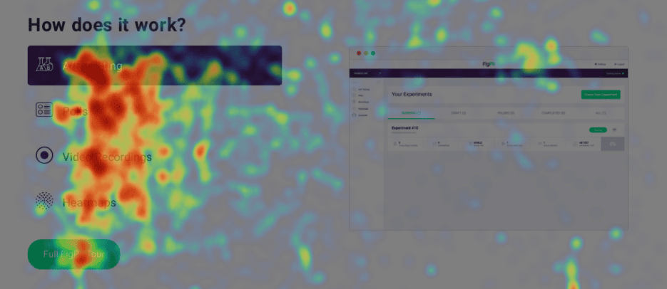
In the below section, ‘How does it work?’, there are clicks on the left part, but the images on the right side are not getting much interaction. So, maybe you can think of putting more text on the left side. Also, you can try to change the image on the right.
The new design:
In the new design of FigPii’s homepage, the changes were as follow:
- We increased the amount of text on the head section, making people still want to read it.
- We added the ‘love’ logo after the head section, and according to move and click heat maps, users click on it and move their mouses in its direction. The interaction with this whole section has improved.


- We reduced the amount of text in the section screenshotted below and changed the image. This has helped in increasing the user interaction with it, according to the move heat maps. It appears that people are trying to read it.
- We added an entirely new segment, as the screenshot shows below. The image on the left seems to have enough interaction; people are reading it. While the text on the right side appears to have low interaction, we might have to think of a solution for it in the next step of redesigning this section. Maybe, it is too much text, or it just needs more images to attract the users.
Wrapping Things Up:
Summing it up to one keyword: data analysis.
Don’t only collect heat map data, analyze it!
When you look at it, you allow yourself to visualize improvements throughout your designated page.
And remember, heat maps alone won’t work, you have other tools to help you understand user behavior, and increase your conversion rates.