

Shopify is the most popular ecommerce platform in the world. It’s easy to set up and use, has a ton of features, and it’s incredibly affordable.
But even though Shopify is so popular with online retailers, it can be tough to get new customers.
That’s where landing pages come in.
Landing pages make it much easier for you to collect leads. You can use them to ask for names and email addresses or other information about potential customers so that you can follow up later with more information about your products or services.
However, you can’t just create any landing page, then expect it to give you results.
It may sometimes seem like people just throw content up on their website, then get a lot of traffic, but this isn’t the case.
Making an effective landing page means creating something that draws attention to what will be most beneficial for the user and will help them find exactly what they need.
What exactly is a landing page?
A landing page (or “one-page site”) is a website focused on one particular product or service, rather than an entire company brand.
A landing page is designed specifically for one goal (such as collecting contact information) and one action (such as submitting the form). It should include only what visitors need in order to complete the task at hand — no more, no less.
Simply put, the goal of a landing page is to convert visitors into customers by providing them with all the information they need to make an informed purchase decision right there on the page. For example, if you are selling a product online and want to collect information from a potential customer before they commit to making a purchase.
Features of an Effective Landing Page
Effective landing pages are the key to converting more of your visitors into customers. If you have a Shopify store, then you can use the built-in tools to create a landing page in just a few minutes.
A good landing page is one that has a clear message and tells your customer what they will get from buying from you. It should also give them the incentive to buy right now.
Regardless of what you’re selling, there are some features that every landing page needs:
- A compelling headline that tells visitors why they should sign up for your email list
- A clear call-to-action that tells visitors what action you want them to take
- An introduction to your brand and product (if applicable)
- A short description of the product or service and why it’s useful or beneficial to the customer
- Social proof, such as testimonials or reviews from customers or experts
- A bulleted list of benefits or features of your product (optional)
- Targeted messaging that speaks directly to your audience
- To help your customers find what they want, use high-quality pictures on your landing page
And most importantly, your landing page should have a clean layout that’s easy for customers to navigate through quickly and easily (i.e., no distractions).
Now that you know what ingredients are essential to creating a winning landing page, let’s discuss the tips in depth.
Tips to Create an Effective Shopify Landing Page
If you want to create landing pages in Shopify, here are some tips:
1. Decide what you want your customer to do
When creating a Shopify landing page, you need to decide what you want your customer to do.
For example:
- Buy something
- Sign up for a newsletter
- Register for an event
- Visit another page on your website
Once you know what action you want your customer to take, it will be easier for you to design the page so that it prompts them to take that action as soon as possible.
A good landing page on Shopify will get people to take action quickly and easily. If someone lands on your website and doesn’t know what they’re supposed to do next (or even where they are), you’ve lost them.
For example, if you want them to buy something, then clearly state that they’ll get X% off if they buy right now. Or, if you want people to sign up for a newsletter, make sure the headline clearly states that information and also include links that lead directly to the signup form on the page.
Don’t make your customers hunt for what they want; instead, draw them in with compelling images, headlines, and copy.
For example, Some Pretty SEO sells a physical copy of a book online, though they aren’t an e-commerce business.
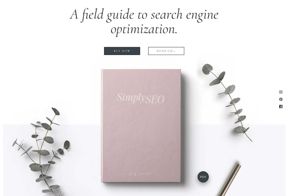
(Source)
They add a picture of the book to their landing page and even offer a secondary CTA if you want a free preview.
It further gives a more detailed description of what’s inside the book:
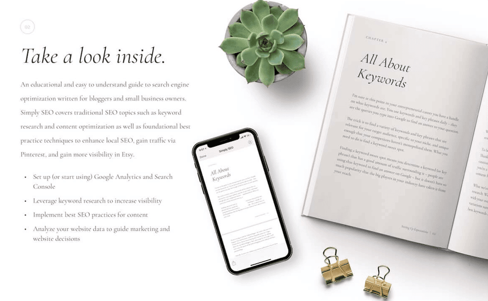
(Source)
2. Choose landing page templates that fit your goals
The most important thing to remember when creating landing pages is that you need to choose a template that fits your goals.
For example, if you’re an online store, then your landing page should focus on encouraging visitors to buy something right away.
Or, if you’re a business consultant or freelance marketer who charges clients for work by the hour, then your landing page should focus on convincing people that they’ll get what they pay for from working with you.
You might want to consider using the Shopify landing page builder and pre-made sales page templates to create custom landing pages. These templates can be customized with your own images, text, and branding.
The great thing about these templates is that they’re easy to use; they have all the features needed for an effective landing page. You don’t have to spend hours designing your own template!
For instance, you can use Shopify Lorin if your goal is to sell shapewear to women. It offers a notification bar, newsletter pop-up, preloaders, and more. The template is customizable and helps you add customer testimonials.
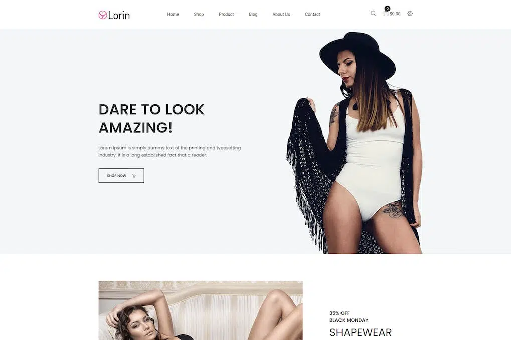
(Source)
Whereas Shopify Avone is for beginners without the required skills and experience to set up a shop, it has features suitable for professionals as well. It costs you a small fee, but it offers many free apps and saves you time and energy.
Avone’s features include header designs, a mega menu, unlimited scrolling, a quick shop, a promotional banner, and more.
3. Use clear, specific headlines
When Sumo tested more than 150,000 opt-in headlines, it found that straightforward headlines performed better than their creative headlines 88% of the time.
For instance, the clear and specific headline “Free Ebook: 15 Emails Everyone Should Send” was downloaded more than 2X as compared to the creative headline “Why Aren’t You Sending These 15 Emails?”
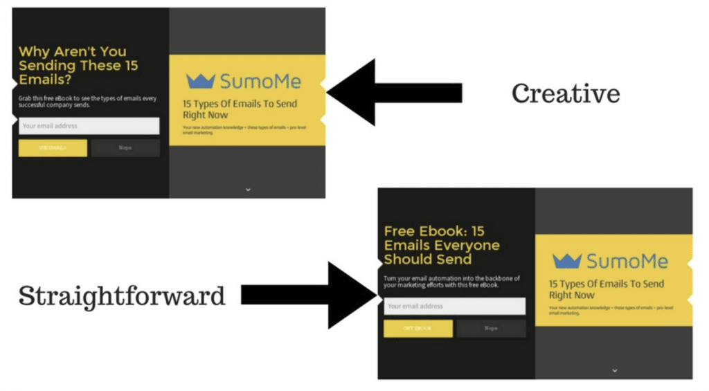
(Source)
Clearly, your headline should also be specific with regard to what your product does or what service you offer.
There’s no point in trying to be vague because this will result in lost sales and customers who aren’t satisfied with their purchase because they didn’t know what they were getting into when they considered buying from you.
Your customers are busy people and don’t want to spend too much time reading about your product or service. They want to know what they’re getting into right away so they can make an informed decision about whether or not it’s something they want to buy.
4. Let your visitors know what to expect from your product or service
When you’re launching a new product or service, your landing page must tell visitors what they can expect. The more specific you can be, the better:
What problem does it solve?
What features does it have?
Who would benefit from using it?
How much will it cost (and when)?
Why should people care about this?
One way to do this is by providing a very clear description of what the product or service is. This description should be simple, easy to read and tell the visitor exactly what they will get from using it.
For example, if you’re selling a product that helps people lose weight, then make sure that your landing page has a short paragraph explaining how it works and its effectiveness. You should also include any testimonials from customers who have used it successfully before.
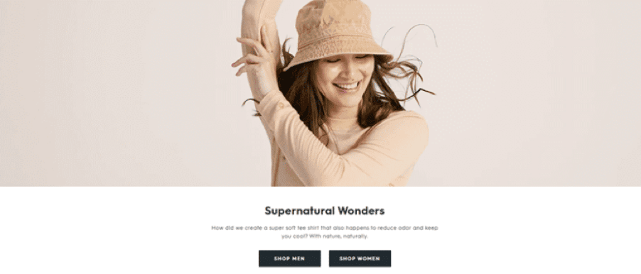
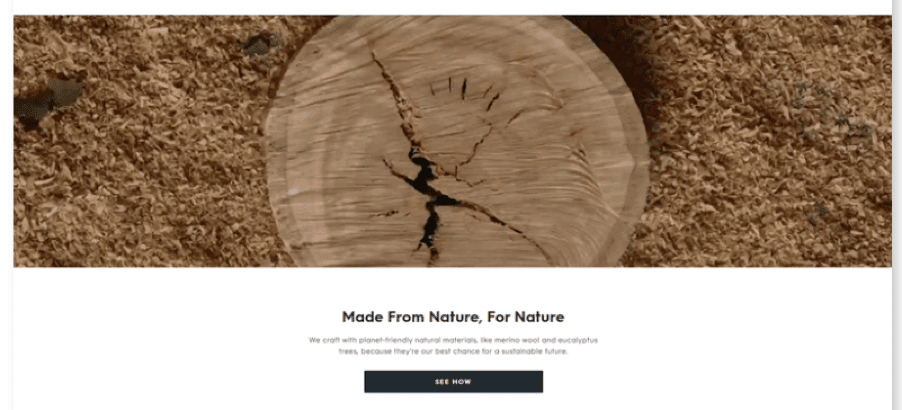
Consider this landing page by Allbirds – a New Zealand-American footwear company that believes in using natural materials when manufacturing its products. They focus on environmental sustainability, and their company is a certified B Corporation.
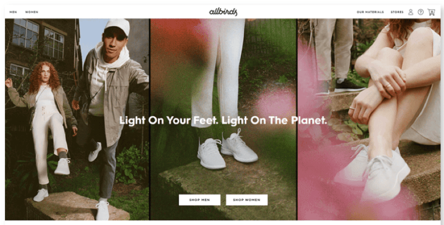
(Source)
When you visit their landing page, you’ll see that the company’s sustainable manufacturing practices get special attention. And you’ll also see a video highlighting their materials and another showing their approach.
Another way to improve your landing page is by including pictures of the product or service in use. If the picture shows someone using or enjoying the product or service, then this can make it much more appealing to potential customers, too!
5. Build trust with customer reviews and testimonials
Customer reviews are one of the most important factors in driving sales on your Shopify store.
It’s no surprise that over 79% of consumers trust online reviews as much as personal recommendations. And with good reason: when it comes to ecommerce, customer reviews can be your best friend or your worst enemy.
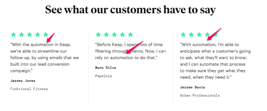
For instance, Keap, a CRM tool, adds testimonial mentions on their automation landing page about how their automation features save users’ time. They use five-star icons to grab attention and show visitors how much people love the tool.
(Source)
So, how do you get more positive reviews?
The best way to get customer reviews is by asking your customers directly for their feedback. You can do this through email, phone, or social media.
If you’re not getting enough customer reviews and testimonials, you can also use these tips to get more:
- Offer discounts or free shipping
- Send an email to customers who haven’t left a review
- Offer exclusive pricing to those who leave a review
- Add a button on your product pages
6. Showcase your benefits, not just features
If you want your landing pages to truly stand out from the crowd, it’s not enough to simply list your product’s features. You need to mention your benefits instead and show them off visually — like in an image gallery or video demo.
Benefits are what people care about most when they’re considering buying a product or service. They’re what help you make a sale — or not make one.
Here’s an example from Love Hair, which focuses on clean products.
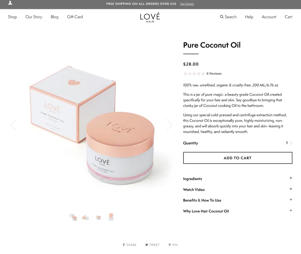
(Source)
If you look under the product video, the brand educates users more about each product and talks about the benefits of the products. It gives them an opportunity to address directly to its audience’s pain points directly.
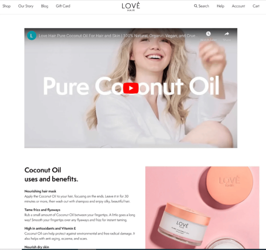
(Source)
Here are some tips to help you create effective, benefit-driven Shopify landing pages:
- Use Benefits-Driven Headlines – Clear benefits-driven headlines can help you win customers over by highlighting exactly what they will get from your product or service. For example, instead of writing a headline like “Our Gym Bag is the Best Gym Bag,” write something like “This Gym Bag Will Keep You Organized.”
- Make It Specific – When it comes to benefits, the more specific you can be, the better. Instead of saying, “Our Products Are Good Quality,” write something like, “Our Products Are Made From High-Quality Materials.” The more specific you are with your benefits, the easier it will be for visitors to understand why they should buy from you and not a competitor.
- Highlight Unique Features – If you have unique features in your products or services that are important for buyers to know about, be sure to highlight them on your landing page! For example, if you sell designer bags and one of them has an extra pocket inside, that’s something that shoppers would want to know about so they can make an informed decision.
7. Keep the form short and sweet for higher conversion rates
It’s tempting to go overboard with your landing page and add every possible call-to-action (CTA) on there. But if you have too many options, people will get confused and bounce back to the top of the sales funnel.
The good news is that there’s an easy fix for this problem: be concise and keep it short!
If your form is too long, visitors will drop it off before completing it. They’ll simply close the tab and move on with their day. And if they do decide to fill out your form, they’ll probably just rush through it without thinking about what they’re actually saying or doing.
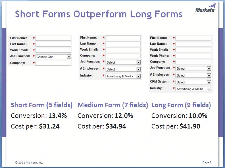
Take this case study, for instance.
In this case study of Marketing Experiments, short forms resulted in higher conversion rates than longer forms.
The short form with only five fields- first and last name, work email, job function, and company resulted in an average conversion of 13.4%, with a cost-per-lead of $31.24.
Adding extra company info fields to the form – a number of employees and industry decreased conversion to 12% and increased the cost-per-lead to $34.94.
Further, when they added the CRM system and work phone fields, their conversion slumped to 10%, and cost-per-lead soared to $41.90.
(Source)
Don’t ask unnecessary questions in your form. If you need more information than just name and email address, then use two different forms – one with all the details and another one with just name and email address.
Here are some more tips for simplifying your form:
- Limit the number of fields in your form to three or four at most. The more fields you have, the less likely someone will complete it — which means fewer sales for you.
- Make sure that each field has a label so users know what information they’re asked for. This will help prevent mistakes and reduce confusion when filling out the form.
- Keep questions relevant to your business goals — don’t ask for personal information unless there’s an immediate benefit for the customer (such as discounts or free shipping).
8. Help people contact you (even if they don’t fill out the form)
If you want to make your ecommerce website more than just a simple store, then it’s essential that you include a Contact Us form in your landing page design. This helps you build a relationship with new customers, and it also allows them to get in touch with any questions or suggestions that they may have.
However, this doesn’t mean everyone visiting your site will fill out the form. Some people may not have any questions at all, while others might not be ready to make a purchase yet.
In both cases, having a way for visitors to get in touch with you is still important — especially if you want to start building those relationships now.
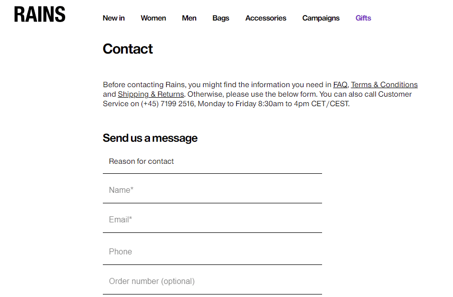
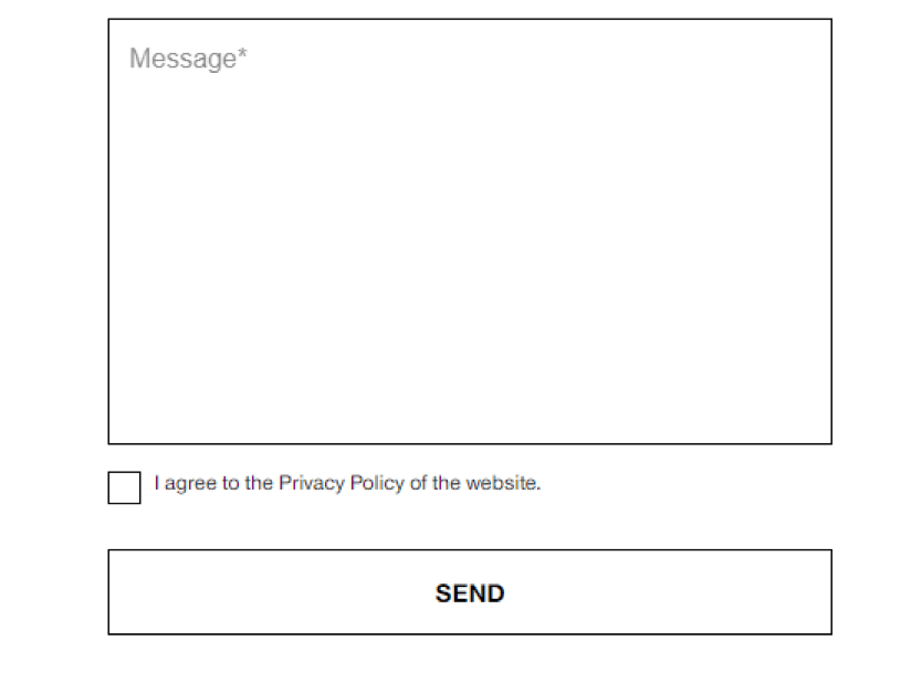
For instance, Rains, an outwear lifestyle brand, allows visitors to contact the brand by sending a message even if they don’t fill out the form. There’s a link to their contact form on their landing page.
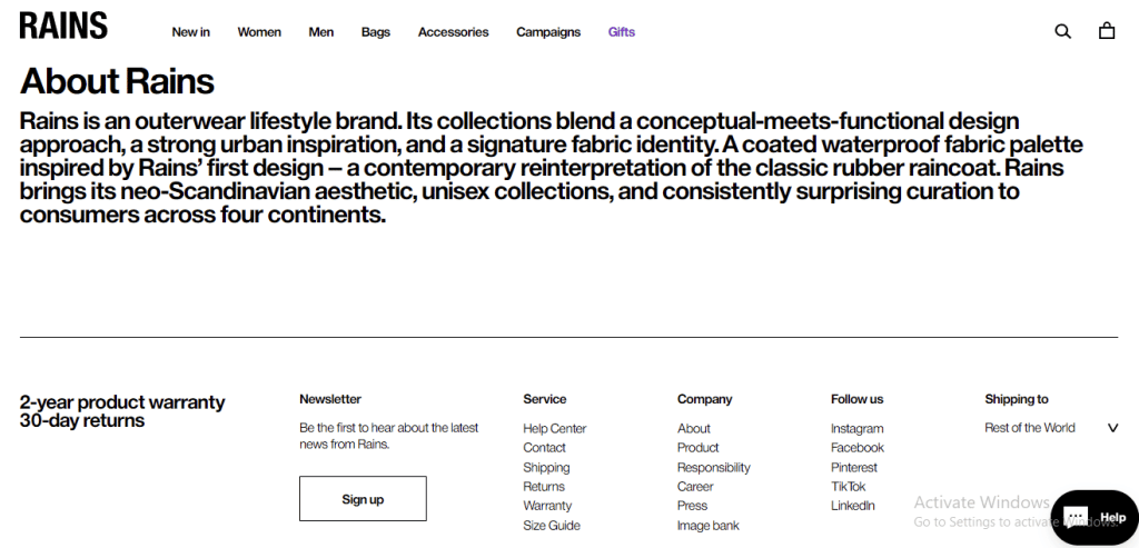
Visitors have to fill in the reason for contact, name, email, phone, and order number (optional) in the contact form.
(Source)
Over to You!
The strategy of a landing page is to have a visitor leave their email in exchange for a call-to-action. This allows a business to advertise to those who are interested in their product or service, allowing them to focus on their target demographic.
The biggest key to developing an effective landing page is to know your visitor and the main objectives they want to achieve by sharing their email address.
Finally, don’t forget to A/B test your landing pages to see which variations are most effective at achieving your conversion goals. If you can accomplish this, your sales will go up exponentially.
How to create a Shopify Landing Page FAQ
What is the difference between a landing page and a homepage?
The main difference between a homepage and a landing page lies in their purpose and focus. A homepage is the front door to your entire website. It’s designed to welcome a broad range of visitors and guide them to various parts of your site, whether that’s product pages, blog posts, or contact information. It often has multiple calls to action (CTAs) that lead to different sections.
On the other hand, a landing page is laser-focused on a single goal or call to action, like “Sign Up” or “Buy Now.” It’s crafted to convert a specific audience, often coming from targeted promotions or ads.
Unlike a homepage, a landing page usually avoids any extraneous information that could distract from that main call to action. So, while a homepage gives visitors a tour of what you offer, a landing page tells them exactly what you want them to do and why they should do
How do I measure the success of my Shopify landing page?
- Conversion Rate: The percentage of visitors who complete the desired action on the landing page. A high conversion rate is usually the ultimate goal.
- Bounce Rate: The percentage of visitors who navigate away after only viewing the landing page. A high bounce rate could indicate that your landing page isn’t convincing enough.
- Average Time on Page: The longer a visitor stays, the more likely they are to convert.
- User Behavior: Tools like heat maps and session recordings can provide insights into how users interact with your page.
- Sales Metrics: If the goal is sales conversion, then tracking metrics like Average Order Value (AOV) and Customer Lifetime Value (CLV) can be beneficial.
What should I avoid putting on my landing page?
- Too Many CTAs: Stick to one primary CTA to avoid confusing your visitors.
- Irrelevant Information: Every sentence should serve the purpose of moving visitors toward the CTA.
- Stock Photos: These can make your site look generic. Use custom images that align with your brand and message.
- Technical Jargon: Keep the language simple and relatable to ensure you’re speaking to your entire audience, not just the experts.
- Auto-play Videos: These can be annoying and slow down page load times.
- Long Forms: The more fields you ask users to fill out, the less likely they are to complete the form.
How often should I update my landing page?
The frequency with which you should update your landing page depends on a variety of factors. If your landing page is tied to a specific event or season, you’ll want to update it accordingly.
For instance, a holiday-themed page should be updated once the holiday is over. If there are significant updates to the product or service you’re promoting, that’s another cue to refresh your landing page.
Performance metrics are also a key indicator. If you notice that your landing page isn’t hitting the key performance indicators (KPIs) you’ve set, it’s time to make some changes.
Regular A/B testing can provide insights into what’s working and what’s not, allowing you to make data-driven updates.
Finally, keeping your content relevant is crucial. If there are new trends or developments in your industry, updating your landing page to reflect these can help maintain its effectiveness.
So, in a nutshell, the timing for updates can range from seasonal changes to performance metrics, but the key is to keep an eye on how well your landing page is achieving its goals and to adjust as needed.