

Setting up a Shopify store in 2022 is as easy as ABC.
This is why many brands have been taking advantage of this – creating an online presence for their businesses. However, a beautiful website design doesn’t guarantee your conversion rate will skyrocket.
As a matter of fact, our friends at Invesp have worked with many businesses that had beautiful Shopify websites but were plagued by low conversion rates. The aesthetics of your website or homepage don’t determine the number of conversions you will get.
Think about websites such as Craiglist, Wikipedia, and Indeed – they both have ugly homepage designs but high conversion rates. I’m not suggesting that your site design doesn’t matter. There are so many factors that you should consider when working on your online store.
In this article, we’ll talk about 11 tips you should consider when creating a Shopify homepage that compels visitors to convert. So, let’s just get into it…
-
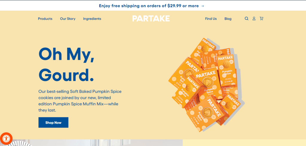
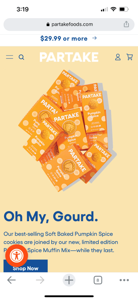
Mobile Friendliness
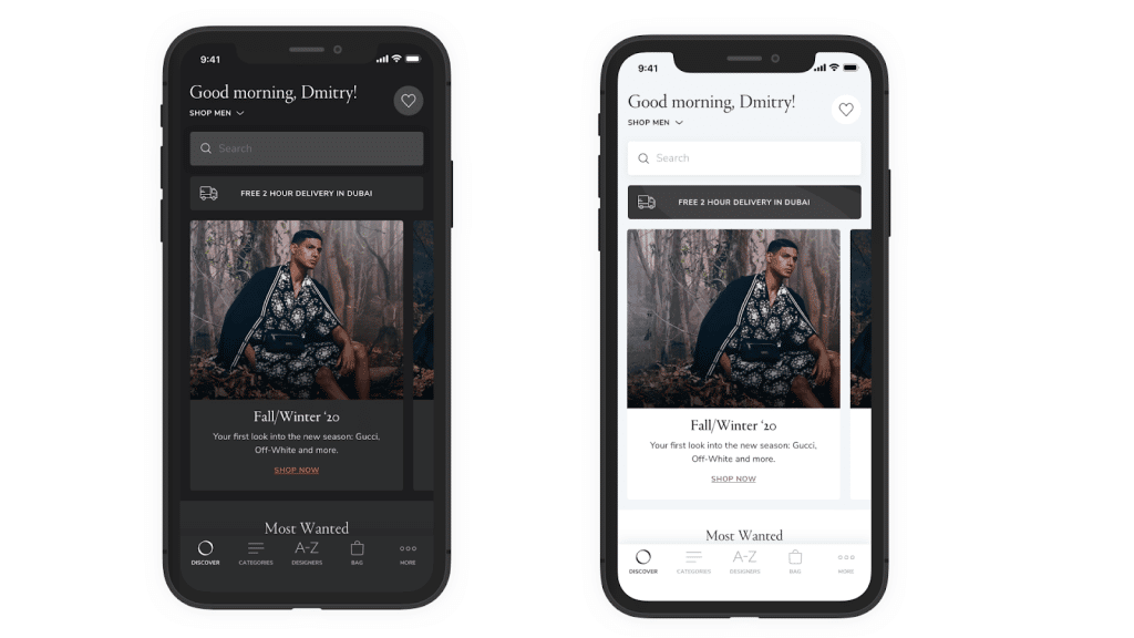
We’re living in a mobile-first world, which means that a significant proportion of people will access your online store through their mobile phones. And even studies confirm that 92.1% of web traffic comes from mobile devices.
This simply means that you can’t afford to ignore mobile optimization! The good thing about optimizing your Shopify store for mobile devices is that it comes with many benefits.
I mean, you can boost the ranking of your website and improve your brand’s reputation and credibility. Also, you are more likely to satisfy your visitors as they browse your site using their mobile devices.
And ultimately, you can boost customers’ engagement – this can positively impact your conversion rate. Below is an example of a mobile-optimized website:
-
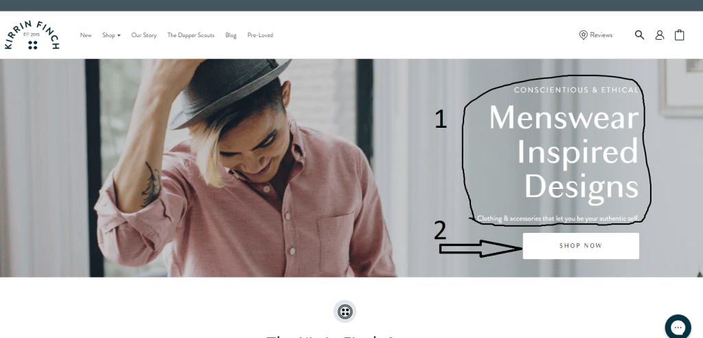
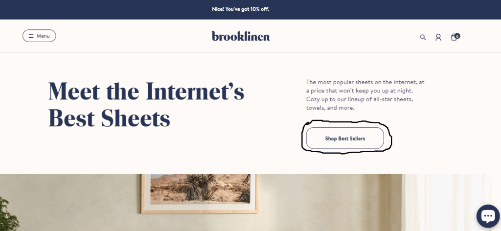
Pay Attention to the Hero Section (Above the fold section)
The above-the-fold section of your Shopify store homepage is the section that your users see before scrolling down. The hero section shows up immediately under your navigation menu and logo. A compelling hero section can increase your chances of grabbing users’ attention.
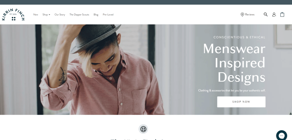
Your Hero Section should contain the following information:
- Your unique selling proposition (what makes you different and why customers should patronize you)
- A call to action
-
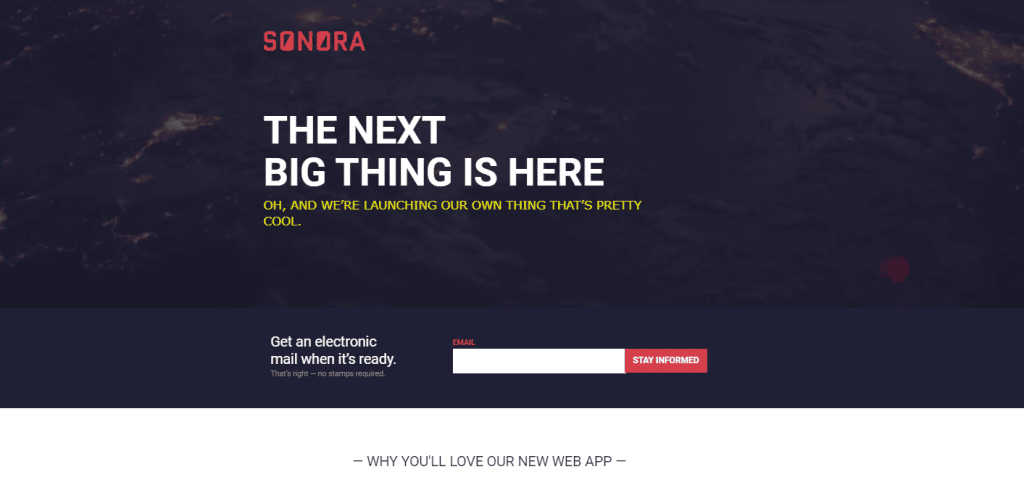
Prioritize Best Sellers
As a regular online shopper, one of the trends I have observed is how ecommerce stores try to push their best-selling products subtly. I like this because it often saves me the time I’d have spent scrolling through their website looking for what to buy. Instinctively, I believe the best-sellers because that means a lot of other users are also buying the same product, so why don’t I just do the same?
The two images below show how the citiesocial store displays its best sellers immediately after their hero section.
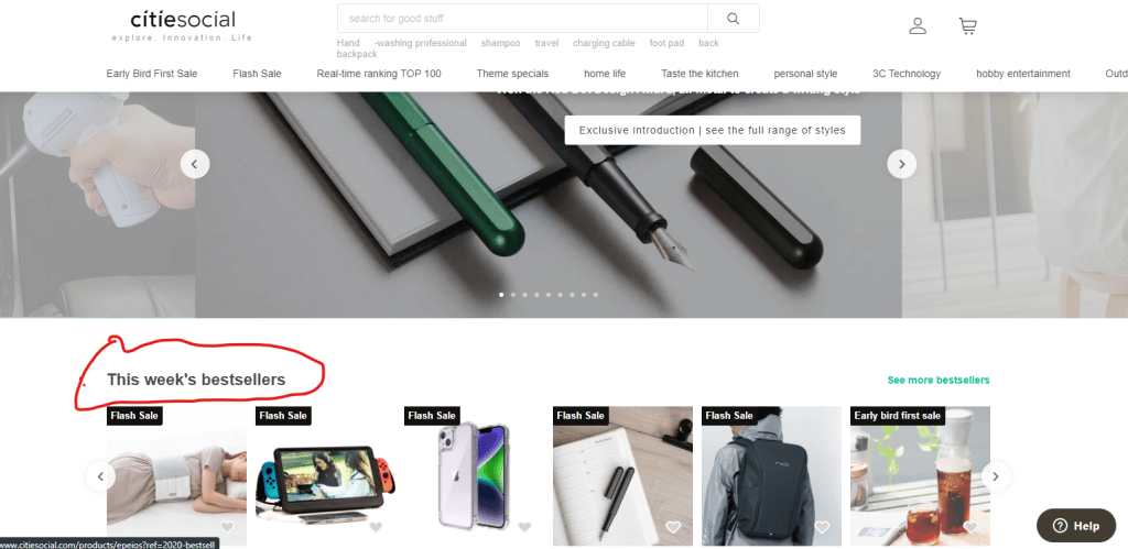
Shopify recently introduced a feature that lets you display your top-selling products first. That way, your best-performing products are shown first when users visit your page. Displaying and recommending your top-selling products can also increase your conversion rates.
-
Social Proof
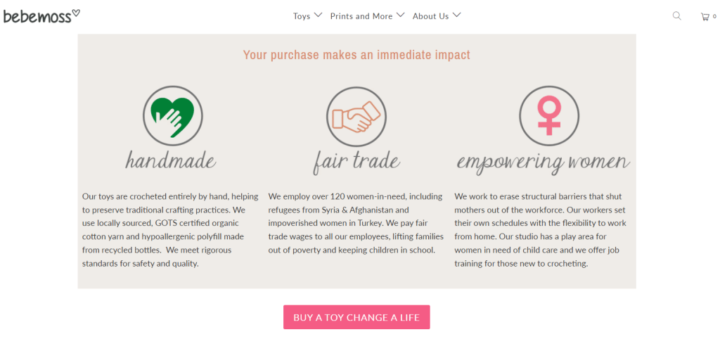
It’s easier to convince potential buyers to patronize you if you can show them your business is trustworthy. Visitors who land on your homepage have fears, doubts, and uncertainties. You must ensure your homepage addresses these anxieties and concerns. One way of doing this is by showing social proof. Here are some examples of social proof you can use on your website.
User Testimonials: Quoting what users say about your products and displaying them on your homepage can boost customer confidence and get them to buy your products.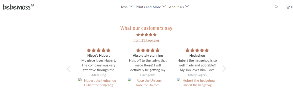
Societal Impact: When customers and potential users see that you are giving back to the community, it can appeal to their sense of responsibility and get them to buy more from you.
Celebrity Endorsement: Celebrity endorsements have been around for a while now and businesses are leveraging the influence of popular figures to promote their products. It gives customers some confidence and trust regarding your product. So, if it is within your budget, you can get a celebrity to endorse your product.
Quick Tip: Try using a celebrity whose personality and values align with that of your brand.
-
Fonts
This may sound far-fetched, but the font on your Shopify home page influences how your brand is perceived. Your font can evoke emotions and cause visitors to either feel excited, intrigued, or comforted. Let’s look at the fonts of these two websites below.
Looking at the website below, you can tell that the font used is clear regarding hierarchy and visibility.
Looking at the second website, you can see that the choice of font color for the price looks a bit off, and the copy written in blue is not clear enough for readers to see.
Fonts majorly affect how users and potential customers perceive your business. Your choice of fonts can affect users’ engagement with your brand. Choose fonts that align with your brand identity, and use them to convey the right message and emotion. Additionally, take advantage of the different font customization options to give a visual hierarchy on your home page.
Shopify also allows you to import a custom font if you want something different from the default fonts. You can take advantage of this to use fonts that resonate with your brand.
If we were to judge the two sample websites above based on fonts and text readability, the first website would likely generate more traffic than the second website.
6. Accessibility Considerations
Accessibility has been a trending topic among UX Designers and Web developers, and it’s an important factor to consider when customizing your Shopify homepage. Accessibility considerations help to make your website usable and accessible by a wide range of users with diverse abilities. Adding image descriptions and alternate texts to images will also make your homepage and website, in general, more accessible for people using assistive technologies.
Shopify allows you to add accessibility features like night mode and language translation to your website. You can take advantage of this to make your home page better.
-
Fast Loading Pages
The faster your home page loads, the quicker users can do what they need to and move on, which is good for your business. If I have to wait more than ten seconds for your homepage to load fully, you have my word that I’ll be out of there in no time, contributing negatively to your bounce rate.
Always ensure that your Shopify store loads at an acceptable speed. For an ecommerce store, you want your store to load fully within 3-5 seconds on a desktop device and 1-2 seconds on a mobile device; anything greater than these numbers will see your bounce rate skyrocket.
However, in some cases, other factors out of your control can cause your website to load slowly. These factors include slow network, location, and device.
-
Pop-Ups
Let’s be honest; pop-ups can sometimes be annoying. But there’s no denying that they can help increase engagement and the chances of conversion. When it comes to pop-ups, there are two things that you have to keep in mind:
1. Timing
2. Value
Let’s start with timing. Imagine going on a first date with someone and having that person immediately propose to you on that first date. Even though you liked that person, you’re more likely to turn them down because of their bad timing. Similar to websites, your visitors will more likely ignore your pop-ups if they appear as soon as they land on your homepage. You should give them a chance to interact with your site before you pop that question.
Value is also an essential pop-up component you can’t afford to ignore. Generally, people don’t care about how beautiful your pop-ups look and are more interested in the value they will get after clicking them. A pop-up is an excellent place to apply the WIIFM principle. WIIFM is an acronym for one important question that drives visitors to take action on your site: What’s in it For Me?
Here’s an excellent example of a pop-up that uses the WIIFM principle on a Shopify homepage design:
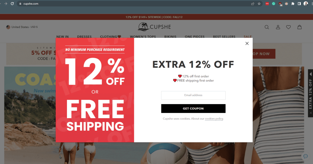
This is an example of a valuable popup on cupshe that comes up about 5 seconds after the website fully loads.
Welcome pop-ups are a great way to get users’ attention to specific products, discounts, or promotions or even get them to signup for a newsletter. If they are timed well and help add value, they can help fast-track the buyer’s journey.
-
Clear and Concise CTAs
A call to action is important because it informs users of the next action step. Ensure that the CTA on your homepage communicates the next step you want users to take. If possible, you want to avoid a situation where you have multiple CTAs on your homepage. However, if you need to have more than one call to action button on a page, you should make the primary action stand out using a different color, font weight, or size.
Since the homepage can also have different sections, it makes sense to use different CTAs in every section. That way, users can easily understand the action you want them to take in the different sections as they scroll through the page.
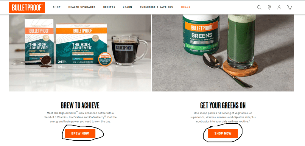
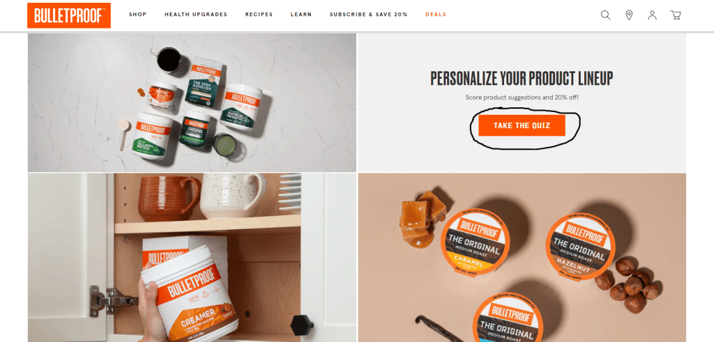
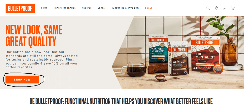
Let’s look at bulletproof.com, where different call-to-action buttons exist in different site sections.
-
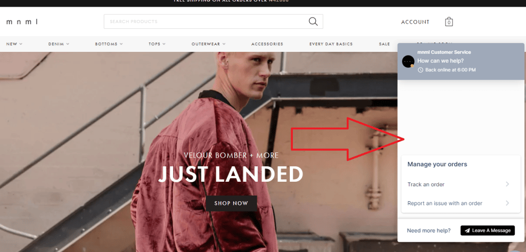
Live Chat
Live chat is a great feature to add to your Shopify homepage because it helps improve customer experience. Customers who encounter challenges while using your site can easily reach out to your customer support team without waiting too long. One other benefit of live chat is that it informs you of pain points in your products, which you can work on to improve.
Having a live chat is like having a team member guide the customers throughout their journey on your site.
Here’s an example of a live chat on mnml.la that shows the live chat feature on the right side of the page.
-
Unique Value Proposition
A unique value proposition, also known as a unique selling proposition, is a statement that tells customers and prospects about distinct features of your products or services and their advantages over your competitors.
As a customer, I would like to know why you want me to buy from you and not from the next person, and your Unique Value Proposition should be able to answer this question in as few words as possible.
Let’s look at these three websites and their unique value propositions highlighted within the black rectangle.
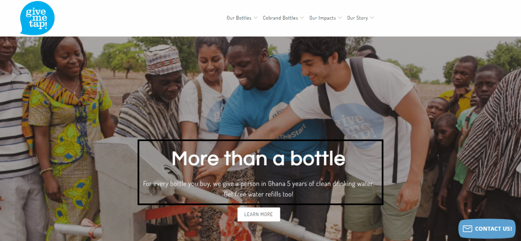
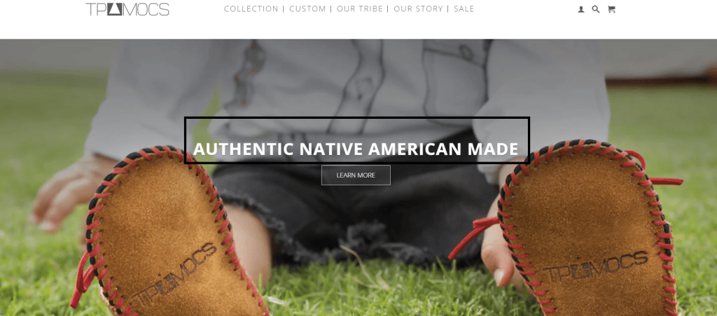
While the first store has a clear and concise unique value proposition, the second does not do justice to its unique value proposition, and the third website has no unique value proposition on its homepage.
-
Visible Search Bar
A search bar can be another selling point on your Shopify homepage to get customers to interact with your product. A visible search bar on your homepage design helps customers find what they need faster, improving their experience. Another advantage of this is that you can analyze the search queries to make changes to your homepage in terms of content, structure, and design.
For example, if you observe that users mostly search for “leather straps,” you can restructure your page to show products with leather straps before other products.
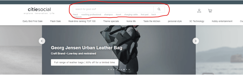
The search bar on the citiesocial website is at the top of the page, where it can be easily found.
- Top Navigation Bar
A well-organized navigation bar gives an overview of all the pages on your site and can point users in the direction to go when searching for a particular page or product. A clear navigation structure will also help inform users where they are on your website and how to get where they are going.
A visible search bar and a top navigation bar can go hand in hand to allow users to browse your site easily.
Bonus Point: A/B Testing
Now that you’ve learned about some of the best homepage practices for your Shopify store, what next? How will you implement some of these practices and ensure they help you increase sales, convert prospects and retain customers?
A/B Testing
When you are ready to implement these best practices on your homepage, A/B tests your ideas to see which performs best at driving conversion rates.
A/B testing helps you answer questions like :
How do you know where to put your CTA or the content that goes into the CTA?
How do you know which pop-ups to use and when to use them?
What font style, color, or size would users find more appealing?
Where should the search bar be on mobile devices?
A/B testing is important because it will help you reveal how best to implement these practices on your homepage.