

Though old in practice, the concept of A/B testing remains a golden egg in the marketing space, if you are not running A/B tests on your e-commerce website, you may already be missing out on potential revenue opportunities.
One of the many things I love about A/B testing is that it works for any e-commerce business, regardless of the industry. Whether your business is B2C, DTC, or B2B, you can rely on A/B testing to:
- learn more about your audience preferences,
- increase user engagement,
- improve your site’s user experience,
- reduce bounce rates,
- increase conversions,
- And minimize risk.
This article will talk about different A/B testing tips, A/B testing mistakes to avoid, and A/B testing ideas you should consider on your e-commerce website.
A/B Testing Tips For E-commerce
What works for your competitors may affect conversions at your online stores.
But there isn’t a general guide for e-commerce websites that can walk you on how to A/B test your store step by step.
However, here are some tips that can send you in the right direction:
1- Test mobile from the desktop separately
Running the same test on mobile and desktop simultaneously is a mistake you should avoid. It comes with many complications for both the QA person and the development team.
According to Anwar Aly, a CRO Specialist at Invesp:
He says:
This is a well-known piece of information. However, not all people do it. They depend on what worked on one device will work on the other, even though each device has an entirely different persona.
Test each device separately for better optimization and higher conversions.
2- Limit changes
Try to limit the number of changes you make in a single test.
In this same vein, Anwar says:
One of the mistakes I used to make is that I used to test a lot of changes in one experiment. So, regardless of the results, I wasn’t sure why this result happened because I changed a lot of elements.
So, you must try to limit the variables to learn which one caused the results.
At this point, I asked Anwar: But what if you have to do multiple changes with a certain page?
Anwar replied:
Here, you go to what is called a multivariate test. Here, you test a variant combination against another variant combination.
For example, in variant combination 1, I will be updating the header, footer, and buttons. While in variant combination 2, I will update the hero image and buttons.
3- Start with an easy test
When you ask a CRO specialist, they will probably tell you that there’s nothing like an easy test. All tests take time and effort to prepare. But some of them are more complicated than others.
In this regard, here’s what Anwar had to say:
There is a term called “low hanging fruits,” which are the opportunities that are too obvious and ‘fix right away’ elements.
As an e-commerce store, we are just about to A/B test and have a couple of test ideas. The first is to remove the product price from the category pages, while the second is to change the grid system of the category pages.
Changing the grid system is more problematic and time-consuming than hiding the products’ price.
So, always aim to start with the high impact tests and need a low implementation time and effort. Because this way, you will validate quickly and then iterate right away.
4- Review test results as a team
As a human being, you already have your preconceived notions.
And the same applies when you’re working as an optimizer. You start forming assumptions once you see the test results.
That’s why it’s crucial to review the results as a team if the test didn’t bring out a winning result.
That way, you will avoid letting your judgments get in the way of the analysis – Also, it will help you brainstorm for better testing ideas.
5- Make the elements you’re testing more obvious
You need to ensure that your testing element stands out to your visitors.
Visitors can miss elements like CTAs (call-to-action), trust badges, and sidebars; they’re obvious and easily spotted – For example, you can place them above the fold.
What to Avoid While A/B Testing Your Store?
1- Avoid testing elements that make the conversion path longer
In an e-commerce website, that will bore customers out, which may lead to them dropping out.
Anwar gave me a great example:
I am currently working on an e-commerce website that sells all the products related to kids and babies. Their checkout process used to be in steps; however, they revamped it to make each part of the process have a different landing page. This led to more clicks but, unfortunately, more drops.
So, don’t test anything that will make the purchase flow longer.
2- Never copy what competitors do.
Anwar commented saying:
Say there is a clothing e-commerce store just getting started, so they will check what other fashion websites are doing and copy it.
This is a common mistake. It doesn’t mean that you shouldn’t get inspired by what they do. Get inspired and take small parts you can apply to your website.
However, whichever part you take, A/B test it. Make sure it synchronizes with your site and users, then implement and repeat the same process with another small part.
3- Avoid biased sampling
Biased sampling happens when you select a sample from the population (all visitors of your website) so that some of the representatives of the population are less likely to be included in this sample.
Thus, some website visitors are less likely to be chosen to see a variation of your A/B test than others.
Why does it happen?
There are various factors influencing conversion rate when you A/B test a website:
- Business cycle
- Promotions
- Newsletter schedule
- Ad campaigns
- Payday of customers
So, when you test only on weekdays, you get skewed test data because people who prefer to shop on the weekdays are more likely to be included in the test sample than those who shop on the weekend.
The same happens when you run a test only for half of the business cycle.
If your sample data includes exceptional periods like holidays and seasonal campaigns, you are on the wrong track. Your test data will be inconsistent.
4- Never test without a hypothesis
A testing hypothesis is fundamental, as it is a predictive statement about possible problems on a webpage and the impact that is fixing them may have on your KPI.
But, how do you come up with a test hypothesis?
Come up with:
- A problem statement.
- How the problem was identified.
- An initial hypothesis on how to fix the problem.
5- Run separate tests for new vs. returning visitors
It is better to test new website designs with new visitors.
Why?
Because returning visitors are loyal to your site, they are used to it with all of its conversion problems!
Moreover, before you test new designs, you need to assess how returning visitors interact with your website compared to new visitors.
6- Don’t call a test too early
You have no control over factors that pollute your results when running a split test.
There are three different categories of factors:
- General market trends: a sudden downturn in the economy, for example.
- Competitive factors: when a competitor runs a massive marketing campaign.
- Traffic factors: change in the quality of organic or paid traffic.
In such cases, it is best to limit the period of any split test to no longer than 30 days.
Why?
Because if you run a test longer than that to achieve confidence on a test, you can impact your testing data negatively.
7. Not documenting your testing insights
One golden principle governing the world of experimentation is that you should document your insights. Whether your tests win or lose, you should capture all of the insights as they help inform upcoming tests.
Not documenting your experimentation insights is one way of disadvantaging yourself. Here are some of the reasons why you should consider documenting your testing insights:
- It will help you avoid rerunning the same test, which means a waste of time, effort, and resources.
- It will help improve the quality of your tests – Because, through documentation, all of the team members will be able to follow the same process.
- It will help you save money – Experiments cost a large sum of money and avoiding repeating the same test or a useless one will help keep some of it.
8. Testing the wrong page
Another mistake that can waste your time, resources, and money is A/B testing the wrong page. This happens more often than not.
Here’s the thing, all e-commerces pages on your website are essential. But some pages are more important than others. Some pages have more impact on the overall conversion rate of your website.
My point here is you don’t need to A/B test all of your pages. You need to test the ones with a greater significance to your goals. For example, e-commerce websites should prioritize funnel pages (category pages, product pages, checkout flow).
Don’t get me wrong; I’m not saying you shouldn’t A/B test your homepage. You should test them. Always know that a conversion lift on a homepage doesn’t necessarily translate to money in the bank.
On the other hand, conversion on your cart page directly impacts your website conversion rate.
E-commerce A/B testing Ideas
There are many A/B tests you can launch on each page of the e-commerce conversion funnel.

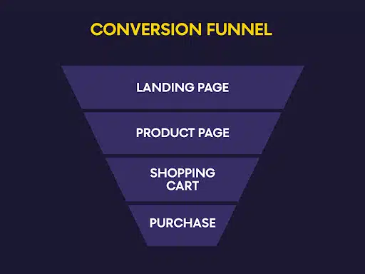
Nonetheless, here are some A/B test ideas we have personally experimented with e-commerce websites:
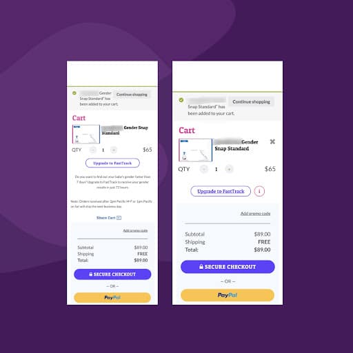
Checkout Page – Hide Promo Code
This client is a home & lifestyle accessories brand.
When visitors reach the checkout page, which as all of you may know, is a very sensitive part of the funnel, we expect them to move and not drop out.
However, this was not the case here. Visitors were abandoning the checkout page upon arriving at the checkout’s first step.
One element that gave us pause was the prominent “apply promo code.” Our hypothesis was that visitors would see it and abandon “search” for a promo code across the web, never returning.
It is undoubtedly a CRO best practice that promo codes boxes shouldn’t be so prominent that they distract the visitors from the objective of their visit to the site/and checkout page in particular, and that’s what we did.
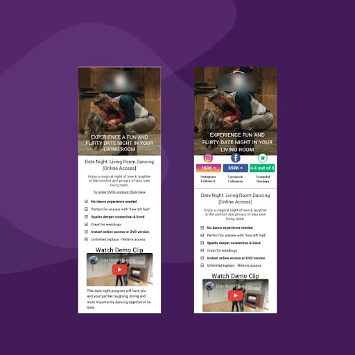
Landing Page – Adding Social Proof
The site sells dancing lessons videos.
When we talked to their customers, some of them mentioned that they didn’t see
the reviews but had seen some mentions on Facebook.
Well, the customers we spoke to still bought the product, but what about the
hundreds that didn’t because they didn’t see enough social proof?
And that’s why we decided to add social proof to the date night landing page.
Product/Cart Page – Cart Trust Comparison Layout Improvement
On this website, which sells reading glasses online, the cart abandonment rate was high, where 42.31% of all visitors abandoned carts, while 37.62% of all visitors abandoned the checkout.
Visitors landed on the cart page immediately after adding an item to the cart. We thought that a pop-up on product pages would allow customers to continue shopping without going to the cart page each time.

Sitewide – Search Bar Improvement
This client is a brand that sells women’s clothing. Reviewing analytics data, we noticed that people who used the search bar were more likely to convert.
But the number of visitors that went through the search was very low because the search icon was not very visible.
We changed the search bar to a horizontal sitewide search bar and placed it under the top navigation.
Before:

After:

Takeaways
In this blog, you have learned about the importance of A/B testing e-commerce websites.
You have also learned some tips and tricks to use while A/B testing, along with what to avoid when testing e-commerce sites.
Most importantly, you now have some A/B ideas that can work for specific pages on any online store. But remember, you have to A/B test them first!