

You’ve spent countless hours perfecting your product pages, optimizing your SEO, using email marketing, and crafting clever social media campaigns to drive traffic to your online business. But did you know that all your efforts could be for naught if you make common mistakes on your checkout page?
Picture this: you’ve got a potential customer all the way to your checkout page, only for them to abandon their cart because of hidden shipping costs or unclear refund policies.
But fear not. Once you realize where you’re going wrong, you can easily avoid these Shopify checkout pitfalls and turn those potential customers into loyal ones.
Let’s dive deep into the world of Shopify checkout pages and learn about the common Shopify store mistakes to avoid.
1. Too many unnecessary steps
One major Shopify store mistake is asking the target audience to complete too many steps, from adding a product to checking out.
For example, if you require customers to fill out their address and billing information before adding a product to their cart, many will abandon their carts before checking out.
You need to allow customers to add items directly into their carts and then go back later and fill out billing information after deciding what they want to buy.
Even statistics suggest that 26% of shoppers abandon their carts because the checkout is too long.
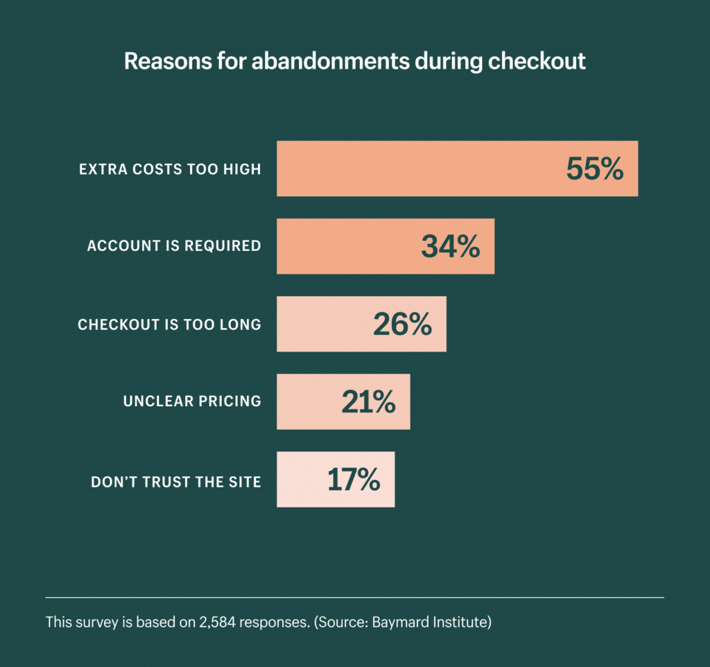
(Source)
You want customers to feel confident and secure when making a purchase, not overwhelmed by unnecessary steps.
Limiting each checkout page to two or three steps is a good rule of thumb. If you need more than that, consider breaking up the process into multiple pages with links back and forth between them.
For example, Allbirds, a Shopify store, offers an optimized checkout form with an express checkout option through Shop Pay. With this option, customers can complete their purchase with just a few clicks without having to provide any additional details.
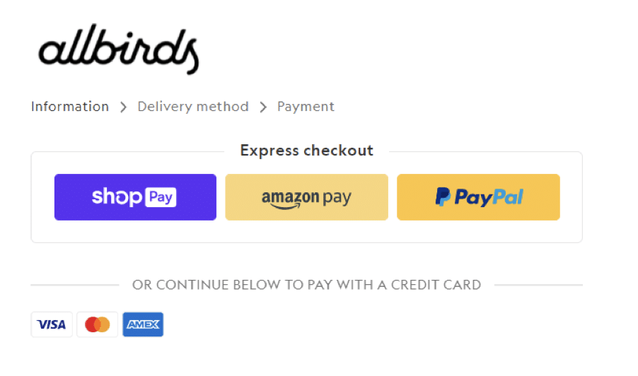
(Source)
Additionally, Allbirds implements a multistep checkout form, which divides the process into smaller, more manageable steps rather than overwhelming customers with too many questions at once.
2. Asking for too many details and adding unnecessary form fields
It’s tempting to want to jam as many fields as possible onto your order form. You want to maximize the amount of information you can ask to get more data to help you understand your customers and improve the experience.
But this is a mistake.
According to a survey, asking for too much information ranked as the number 1 reason that made shoppers distrust a brand. It scored 34.64%, an increase from 31.81% in Q3 2020.
It’s not just about reducing friction on the front end; it’s also about reducing friction on the back end (by simplifying your data collection). If you have too many unnecessary steps in your checkout process, you’ll end up with a lot of customer data – but much of it will be lost or messy because there were too many steps involved in getting that data.
You’re better off with fewer fields and simpler forms. This doesn’t mean you should shy away from asking for information – just make sure the questions are relevant and useful, and avoid asking questions that don’t add value to either side.
Even if you’re selling digital goods like ebooks or software licenses, keep your forms short by asking only for things like payment method (credit card or PayPal), name, and email address.
Here’s a quick rundown on key points to help you optimize your Shopify checkout page and form:
- Keep the form simple and ask only for the necessary information
- Display an order summary with prices, fees, and taxes
- Request the customer’s name, email address, phone number, and shipping address
- Provide an option for the customer to save their details for future purchases
- Request payment information using a secure payment gateway
- Provide an option for the customer to leave a note with special instructions
- Display a confirmation page with order details and number after checkout
3. Slow-loading page
Nearly 70% of shoppers say that page speed impacts whether or not to purchase from an online retailer.
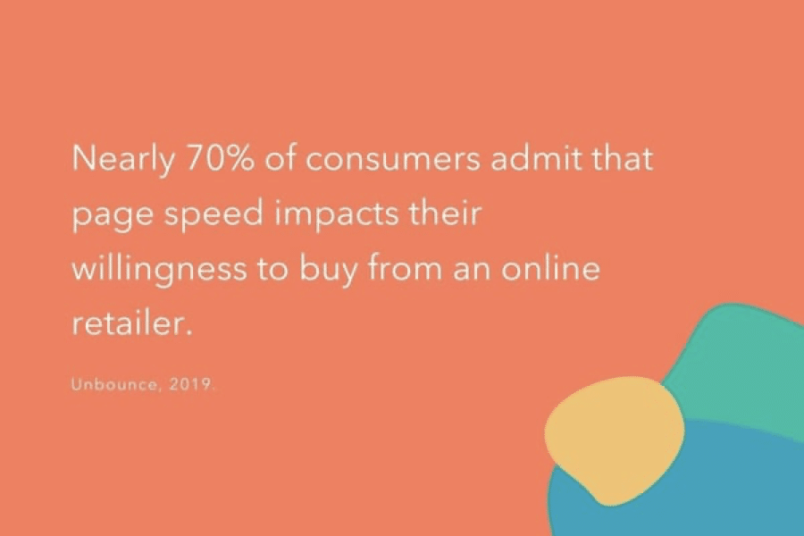
(Source)
According to another report by Unbounce, 45.4% of respondents said they are less likely to purchase if an e-commerce site loads slower than expected. This means that a slow checkout page can lead to lost sales and decreased revenue for your online store.
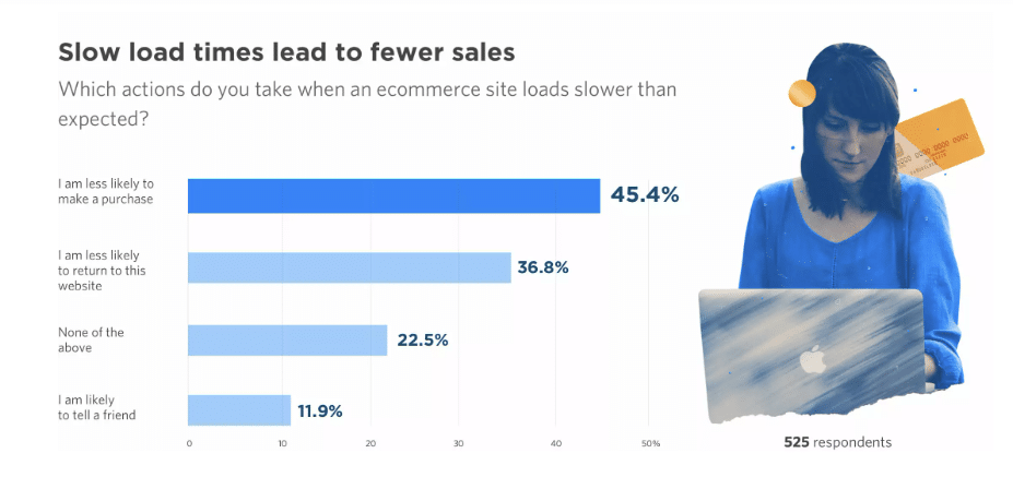
(Source)
Clearly, slow-loading pages checkout pages can be disastrous for you.
Let’s look at a case study of AutoAnything.com, an e-commerce auto parts store, to illustrate the impact of fast-loading checkout pages further.
By cutting their page load time in half, they managed to increase sales by 12%-13%. This highlights the importance of optimizing your Shopify checkout page speed, as even small improvements can significantly impact your bottom line.
The problem of a slow-loading page can occur due to multiple reasons, including:
- Too many external links and images on the page
- Poorly coded code
- Incorrectly configured cache settings
It’s also important to ensure you are using the right Shopify theme for your store. If you use too many different plugins and apps, it can also make for a slow-loading page.
Here are some tips to help you optimize your Shopify checkout page for speed:
- Optimize your checkout pages and overall online store for mobile devices.
- Optimize your images for desktop and mobile users and use compressed file formats to reduce size without compromising quality.
- Minimize using scripts and third-party apps that can slow down your page loading times.
- Use a content delivery network (CDN) to speed up the delivery of your page assets and reduce the server response time.
- Use lazy loading techniques to delay the loading of non-critical elements until the customer scrolls down to view them.
- Test your checkout page speed regularly using tools like Google PageSpeed Insights, GTmetrix, or Pingdom to identify potential issues and optimize your page accordingly.
4. Broken links
Broken links are another common mistake to avoid in Shopify stores. They can affect your customer experience, SEO, and sales.
Broken links are hyperlinks that lead to pages or resources that no longer exist or cannot be accessed. For example:
- The customer entered an incorrect URL.
- You changed the page URL or resource but forgot to create the redirect.
- The website, page, or resource is unreachable due to technical issues or restrictions.
- The page or resource was deleted or moved.
If customers get stuck in the checkout process because they clicked an incorrect link or button, they will likely leave your site and never return. You’ll lose their business forever, and you’ll never know why.
How will you sidestep this issue? Here are some things to consider:
- Conduct regular audits of your checkout pages to identify any broken links and fix them promptly.
- Use tools like Google Search Console or Broken Link Checker to monitor your website for broken links.
- Ensure that all links on your checkout pages are up-to-date and lead to the correct pages.
- Avoid using temporary or shortened URLs that can expire or redirect to broken pages.
- If you must delete a page, ensure that all internal links leading to that page are updated or redirected to a relevant page.
If you want to improve your Shopify checkout page and avoid common mistakes like broken links, consider using FigPii. FigPii is a conversion optimization tool that can help you monitor, test, analyze, and optimize your checkout funnel.
FigPii’s suite of tools like heatmaps, A/B tests, and session recording can help you:
- Monitor your checkout funnel and identify where customers drop off or encounter errors.
- Run A/B tests and experiments to find the best checkout design and layout.
- Analyze customer behavior and feedback using heatmaps, polls, surveys, and recordings.
- Implement best practices and recommendations based on data and insights.
5. Lack of trust badges like security badges or SSL certificates
Did you know that having security measures like SSL certificates and trust badges can significantly impact your conversion rates on Shopify? According to a study, adding trust badges can boost conversion rates by up to 40%. Similarly, ecommerce sites with SSL certificates see an 18-87% increase in conversions.
Ecommerce sites without these trust badges are like going to a sketchy store where you don’t feel safe leaving your wallet out in the open.
The more trust you can build with your customers, the more likely they will buy from you.
Here’s why:
If a customer sees a security badge or an SSL certificate on your site, it means that a trusted third party has verified and encrypted the site. This reassures customers that their information is safe and secure. If they don’t see these things, they are more hesitant about entering their credit card information on your site – because they don’t know if it’s safe.
Check out this example of a checkout page with a trust badge prominently displayed at the top. Doesn’t that look reassuring to you as a customer?
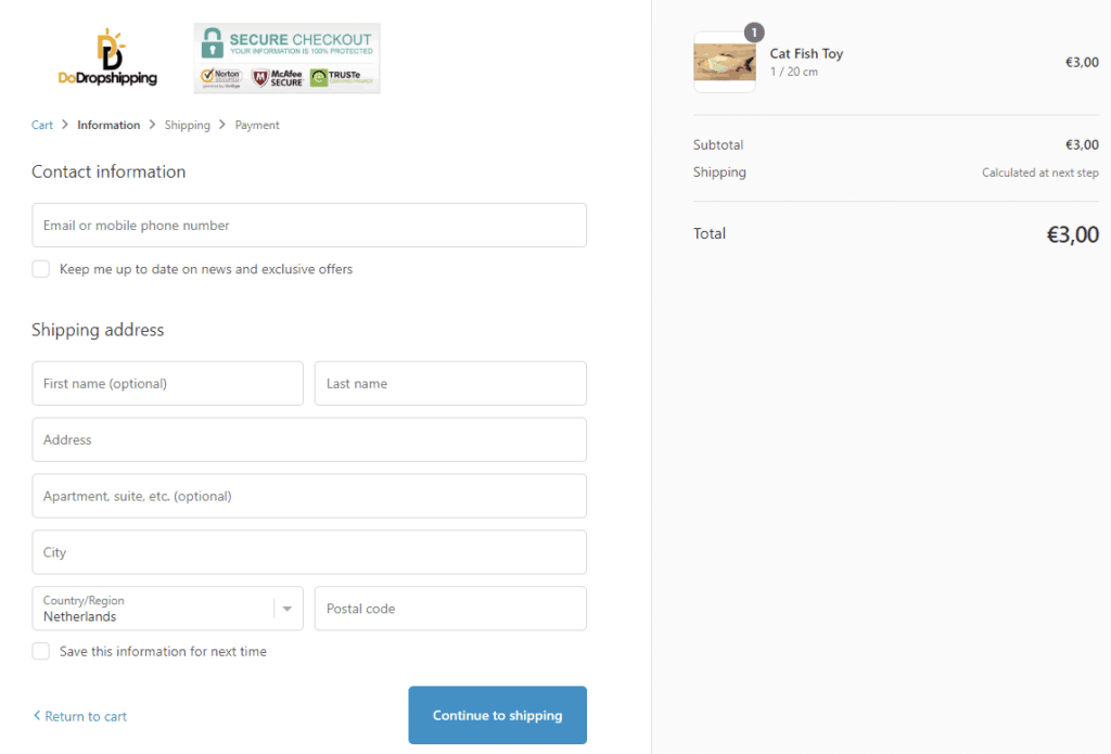
(Source)
You can also take a look at this example from ASOS, a popular ecommerce brand that prominently displays its SSL certificate on the checkout page to attract customers. By doing this, they’re making their customers feel safe and secure while shopping on their platform.
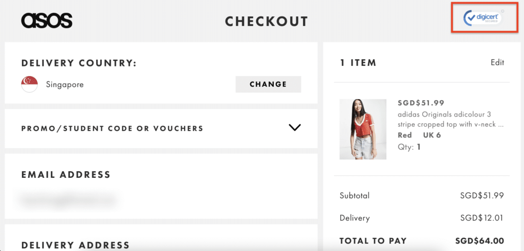
(Source)
Another type of trust badge that can help increase conversion rate is a money-back guarantee badge. It lets customers shop confidently, knowing they can always get their money back if the product doesn’t turn out to be satisfying.
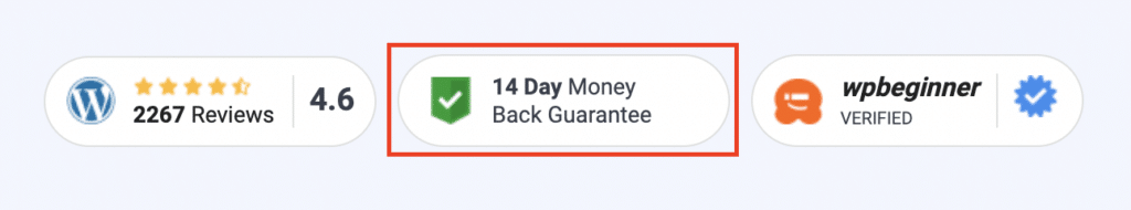
(Source)
Here are some tips for Shopify store owners for using security badges and SSL certificates on your Shopify store:
- Enable secure connections to your Shopify store by using an SSL (Secure Sockets Layer) certificate.
- Add security badges to your theme by using HTML code snippets. You can choose from different badges like Shopify Secure, Norton Secured, and PayPal Verified.
- Test your checkout page speed and security using tools like Google PageSpeed Insights, GTmetrix, or SSL Server Test. These tools can help you identify and fix any issues affecting your checkout performance or security.
6. Unclear refund and return policies
When it comes to your Shopify checkout page, you want it to be clear and easy to use.
One of the most common mistakes businesses make is having unclear refund and return policies on their checkout page.
Unclear refund and return policies are a big turnoff for customers who are already hesitant about making a purchase.
If you fail to explain a policy, customers will have so many questions that they might just give up before they even start the purchase.
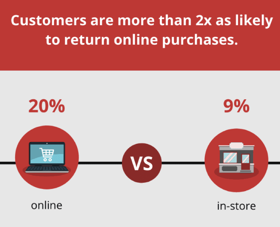
In fact, a study shows that more than 60% of shoppers review a retailer’s return policy before making a purchase. That’s a significant percentage of potential customers considering your policies before adding items to their cart.
It’s also worth noting that shoppers are more than twice as likely to return products they purchase from online stores. This makes it even more important for ecommerce stores to have a clear and easy-to-understand refund and return policy in place.
(Source)
One study published in the Journal of Retailing even found that a generous monetary return policy can boost online sales too. This is because customers feel more confident in their purchase when they know they can return it if they’re unsatisfied. On the other hand, if a return policy is unclear or restrictive, customers may be hesitant to make a purchase in the first place.
To make your policies clear and concise:
- Use simple language that is easy for customers to understand.
- Provide clear instructions on initiating a return, the timeline for returns, and any restrictions or exceptions that may apply.
- Prominently display your policies on your website – ideally on your homepage and checkout pages.
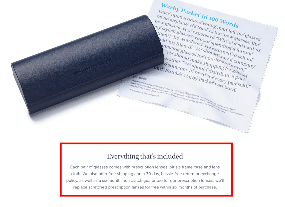
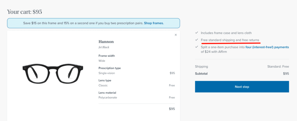
For example, Warby Parker – an eyewear brand – does a great job with its refund and return policy.
They explicitly mention offering “free returns” while checking out and on their product pages.
(Source)
By providing this level of clarity in product descriptions, Warby Parker is building trust with their loyal customers, making it more likely that they’ll return for future purchases.
7. Hidden shipping costs and taxes
A 2022 Baymard study found that 48% of shoppers abandon their carts due to extra costs, including taxes. That’s why it’s essential to be upfront about any additional charges that customers may incur.
The first step to avoiding this mistake is setting up your store’s loading time properly.
First, you’ll want to ensure you have a shipping cost and tax rate for every country you ship to. Otherwise, the customer won’t be able to see their total price when they check out.
Next, your customers should know of any additional fees your carrier or courier company may charge. This includes a fuel surcharge or something similar if they are shipping internationally or domestically. When processing payments, you can also add any extra fees charged by third-party companies, such as PayPal or Stripe.
Speaking of good checkout design, an ecommerce store reduced cart abandonment by 6% just by displaying order costs and shipping fees upfront.
(Source)
Customers can make informed decisions about their purchase by displaying the total cost of an order, including any additional charges. This can also help avoid unpleasant surprises at checkout and ultimately lead to more completed orders.
Common Mistakes To Avoid on A Shopify Checkout Page FAQs
-
How do I Make A Good Checkout Page?
Creating a good checkout page involves several key considerations.
- First and foremost, simplicity and clarity are paramount. Keep the layout clean and straightforward, ensuring that customers can easily understand each step.
- Minimize distractions, such as excessive navigation options or promotional banners, to keep the focus on completing the purchase.
- Implement a progress indicator to show customers where they are in the checkout process, reducing anxiety about the time it will take.
- Offer multiple payment options to accommodate diverse customer preferences.
- Finally, prioritize mobile responsiveness, as many shoppers use smartphones for online purchases.
- Regularly test and optimize your checkout page based on user feedback and data analysis to continually improve its performance.
-
How Can I Improve the Checkout Flow?
Improving checkout flow requires a careful examination of the entire process.
- Begin by reducing the number of steps involved in completing a purchase.
- Minimize the amount of information customers need to enter, and use autofill options whenever possible to save time.
- Implement a clear call-to-action (CTA) at each step, seamlessly guiding users through the process.
- Provide an option for users to review their order before finalizing the purchase, reducing the likelihood of errors.
- Address any unexpected errors or issues promptly with clear error messages and solutions.
-
How can a poorly designed checkout page affect my e-commerce store’s conversion rates?
A poorly designed checkout page can have a detrimental impact on your e-commerce store’s conversion rates. It can lead to higher cart abandonment rates as customers become frustrated with a confusing or lengthy process.
Additionally, it can erode trust in your brand, as customers may question the security and legitimacy of your site.
Poorly designed checkout pages often result in lost revenue opportunities, as potential customers abandon their carts before completing the purchase.
-
What’s the significance of implementing a guest checkout option, and how can it reduce friction in the buying process?
Implementing a guest checkout option is significant because it reduces friction in the buying process. Many customers prefer a streamlined and hassle-free experience when making online purchases.
Offering a guest checkout option allows customers to complete their purchases without creating an account or providing extensive personal information. This reduces the time and effort required, making the process more efficient.
Guest checkout options are particularly important for first-time customers who may not be ready to commit to creating an account.
-
How can I balance collecting essential customer information and ensuring a quick, hassle-free checkout process?
- Striking the right balance between collecting essential customer information and ensuring a quick, hassle-free checkout process requires a customer-centric approach.
- First, identify the information that is truly essential for completing the transaction, such as shipping and payment details.
- Ask for this information in a concise and straightforward manner, using clear labels and minimal form fields. Additionally, implement autofill options to simplify data entry.
- Consider offering optional fields for additional information, such as marketing preferences or account creation, after the purchase is complete.
Checkout pitfalls: Avoid these blunders and secure those sales!
As a Shopify store owner or an ecommerce business, the Shopify checkout page is the final hurdle in your ecommerce sales. From hidden shipping costs and taxes to unclear refund and return policies and low-quality or poor product descriptions and images – these pitfalls can lead to cart abandonment and lost sales.
Many businesses fail when they neglect these seemingly small issues. However, with the right strategies, you can build customer trust, increase conversion rates, and boost your bottom line.
By incorporating security badges and SSL certificates, providing clear refund and return policies, and displaying order costs and shipping fees upfront, you can create a seamless checkout experience that will leave your customers feeling confident and satisfied with their purchase.
So, take these lessons to heart and optimize your Shopify store’s design for success.