

Today I want to talk about heatmaps and their role in helping small to medium businesses grow by uncovering crucial data about their customers.
This will help online business owners understand the needs of those customers as well as identify opportunities that could turn into new sales or improved customer satisfaction.
First, I’ll need to explain how a heatmap works and what information it provides.
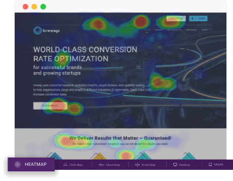
A heatmap is a visualization of where people click on your site (an image of actual mouse clicks).
Analyzing the map will tell you if visitors are drawn to certain areas on your home page or throughout other pages on your website that you may not have realized had such great potential for enticing users.
The information you gather from the heatmap will show you what users are doing on your site, where they’re clicking, and how much time they spend (or don’t spend) on each page.
You’ll be able to see if people tend to focus on specific areas or ignore certain areas that may offer important content or call-to-action buttons.
When looking at the data, it’s best to use a contrasting color for visitors who click (the darker reds indicate higher activity) versus those who don’t click anything (lighter colors being less activity).
As I mentioned, heatmaps have three main potential benefits: identifying opportunities, understanding customer needs, and increasing conversions.
I’ll talk to you about all three benefits and then show you how to use a heatmap actually to create one.
Identifying Opportunities:
Let’s say, for example, that your ecommerce site has sales pages on which you offer free shipping if the order exceeds $50.
Using a heatmap will help you determine if visitors click that call-to-action button or ignore it altogether.
You can see where they click instead of offering free shipping, which may indicate what they’re looking for when buying online (such as discounts).
If people aren’t clicking this area of your home page, there could be some important information that they are looking for but are not finding.
This insight will help you create content or design your pages in a way that drives more clicks to the area.
For example, you may have wanted them to click on the call-to-action button, but if they’re ignoring it completely, it could be because there is too much information on the page and/or it’s difficult to find.
You’ll also want to pay attention to where people do click so that you know what areas of your site they like and which ones might need some tweaking.
You can use this as a guide when creating new sales pages as well as identifying opportunities for an improved customer (such as updating how certain information is displayed).
Understanding Customer Needs:
Once you determine what pages or areas of your site are successful, the next step is to figure out why.
This will help you uncover what people are looking for, which will, in turn, give you ideas for future products (or opportunities to improve existing ones), as well as help identify ways that you can create content that fulfills these needs.
For example, if there’s a particularly high activity area on one of your sales pages, it could be because people are trying to find information about shipping costs and/or discounts.
It may also mean that they’re simply scrolling through the page but not finding what they’re looking for, so they’re moving on.
Either way, it’s important to understand why users are interacting with certain parts of your page more than others.
You don’t want to simply change the area they’re interested in but figure out why that section catches their eye.
This will help you create better content, design pages to make it easier for people to find what they’re looking for, and ultimately increase conversions.
Increasing Conversions:
The third potential benefit of using heatmaps is increased conversions (the actual act of purchasing something). If you can pinpoint where people are clicking on your site or which areas draw them in, you’ll be able to enhance these sections so that they convert visitors into customers more often.
For example, let’s say that you have a sales page with several different call-to-action buttons.
Some people may be clicking on one button more than others, but it could be because there isn’t enough contrast between the background and text colors.
By making this area stand out more, you’ll increase conversions.
As I mentioned earlier, using a heatmap is not an exact science, so don’t expect immediate results immediately.
Heatmaps can take some time to show trends and patterns, so you may need to review them before pinpointing areas where you want to make changes (such as changing colors or updating content).
That said, once you start seeing patterns emerge (and you understand why) it will be easier to pinpoint areas that either require changes or which you want to enhance with additional content, colors, etc.
Now, let’s say you have a blog and want to find out what posts your readers are most interested in.
You would probably check the number of views each post received on your analytics page, but I bet it wouldn’t tell you which articles made them stay.
If they left right after getting what they needed (after all, blogs should help users accomplish goals), you’d never know why.
With a click map tool like FigPii, you can see how long people stick around for as well as where they look first when they do stick around:
As you can see from this example, having such information is invaluable to understanding customer behavior and discovering areas that could be improved upon. I hope this post has given insight into heatmaps and shown their potential.