

If you’re running an online business, your website will likely be the first point of contact between your brand and your audience.
Naturally, how they perceive your web design will make all the difference between mere visitors and engaged, converted users.
But what do users look for when browsing a website? How can you make them stay and take the desired action on your website?
In this article, we’ll explore some of the best web design practices to help you optimize your website design and bolster conversion rates.
1. Hick’s Law: Reducing decision-making time by simplifying choices
Hick’s Law states that people will find it easier to make decisions if fewer choices are available to them at any given time.
For example, if you’re trying to decide on which restaurant to eat at tonight, you’ll find it much easier than if you had hundreds of options available at your fingertips.
The same logic applies to your website – too many options on one page can confuse customers and cause them to make no decision at all.
For example, if you’re running an ecommerce site with hundreds of products displayed on each page, chances are your customers will just leave without making any purchases.
The streaming giant Netflix also uses Hick’s Law to suggest content to its users.
Rather than simply bombarding their users with an overwhelming library of all available shows and movies, they use algorithms to curate a personalized selection. This simplifies the choices users face when deciding what to watch.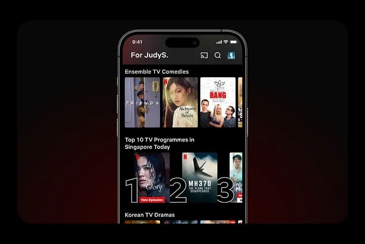
The more users interact with Netflix, the better it becomes at offering tailored recommendations, further reducing decision-making time.
Here are some website elements where you can apply Hick’s Law to optimize your audience’s browsing experience:
- Navigation Menus: Too many options in navigation menus can confuse visitors and deter them from picking even one. So, use only the most relevant menu options to help them make quick decisions.
- Forms: Simplifying the number of fields in a form can help users complete it more quickly.
- Product Pages: By limiting the number of products displayed on a page, designers can help users make easy decisions.
- Checkout Pages: Reducing the number of steps in your checkout process to encourage users to complete the purchase more quickly.
Remember that Hick’s Law only suggests simplification, not sacrificing essential information or functionality. You just have to strike a balance between offering crucial choices and being overwhelmed with unlimited options.
2. Rule of Thirds: Creating balance and harmony in design
The Rule of Thirds is a fundamental principle in visual design that can help you optimize your web design by making it more aesthetic.
It involves dividing an image or layout into nine equal parts by drawing two equally spaced horizontal lines and two equally spaced vertical lines.
The four points where these lines intersect are called the “power points,” which serve as focal points for key elements in the design. This concept works wonders in web design to create balance, harmony, and visual interest.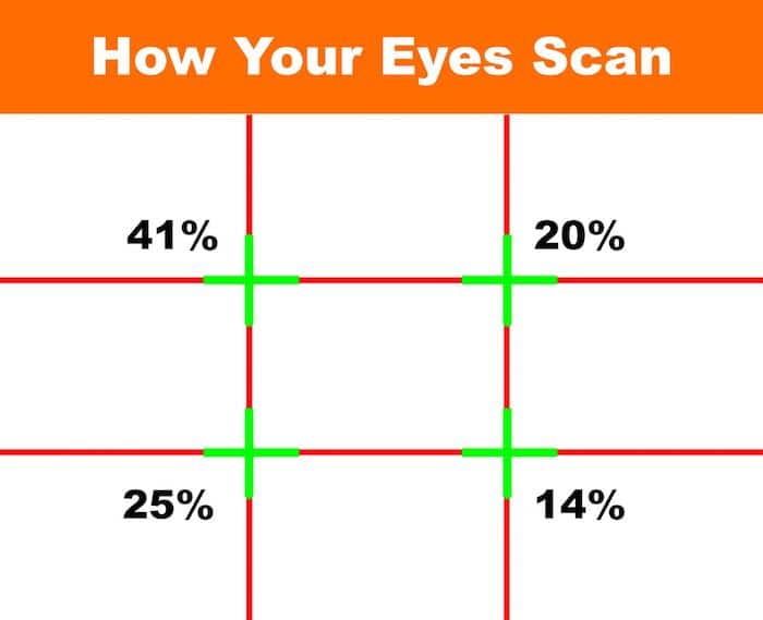
By incorporating the Rule of Thirds in your web design, you can achieve several benefits:
- Visual Appeal: It helps create visually pleasing and balanced layouts to capture your audience’s attention.
- Clarity: By placing important elements at the “power points,” you can draw users’ focus to essential information.
- Harmony: It creates a sense of balance and order, making the design more aesthetically pleasing.
- Engagement: Users are more likely to engage with and remember well-composed and visually appealing content.
Apple, renowned for its minimalist design aesthetic, consistently employs the Rule of Thirds in product photography on its website.
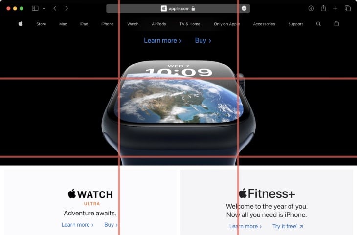
When showcasing a new product, they position it at one of the power points, ensuring that it draws the viewer’s attention while maintaining a sense of balance in the overall composition.
This approach highlights the product and creates an elegant and harmonious visual experience.
3. White Space: Creating a clean and uncluttered design
One of the most important factors in creating an effective website is white space (or negative space).
As the name suggests, white space is a web page area left blank or empty. It creates a contrast between elements on the page, which helps users navigate more effectively.
White space also allows your content to shine and stand out from other elements on the page.
Imagine if every element on your page was crammed together like sardines in a can.
(Source)
It would confuse users and make it difficult to scan the page for what they need.
Studies also show that websites with more white space convert better than those with less white space.
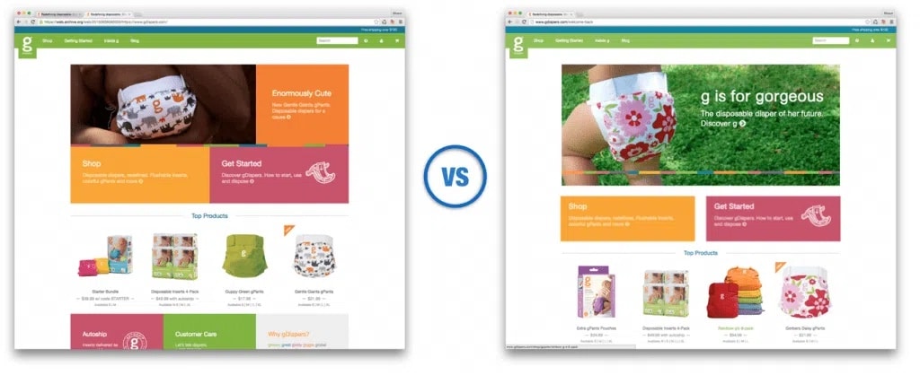
Look at this case study involving gDiapers, for instance.
By introducing white space between the banner image and call-to-action elements, desktop engagement increased by 150%, and the site’s overall conversion rate improved by nearly 20%.
The reason is simple: There’s less visual clutter and distraction, which means visitors can focus more clearly on what matters most — your products or services.
The popular content publishing platform Medium is a perfect example.
Known for its user-friendly interface and readability, the website uses white space to create a clutter-free reading experience.
You’ll notice how they present articles in a narrow central column with generous margins, allowing readers to focus on the text without distractions. The clean design encourages users to engage with the content and can lead to increased time spent on the platform.
And not just desktop sites, white space is especially useful in mobile design, where screen real estate is limited. It ensures that content remains legible and clickable on smaller screens.
4. F-Layout: Guiding users’ attention to important elements
A user’s attention is limited. That’s why directing it to the most important elements on a web page is important.
The F-Layout is a common way to do this.
The F-layout is a widely recognized web design principle that leverages the natural reading and scanning patterns of users, particularly for websites in languages read from left to right, like English.
The F-layout suggests that users focus on the upper-left corner of a webpage, scan horizontally along the top, and then move down the page in a vertical line.
By aligning critical content and important elements along these natural scanning paths, you can guide users’ attention and optimize conversion rates.
Check out this Heat Map that shows the F-Shaped pattern, revealing how people usually read web content: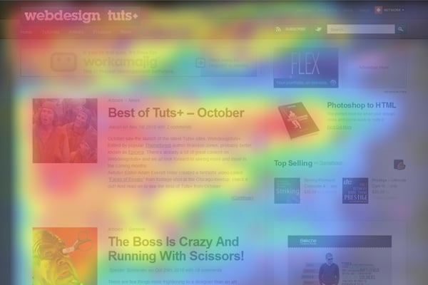
The hot spots, marked in red, orange, and yellow, are where people’s eyes hang out the most.
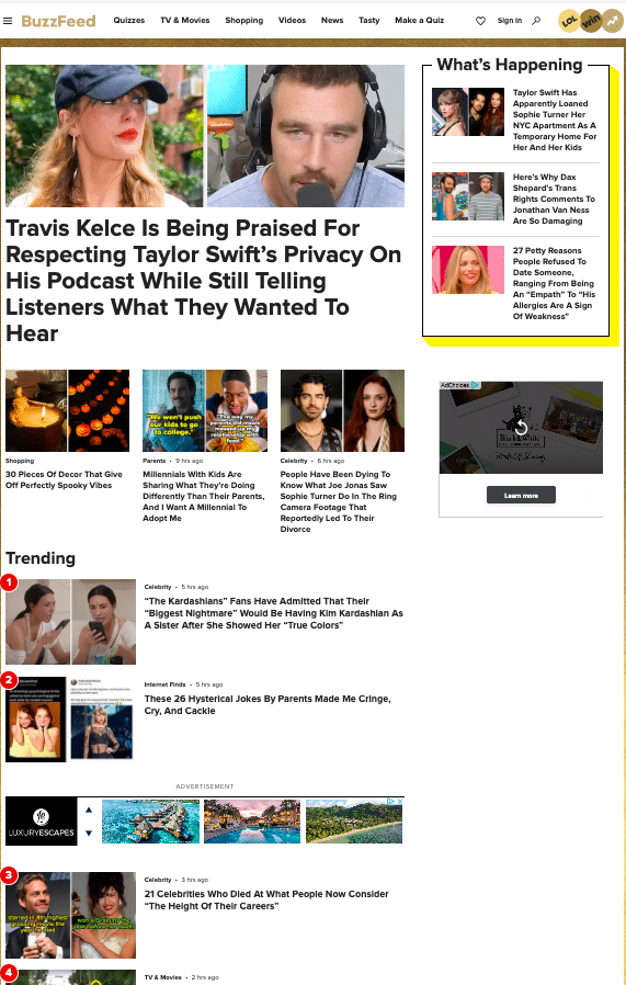
BuzzFeed, a popular digital media company, uses F-layout to increase user engagement.
When you visit their website, you’ll notice that the main headline and initial content are prominently displayed at the top left, with engaging images or multimedia elements to the right.
As users scroll down, the layout continues to guide their attention with strategically placed content blocks and ads.
The advantages of using the F-layout to design your website are apparent.
For one, placing CTAs and links where users are likely to look first can lead to higher click-through rates and improved conversion rates.
When users find the information they’re looking for, they’re less likely to leave the website immediately, reducing bounce rates.
5. Value Proposition: Communicating unique value to users
Web designing is more than just creating a simple, easy-to-navigate, and visually aesthetic website.
Aside from just offering a goood user experience, you also need to find a way to stand out amid the high competition.
One way to do is by creating a value proposition that sets you apart and, at the same time, conveys your principles.
It’s also important to remember that your website is not just a place to sell something. It’s also a place to communicate the unique value of what you do.
When creating a value proposition, ask yourself: why should anyone care about your brand? Why should they choose your product over another? What makes it special?
You need clear answers to these questions before creating a compelling value proposition.
Slack’s got one of the greatest value propositions out there.
Their value proposition directly talk to their audience and also highlights their key benefits by saying “Made for people” and “Connect the right people, find anything you need, and automate the rest.”
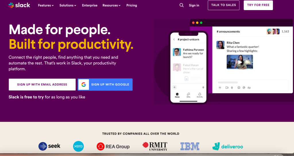
Slack manages to communicate its value proposition to users seeking a more efficient way to communicate and collaborate within teams.
When crafting your value proposition, keep these key elements in mind:
- Clarity: Your value proposition should clearly indicate what sets you apart. Avoid jargon and unnecessary technical language that might end up confusing your audience.
- Relevance: It should address your target audience’s needs and pain points. After all, they don’t care about how great your product is – their main concern is what problems are you solving for them?
- Uniqueness: Your value proposition should highlight what makes you different from competitors.
- Visuals: Accompany your value proposition with supporting images or graphics to make it more engaging.
6. Contact Forms: Designing user-friendly contact forms
Contact forms are an essential element of every website. They allow users to contact you, and you can use them to collect information about your target audience.
It’s a win-win for everyone!
However, while contact forms are useful, they can also frustrate users if they have to deal with too many form fields or are asked to enter unnecessary information.
A good rule of thumb is to keep your contact forms as simple as possible and only ask for necessary information.
Here are some more best practices to design a user-friendly contact form for your website:
- Clarity: Use clear labels and instructions for each field. Visitors should understand what’s expected of them when filling out the form.
- Mobile Optimization: Considering that most users are now using mobile phones to browse the internet, your contact forms should be mobile-responsive and easy to use on mobile devices.
- Privacy and Trust: Explicitly inform users that their information is secure and you won’t misuse it. You can do this by displaying privacy policy links or trust badges (if applicable).
7. Testimonials: Building trust and credibility
While shopping online, you’ve probably noticed that some of the best-designed sites feature testimonials from happy customers.
This is no coincidence – testimonials help build trust and credibility.
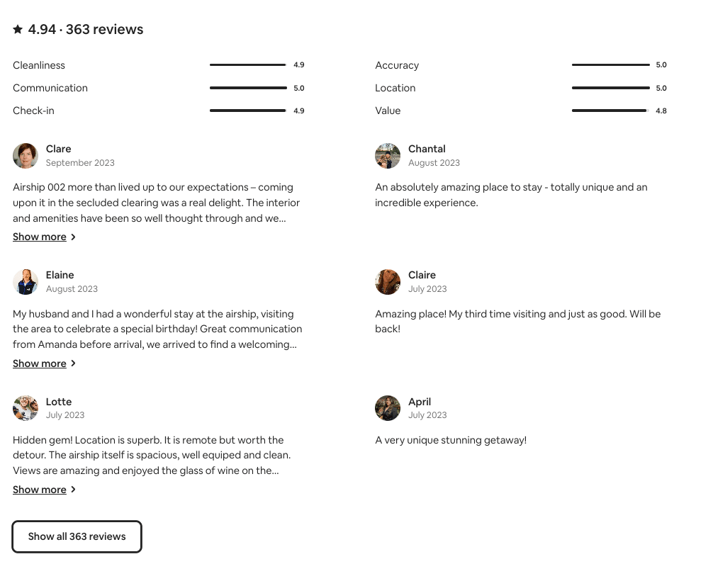
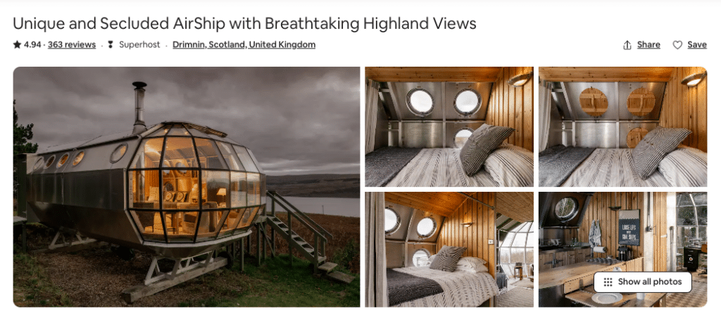
Take Airbnb’s model, for instance.
The holiday home rentals platform is famous for its use of host and guest testimonials. All their listings include guest reviews and ratings, which indicate whether the guest can trust the pictures, quality of the accommodations, and the host’s hospitality.
These testimonials help build trust between hosts and potential guests and play a significant role in booking decisions.
When you see positive reviews for a place, you can rest easy and hit that booking button without worrying.
Here are some best practices for incorporating testimonials in your web design for better conversion rates:
- Authenticity: Naturally, authentic testimonials are more trustworthy and relatable, so keep them genuine and unaltered.
- Relevant Placement: Place testimonials strategically on pages where they are most likely to influence user decisions. For example, on product pages or key conversion points in the user journey.
- Visual Appeal: Visual elements can make testimonials more engaging and believable, so use images or videos alongside testimonials if possible.
- Case Studies: In addition to short quotes, you could use case studies that provide in-depth insights into how your product or service solved specific customer problems.
8. 404 Pages: Designing effective 404 pages
The 404 pages – or error pages, as some people call them, often serve as a last chance to retain and engage visitors after encountering a broken link on your site.
A well-designed 404 page can turn a potentially frustrating experience into a positive one and even lead to improved conversions.
How do you make the most out of 404 pages (aka your last chance to retain your visitor)? Here are some tips:
- Clear Messaging: Avoid confusing your users with technical jargon. Instead, use a concise and friendly message to make them aware they’ve encountered an error.
- Navigation Options: Offer easy ways for users to get back on track. This may include links to the homepage, a site search bar, or links to popular content.
- Engaging Visuals: Incorporate visuals, graphics, or illustrations that align with your brand’s tone and personality.
- Humor (if appropriate): Adding a touch of humor or creativity can make the experience more enjoyable, but it should align with your brand and the overall context.
- Branding: Ensure that your 404 page maintains consistent branding, so users know they’re still on your website.
Email Center UK takes an innovative approach to its 404 error page.
Instead of leaving users frustrated, they turn it into an engaging experience.
Upon landing on their site, visitors can virtually “fire” a member of their development team as part of an ongoing joke.
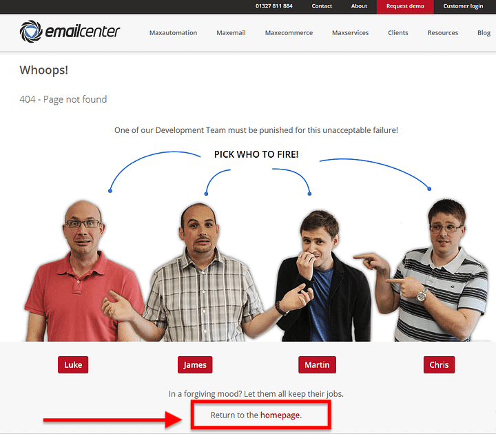
While a message offers a way to return to the homepage, the interactive element adds a touch of humor and encourages user engagement.
This unique approach may focus little on traditional calls to action, but the playful gimmick itself is enough to keep visitors entertained and less bothered by the error.
9. Consistency: Maintaining consistency in design
Consistency is one of the most important factors in web design. It’s the glue that holds your design together and creates an enjoyable browsing experience for visitors.
Consistency in color schemes, fonts, spacing, and layout can greatly affect how visitors perceive your site and what they think about it.
Here are some web design best practices to help you achieve consistent designs:
- Use the same font throughout your website. If you use multiple fonts on your site, use them consistently throughout the site or choose a font family that includes different styles.
- Choose one primary color scheme and stick with it throughout all website elements, including text, links, banners, backgrounds, and borders. If you want to add some variety, try using different shades of the same color instead of changing everything completely.
- Keep font sizes consistent throughout your website – especially heading tags like H1s or H2s. It’s okay if some headings are larger than others, but try to keep them as close as possible so that users don’t have trouble reading them at different sizes.
Mastering Web Design for Conversion Success!
In a competitive market, web design is your secret weapon for capturing and retaining your audience’s attention.
From the first impression to the final click, your website’s design influences the decisions and actions of your visitors.
However, it’s apparent that effective web design isn’t just about aesthetics – it’s also about strategy, psychology, and creating exceptional user experiences.
Here’s a quick summary of the best web design practices we discussed to help you improve conversion rates:
- Design with Purpose: Every element on your website should have a purpose. Whether it’s the placement of a CTA, the use of whitespace, or the artful application of the Rule of Thirds, each decision contributes to a more user-friendly and persuasive design.
- Build Trust and Credibility: Testimonials and a clear value proposition instill trust and credibility, vital factors in decision-making.
- Engagement Beyond Errors: Even a 404 error page can be transformed into an opportunity for engagement and amusement.
With the correct design principles, you can craft web experiences that inspire, captivate, and ultimately drive your desired conversions.