
- Session Recording Examples and Case Studies
- Difficulty Dismissing Pop-up on Desktop (Sitewide)
- What we learned from session recordings:
- Users expect intuitive interactions
- Frustration leads to abandonment:
- Minor design issues can cause significant drop-offs:
- Visitor Couldn't Find a Store Using 'Select Store' Feature (Checkout Page)
- What we learned from session recordings:
- Complex store selection leads to checkout abandonment:
- Unclear UI elements confuse users:
- Checkout processes must be simplified:
- Search Function Issues on Desktop (Search Page)
- What we learned from session recordings:
- Example 4: Hover Zoom Feature Confusing on Desktop (PDP Page)
- What we learned from session recordings:
- Mismatched functionality creates confusion:
- Users need consistency in product interactions:
- Investigate functionality alignment:
- Example 5: Variant Selection Confusion on Desktop (PDP Page)
- The first two reviews set the tone
- Review order affects purchasing decisions.
- Optimizing review sorting can improve conversions.
- Visitor Can't Select Color on Mobile (PDP Page)
- What we learned from session recordings:
- Address Limited Characters on the Checkout
- What we learned from session recordings:
- Visitor Abandoned Checkout Due to Promo Code Issue (Checkout Page)
- What we learned from session recordings:
- Benefits of Using Session Recordings for CRO
- Identify Hidden Usability Issues
- Pinpoint Checkout Friction
- Understand User Behavior Across Devices
- Improve Search and Navigation
- Enhance Product Interaction
- Prioritizing Session Recording Insights for Action
- Fix Right Away
- Investigate Further (IF)
- Research Opportunity (RO)
- Conclusion

Join Our Journey To $100K in Monthly Revenue.
Subscribe to Invesp's blog feed for future articles delivered to your feed reader or receive weekly updates by email.Understanding how visitors interact with your website is a powerful tool for improving user experience and driving conversions.
Many small and large eCommerce businesses face similar challenges when identifying usability issues and uncovering hidden obstacles in their conversion funnels.
However, one of the most effective ways to gain insight into these problems is by using session recordings. Session recordings capture real-time user interactions, showing how visitors navigate a site.
They allow you to see where users encounter difficulties, such as struggling to complete a purchase, missing important information, or abandoning a cart due to unclear checkout processes.
This article explores specific examples and case studies of businesses using session recordings to tackle usability issues. These real-world examples show how session recordings helped identify friction points, bottlenecks, and conversion hurdles.
Session Recording Examples and Case Studies
-
Difficulty Dismissing Pop-up on Desktop (Sitewide)
Session recordings revealed a significant usability issue where visitors struggled to dismiss an “edit product” pop-up across various pages on the website.
The recordings captured multiple failed attempts by users to either close the pop-up or continue interacting with the rest of the page, which led to increased frustration and, ultimately, abandonment.
What we learned from session recordings:
-
Users expect intuitive interactions
Visitors naturally tried to close the pop-up by clicking outside or searching for a visible close button, but when neither action worked, they quickly grew frustrated.
-
Frustration leads to abandonment:
The recordings showed that users attempted to interact with the page, but the persistent pop-up blocked their progress. Many users left the page without completing their intended actions, such as adding items to their cart or moving toward checkout.
-
Minor design issues can cause significant drop-offs:
This issue was categorized as “Fix Right Away” (FRA) due to its immediate impact on conversions. Even a small issue like a pop-up that cannot be dismissed easily can create enough friction to drive users away.
-
Visitor Couldn’t Find a Store Using ‘Select Store’ Feature (Checkout Page)
Session recordings revealed that users struggled to select a store location during checkout. The process appeared unclear, causing hesitation and confusion, eventually leading to cart abandonment. This pattern was consistently observed among users across both desktop and mobile devices.
What we learned from session recordings:
-
Complex store selection leads to checkout abandonment:
Recordings highlighted that users spent too much time determining how to select their preferred store, often clicking back and forth or leaving the page entirely without completing their purchase.
-
Unclear UI elements confuse users:
The session replays showed users hovering over the store selection options without fully understanding how to proceed. This indicates that the interface was not intuitive enough to guide users smoothly through the selection process.
-
Checkout processes must be simplified:
Checkout is a critical stage, and any friction at this point can significantly impact conversions. This issue was labeled a “Research Opportunity” (RO), suggesting further testing to streamline the process and ensure users can complete their purchase without delays or confusion.
-
Search Function Issues on Desktop (Search Page)
Users faced issues with the search function on the desktop when trying to locate products.
The search bar required the product name to be entered exactly, which led to frustration when users made minor spelling errors or entered partial product names.
Without the flexibility to account for these variations, many visitors would not be able to find the products they were looking for.


What we learned from session recordings:
-
Error tolerance in search is critical:
The recordings showed users were frustrated when the search function didn’t account for slight spelling mistakes or incomplete product names. Many visitors typed in partial queries or made minor typos, only to receive zero relevant results.
-
Predictive text can improve search experience:
Users were left guessing the correct product names without predictive text or search suggestions. Visitors frequently tried different variations of product names before eventually abandoning the search altogether.
-
The search must guide users, not confuse them:
Search is one of the primary ways visitors navigate a site, and any friction in this process can lead to immediate drop-offs. This issue was classified as “Fix Right Away” because it was clear that the search function was a significant bottleneck in the user journey.
-
Example 4: Hover Zoom Feature Confusing on Desktop (PDP Page)
Users on the desktop encountered a confusing issue when trying to use the hover-to-zoom feature on product pages.
Instead of zooming in on the image they were hovering over, the zoom function displayed an entirely different image.
This unexpected behavior led to frustration, as users could not properly view the product details they were interested in.


What we learned from session recordings:
-
Mismatched functionality creates confusion:
When users hovered over the product image, expecting to zoom in for more detail, the zoom feature displayed a different image, disrupting the user experience and leaving visitors confused.
-
Users need consistency in product interactions:
The recordings highlighted that users actively tried to zoom in on specific product details. However, the image mismatch prevented them from getting a closer look at the desired part of the product.
-
Investigate functionality alignment:
This issue was marked as “Investigate Further” because the zoom feature’s behavior needed to be corrected to ensure the correct image is zoomed in on when hovered over. Consistency between user actions and expected outcomes is critical for a smooth shopping experience.
-
Example 5: Variant Selection Confusion on Desktop (PDP Page)
On the product display page (PDP), users were consistently shown two negative reviews at the top of the review section, even when many positive reviews were available.
This created a negative perception of the product and caused some users to abandon the purchase.
What we learned from session recordings:
-
The first two reviews set the tone
Seeing two negative reviews right at the top shaped users’ overall opinion of the product before they had the chance to explore more positive feedback. This initial negative sentiment led to hesitation and distrust.
-
Review order affects purchasing decisions.
The recordings showed that after reading these two negative reviews, many users either left the page or became less engaged with the product. Even if the product had mostly positive reviews, the order in which reviews appeared significantly influenced user behavior.
-
Optimizing review sorting can improve conversions.
This issue was categorized as a “Research Opportunity” (RO), suggesting that sorting reviews by “Most Recent” rather than “Most Helpful” might give users a more balanced view of the product.
-
Visitor Can’t Select Color on Mobile (PDP Page)
Visitors on mobile devices struggled with selecting a product color, which prevented them from filtering and moving forward with their purchases.
The recordings showed repeated attempts to select the color filter, which either wasn’t functional or visible to the user.

What we learned from session recordings:
-
Mobile optimization for product selection is necessary
Many users on mobile devices couldn’t find or use the color selection tool, preventing them from narrowing down their product choices and completing their purchases. This led to increased frustration and eventual abandonment.
-
Poor mobile usability creates roadblocks.
Users expect seamless experiences on mobile, especially when selecting product variants. The inability to select a color filter meant they couldn’t find the products they wanted, leading them to leave the site entirely.
-
Quick fixes can make a big impact.
This issue was categorized as “Fix Right Away” (FRA), emphasizing the need to address mobile-specific usability issues that directly affect the shopping experience.
-
Address Limited Characters on the Checkout
Visitors faced issues during checkout due to the character limits on the address input fields.
Many users could not input their full addresses, leading them to abandon their carts at a critical stage of the purchase.
What we learned from session recordings:
-
Checkout fields must be flexible
The recordings highlighted that users were frustrated when they couldn’t enter their full address. Many tried shortening their address, but this led to errors and confusion, which caused them to abandon the checkout process.
-
Unnecessary restrictions harm conversion:
Restrictions on input fields, especially in checkout forms, create friction at a crucial point in the buyer’s journey. Even small limitations, such as character caps, can lead to significant drop-offs.
-
Address field optimization is necessary for smoother checkout:
This issue was labeled “Investigate Further” (IF), indicating the need to explore how these restrictions affect user experience and conversion rates. Businesses can reduce friction and improve checkout completion rates by allowing more flexible inputs.
-
Visitor Abandoned Checkout Due to Promo Code Issue (Checkout Page)
Users frequently abandoned the checkout process when they encountered issues applying promo codes. The session recordings showed visitors inputting a promo code only for it to be rejected, causing frustration and leading them to leave the site without completing their purchase.
What we learned from session recordings:
-
Promo code issues create significant friction:
Users who tried to apply promo codes but saw them fail immediately showed signs of frustration, such as repeatedly trying the same code or searching for alternative codes. This led to a breakdown in the checkout process, causing users to abandon their carts.
-
Clear communication around promo codes is crucial:
The recordings showed that users were not only confused by the promo code rejection but also received unclear or unhelpful error messages. Without proper feedback or alternative offers, users felt stuck and chose to leave the site.
-
Checkout issues need continuous research and testing:
This problem was categorized as a “Research Opportunity” (RO), signaling the need to investigate and test solutions that could streamline the promo code application process, reduce errors, and keep users engaged through the final steps of checkout.
Invesp TV

Bounce Rate in Google Analytics 4

Top Google Optimize Alternatives
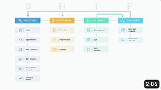
Conversion Rate Optimization Mastery Course: SHIP Process by Invesp
Benefits of Using Session Recordings for CRO
-
Identify Hidden Usability Issues
Session recordings help reveal problems that aren’t immediately obvious, such as users struggling to dismiss a pop-up or select a product variant. Without these insights, issues like the inability to close the “edit product” pop-up could go unnoticed, significantly impacting the user experience and causing drop-offs.
-
Pinpoint Checkout Friction
Checkout is a critical stage, and even small problems can result in cart abandonment. For instance, session recordings highlighted issues with limited address input fields and promo code errors. Businesses can optimize their checkout process and reduce abandonment rates by identifying these pain points.
-
Understand User Behavior Across Devices
Recording sessions on both mobile and desktop allows businesses to spot device-specific issues, such as the mobile difficulty in selecting product colors or navigating the store selection process. This insight ensures that both mobile and desktop experiences are equally optimized, preventing user frustration.
-
Improve Search and Navigation
Users often rely on search bars to quickly find products. Recordings showed us that the search function lacked error tolerance, leading to frustration when users couldn’t find products with minor typos. By observing these behaviors, businesses can make search more intuitive and guide users more effectively.
-
Enhance Product Interaction
Session recordings revealed that subtle design features, like the hover-to-zoom functionality on product pages, can confuse users. Observing this in real-time enables businesses to refine these interactions and ensure that users engage with product visuals smoothly, boosting their confidence in the purchase process.
Prioritizing Session Recording Insights for Action
When analyzing session recordings, it’s important to prioritize the problems uncovered based on their impact and the level of effort required to resolve them.
Problems can typically be categorized into three priority levels: Fix Right Away, Investigate Further, and Research Opportunities.
Here’s a breakdown of each category and examples from the issues we identified:
-
Fix Right Away
This category includes issues immediately impacting users’ ability to interact with the site or complete important tasks. Problems such as pop-ups preventing further navigation or non-functional product selection options need to be addressed quickly to minimize user frustration and prevent lost conversions.
-
Investigate Further (IF)
Problems in this category require deeper analysis to understand their full effect on user behavior. While they may be less urgent, they still need attention.
Investigating further allows for a more thorough understanding, helping to create lasting solutions that address root causes, such as unclear interface elements or subtle design issues.
-
Research Opportunity (RO)
These are areas where user preferences or behaviors are unclear, providing testing and experimentation opportunities.
While these issues may not directly harm conversions, understanding them can offer valuable insights for future optimization efforts, especially in checkout or promo code applications.
Conclusion
Session recordings offer valuable insights into how users interact with a website, revealing hidden issues that can affect user experience and conversions.
When you prioritize problems, whether they need immediate fixes, further investigation, or research opportunities, businesses can take focused action to improve their site.
The case studies show that even small changes can have a big impact, helping businesses streamline the user journey and boost conversions.