

The eCommerce industry is one of the most competitive industries in the world. Unsurprisingly, many companies are reluctant to try new strategies and need a little extra motivation.
This blog post provides 10 successful eCommerce A/B testing examples, which you can use to inspire your next experimentation campaign or storefront update.
A/B testing is a great way to test new ideas and determine what works best for your ECommerce store.
What is Ecommerce A/B Testing?
Ecommerce A/B testing is a method online retailers use to compare two or more versions of a webpage to see which one performs better in conversions, such as sales or user engagement.
By splitting traffic between page variations, businesses can determine which version resonates more with users and leads to higher conversion rates.
The objective of A/B testing is to find out which webpage version gets better conversions. For example, it can involve:
For example, it can involve:
- A/B testing will test two layouts for a single product to see which layout produces more sales.
- Discover how various product taxonomies can encourage your customers to make purchases.
- Changing navigation options to improve user engagement and conversion rates.
The focus of A/B testing should be on discovering which website version improves content engagement, reduces bounce rate, increases conversions, increases sales, and reduces cart abandonment. However, at one time, A/B testing can be done only for one defined goal.
You might have a million ideas that you think will help you improve conversion rates.
However, only testing can prove which ideas are feasible and would give desired results. A/B testing validates whether your ideas will give improved results over your current website or campaign on implementation.
Where to Use A/B Testing on Ecommerce Sites
If you’re running an eCommerce store, not every part of your website needs to be tested. But some areas have a direct impact on whether someone buys or bounces. These are the spots where A/B testing makes the most difference.
- Product Pages
This is where buying decisions happen. You can test different versions of product descriptions, image styles (e.g. lifestyle vs. studio), the placement of trust badges, and even how product specifications are displayed. A small change here can influence how confident someone feels about hitting “Add to Cart.”
- Homepage
The homepage is your store’s first impression. Try testing variations of your hero banner, featured collections, or promotional headlines. It’s also a good place to experiment with the order of content blocks — like whether users respond better to featured products first or seasonal offers.
- Checkout Flow
A clunky checkout is one of the biggest reasons for cart abandonment. A/B testing can help you compare shorter vs. longer checkout forms, guest checkout vs. required sign-in, or different ways to display shipping options. Even minor changes can reduce friction and recover lost sales.
- Navigation and Menus
Confusing navigation loses customers fast. Test different menu layouts, dropdown behavior, category labels, or whether users engage more with a simplified vs. expanded menu. Clean navigation helps shoppers move through your site faster and buy without hesitation.
- Popups and Overlays
Popups can either convert visitors or annoy them into leaving. Test things like exit-intent offers vs. timed popups, discount messaging vs. product discovery, or the use of images inside the popup. You’ll learn what grabs attention without killing the user experience.
- Landing Pages for Ads or Email Campaigns
Dedicated landing pages are perfect for A/B testing. You can test variations in layout, headline copy, button placement, or even what kind of offer gets more clicks (free shipping vs. 10% off, for instance).
- Cart Page
Beyond the checkout, your cart page is worth testing too. You might test whether cross-sell suggestions work better above or below the product list, or if adding delivery time estimates next to each item makes shoppers feel more ready to buy.
Once you get comfortable with the process you can start A/B testing more complex and the main pages on your website. According to Michael Reddy:
“Powerful A/B testing provides more information about your customers than you may realize. It enables your ability to segment your customers on multiple levels in order to gain a deeper understanding of their behaviors.”
Michael Reddy
When To Use A/B Testing for Ecommerce?
A/B testing is a powerful tool, but it’s most effective when applied at the right time.
Knowing when to conduct these tests can help you optimize your ecommerce site for better performance.
Here are some key scenarios where A/B testing can make a significant difference.
-
When You’re Launching a New Product Page
Before rolling out a new product page to all your customers, use A/B testing to compare different page versions. This helps you identify which layout, images, or descriptions resonate best with your audience, ensuring the new page drives maximum conversions from the start.
-
When You Notice High Cart Abandonment Rates
If your analytics reveal a high cart abandonment rate, it’s a good time to use A/B testing. Experiment with different checkout processes, such as simplifying steps or adding trust signals like security badges, to see which changes reduce abandonment and lead to more completed purchases.
-
When Traffic Increases but Conversions Don’t
An increase in traffic without a corresponding rise in conversions indicates potential issues with your site’s user experience. A/B testing can help you identify and resolve these issues by testing different elements on key pages, like headlines, product images, or call-to-action buttons.
-
When Implementing Major Website Changes
Before implementing major changes, such as a site redesign or new navigation structure, use A/B testing to ensure the new design improves user experience and conversion rates. Testing allows you to make informed decisions and avoid potential drops in sales due to unanticipated user reactions.
-
When Seasonal Campaigns Are in Play
During seasonal sales or promotional campaigns, use A/B testing to determine the most effective messaging, banners, or discount offers. Testing in real-time allows you to maximize the impact of these campaigns, ensuring that you capitalize on increased traffic during peak shopping periods.
How to Run A/B Testing for eCommerce
Running A/B tests on an eCommerce site goes beyond switching colors or tweaking button sizes. To get meaningful insights and real improvements, you need a structured approach that’s tailored to how people shop online. Here’s how to do it right.
-
Choose the Right A/B Testing Tool
Start with a tool that fits your workflow and team. If you’re looking for something built for eCommerce, FigPii is a good choice — it lets you set up tests quickly and track everything from clicks to revenue impact. Ensure the tool allows traffic splitting, has solid reporting features, and integrates easily with your platform (like Shopify or Magento).
-
Form a Hypothesis
Every test starts with a clear hypothesis. Don’t test for the sake of testing — identify a specific problem you want to solve.
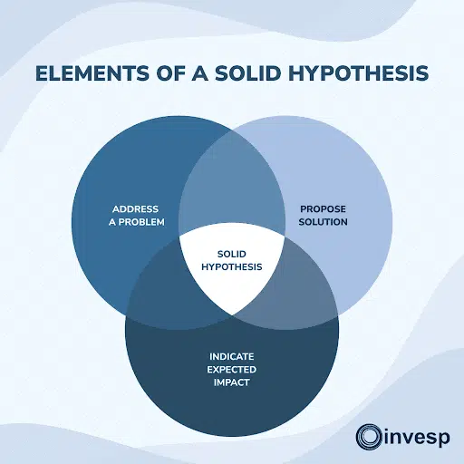
For instance, if many users are dropping off at the product page, you might hypothesize: “Adding trust badges near the Add to Cart button will reduce friction and increase clicks.”
Your hypothesis sets the direction for the test and helps you measure its success.
-
Define Success Metrics
Decide what you’ll measure before you run the test. In eCommerce, the most common metrics are:
- Conversion rate (sales or signups)
- Add-to-cart clicks
- Average order value
- Checkout completion rate
Choose one primary metric. Secondary metrics are helpful, but don’t let them distract you from your main goal.
-
Build and Set Up Variations
Create two (or more) versions of the element you’re testing. The control is your current version; the variation is your proposed change.
If you’re testing a product page layout, for example, your variation might place customer reviews higher up or feature larger product images.
Make sure the difference is noticeable enough to influence behavior. Subtle changes rarely lead to meaningful results.
-
Ensure Proper Traffic Allocation
Split your traffic between the control and variation — a 50/50 split is standard. Most A/B testing tools handle this automatically.
If your store has high traffic, results can come in faster. Lower-traffic sites will need more time to reach reliable conclusions.
-
Calculate Sample Size and Duration
You’ll need enough visitors to detect whether the change is statistically significant. Use a sample size calculator to estimate the required visitors based on your expected uplift.
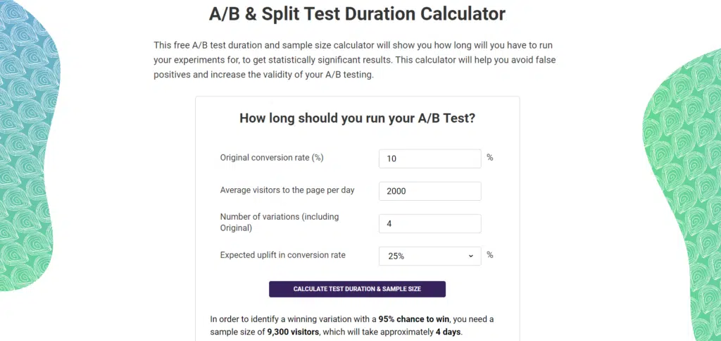
A test that ends too early often gives misleading results, so be patient. Run tests for at least one full business cycle to capture different types of shoppers (weekdays vs. weekends, mobile vs. desktop).
-
Set Up Analytics and Tracking
Make sure your analytics are properly configured. This includes event tracking for conversions, product clicks, and other user actions. Without clean data, your test results won’t be trustworthy. Double-check that both variations are tracking the same metrics consistently.
-
Run QA Before Launching
Do a complete quality check. Ensure the test variation doesn’t break layout on mobile, that the right people are seeing the right version, and that nothing interferes with the checkout process. Poorly implemented tests can hurt revenue or frustrate users.
-
Launch and Let the Test Run
Once your test is live, avoid making changes. Let the data accumulate. Resist the urge to peek and end early, even if you see early winners. Premature conclusions can lead to bad decisions.
-
Analyze the Results
Analyze the data once your sample size is met and your test has run long enough. Look for:
- Statistical significance (typically a confidence level of 95%)
- Uplift in your primary metric
- Any negative impact on secondary metrics
Did the variation perform better? If yes, implement it. If not, dig into why and use the findings to shape your next test.
-
Document and Iterate
Whether your test wins or fails, document what you learned. Over time, these insights help you build better hypotheses and improve your entire testing program. A/B testing isn’t a one-time activity — it’s an ongoing process.
Ecommerce A/B Testing Examples
Here are examples highlighting the types of A/B tests you might want to try on your ecommerce store.
-
Navigation
Here’s a real-life example of a test meant to smooth the navigation across different categories;
By providing a sticky menu showing all the subcategories, we can help visitors find the category they’d like to visit immediately without much scrolling.
By providing visual categories, users can determine which product meets their needs. This is a good example of simplifying the visitor’s journey through your website.
Your visitor is bound to get frustrated looking at your website’s complex navigation menu, which is supposed to show him the way.
Simplify the options, fewer options will reduce confusion and frustration among users.
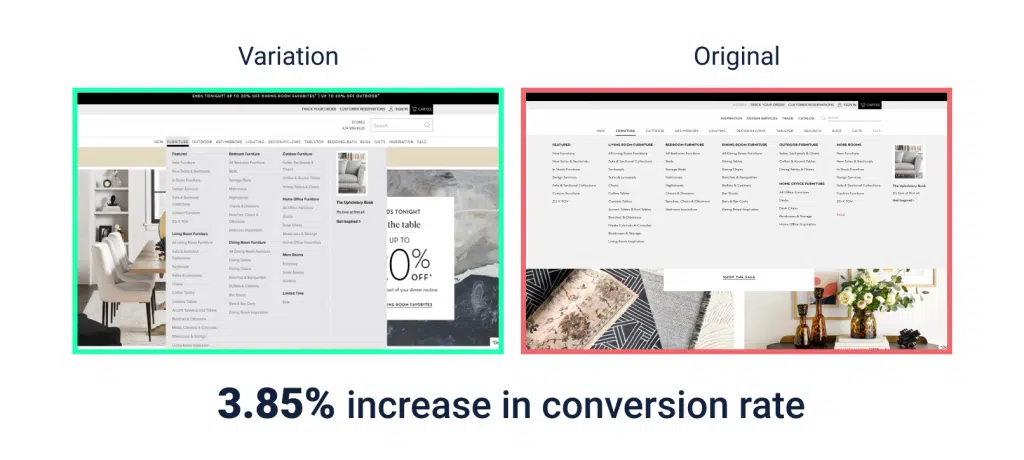
With over 150 subcategories, users are bound to be frustrated and confused on this furniture eCommerce website. By extending the width of the menu, all items are visible at a glance, reducing confusion.
This test resulted in a 3.85% increase in conversion rate, which directly affected revenue.
-
Free Shipping
Do a test to compare conversions by testing your product with free shipping and without it.
You may want to include the shipping price in your product base price for the free shipping variant, whereas keeping the control without free shipping.
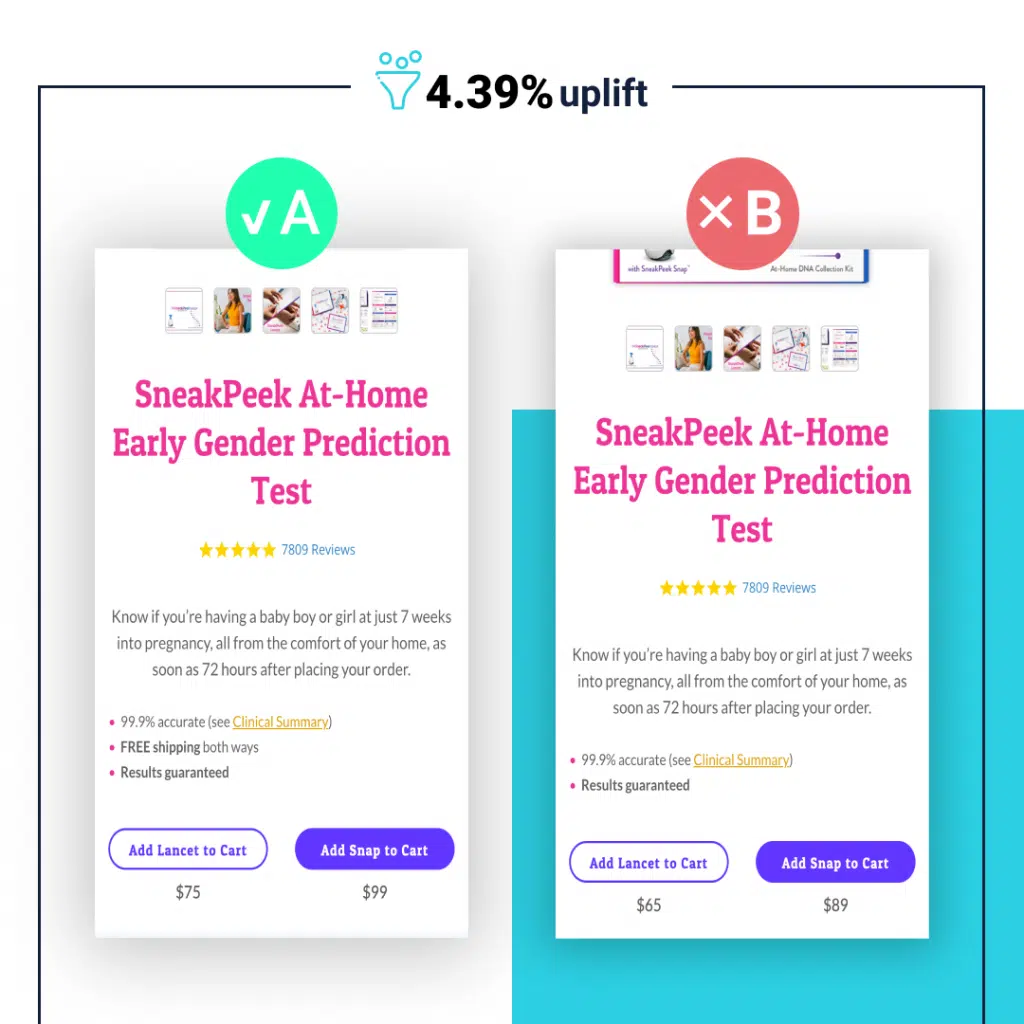
In this test, the price of products was increased by $10, but in return, users were guaranteed free shipping. This test caused a 4.39% uplift in conversions.
You can conduct another test by setting a threshold for free shipping or offering other benefits to gauge what works best for your conversion goals.
Providing a free gift and free shipping for purchases over $200 will help convince your users to purchase more products. Besides the huge increase in conversion rate, an increase of %20 in AOV was achieved.
-
Product Page Call to Action
The CTA button should be prominent, bold, easy to find, and placed in a strategic location on the website.
There are many aspects of design to consider, but many of them can be figured out by experimenting with different sizes.
In other words, there is no universal size that can drive desired conversions reliably.
This test works best on mobile devices.
By placing the Add to Cart button within reach of the user’s thumb, the process of purchasing products is simplified.
-
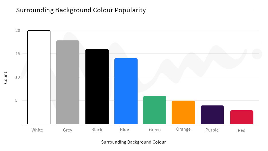
Don’t forget to test the color of your CTA
Your CTA needs to catch the eye. Period.
By running an A/B test, find out which color would work best for your call-to-action button.
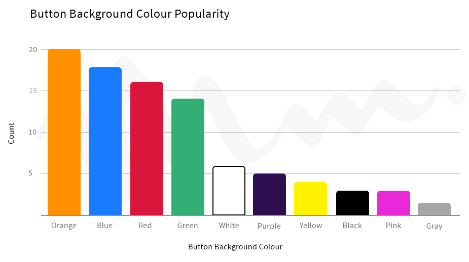
Ensure that the color you pick doesn’t clash with your website’s background.
-
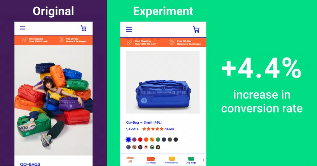
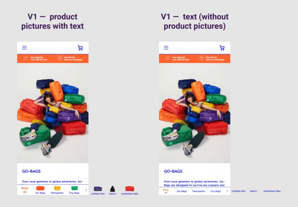
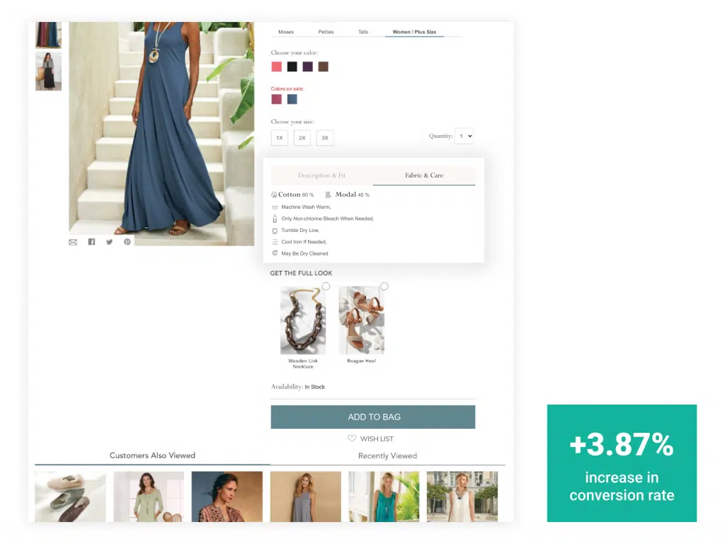
Images on Product Pages
You may want to conduct various tests with different types of pictures, such as lifestyle or detail shots, to see what works best.
Customers can relate better to these visuals that show how they’ll use the item when it arrives at their homes.
You can test out different types of imagery or even post-process your pictures with filters that help them stand out more against other product pages.
-
Product Descriptions
The content you put into the description fields of your products is important for conversion rates.
An A/B test might prove worthwhile if you want to know what description copy should be used to improve conversions.
For example, maybe some people prefer concise descriptions, while others like descriptive text.
Visual elements indicating the texture of your product or how to care for it will increase interactions with its description, which means users will read more of it.
-
Product Reviews
Many e-commerce sites offer product reviews as a feature, but it might be worth conducting an A/B test to see how that works for you.
If your goal is conversion rates, it’s important to have enough reviews and good quality ones.
It might seem counterintuitive but sometimes removing the reviews completely from your website will increase your conversion rate.
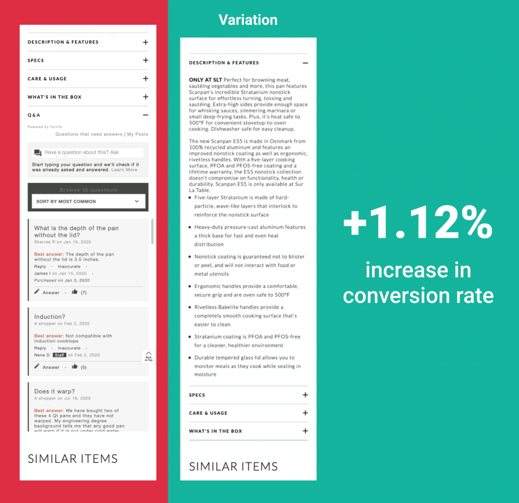
Separate reviews from questions! Questions from users who already purchased the product might confuse your visitors.
Make sure to separate them into two different sections.
-
Tags on Product Images
Emphasize “New” or “Best Seller” for added guidance. Add callouts on items that may be on sale as well, and include the percentage.
Callouts add additional value to your products and increase visitors’ motivation to purchase.
Customers are more likely to buy an item when they see it’s on sale.
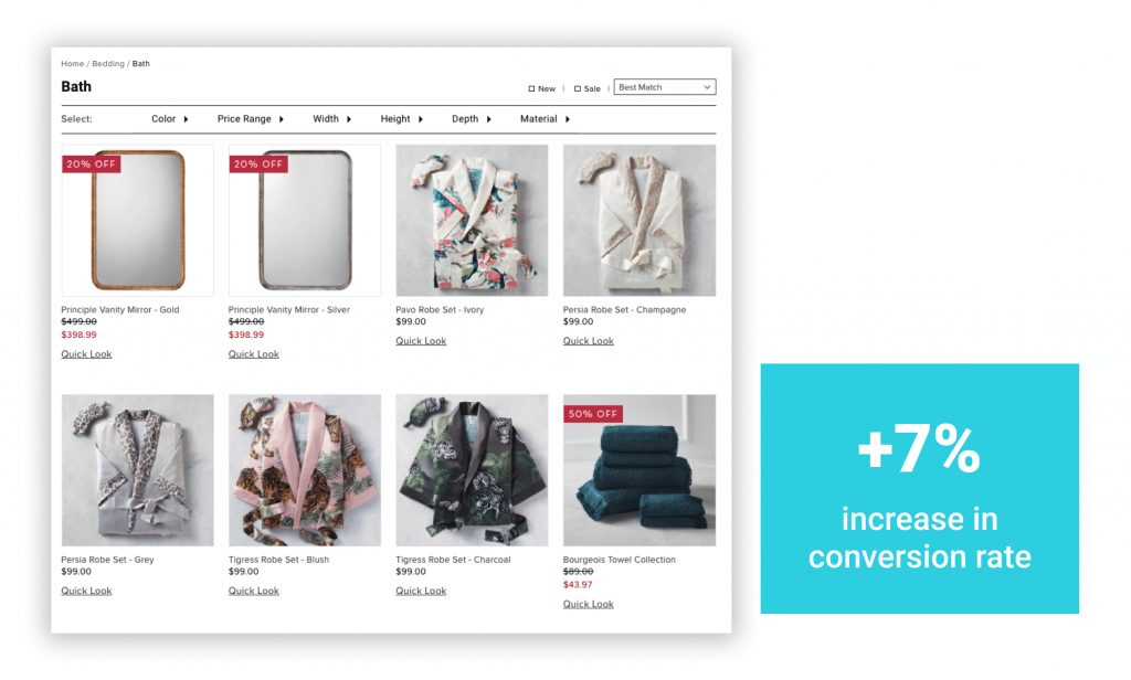
Experiment with using different call-outs, adding “new” or “back in stock” to the text, or changing your font size.
Benefits of Ecommerce A/B Testing
Ecommerce A/B testing offers tangible benefits that directly impact your ecommerce store’s success:
-
Tailored Product Pages: When you test variations of product pages, you can identify the elements that most influence buying decisions.
Whether it’s the placement of the “Add to Cart” button, the size of product images, or the type of product descriptions. This leads to pages that convert visitors into buyers more effectively. -
Optimized Checkout Process: Simplifying and streamlining the checkout process through A/B testing can reduce cart abandonment rates.
For example, testing one-click checkout options against multi-step processes can reveal which method minimizes friction and increases completed purchases. -
Personalized Shopping Experience: A/B testing can help you personalize the shopping experience by identifying what resonates with different customer segments.
For instance, testing targeted offers or personalized product recommendations can lead to higher engagement and repeat purchases. -
Effective Promotion Strategies: Test different promotional strategies, such as discount banners, limited-time offers, or free shipping thresholds.
This can show you which promotions drive the most conversions without eroding profit margins. -
Mobile Optimization: With more shoppers buying via mobile, A/B testing mobile-specific elements, like button sizes, loading speeds, or mobile-friendly navigation, can ensure your site provides a seamless experience across devices, leading to higher mobile conversions.
-
Understanding Customer Behavior: Through A/B testing, you can discover how customer segments interact with your site. For example, testing different landing pages for new versus returning customers can help you tailor the experience to each group’s preferences, leading to more conversions.
FinaL Thoughts
A/B testing is a powerful way to optimize your e-commerce site for higher conversions. You can identify what works best by testing different elements, such as colors, images, and descriptions.
Start your first A/B test with clear objectives. Base your tests on research using tools like heat maps and session recordings.
Monitor user activity and analyze data to understand why customers aren’t converting. Run tests in a controlled environment to avoid interference from other factors.
Set up conversion tracking to measure and analyze the A/B test results accurately. Always create tests with a clear hypothesis and goal.
Ecommerce A/B Testing FAQs
What is A/B testing in e-commerce?
A/B testing in e-commerce involves comparing two versions of a webpage or app to determine which one performs better in terms of conversions. This could include testing different headlines, product images, descriptions, or checkout processes to see what drives more sales or user engagement.
Does Shopify do A/B Testing?
Shopify does not have built-in A/B testing functionality, but you can run A/B tests using third-party apps like FigPii, Optimizely, or VWO. These tools allow merchants to test product pages, pricing strategies, checkout flows, and other elements to enhance their store’s performance.
Does Amazon allow A/B testing?
Yes, Amazon allows A/B testing through its Manage Your Experiments tool for registered brands. This feature enables sellers to test different versions of product images, titles, and descriptions to determine which version drives more engagement and sales.
How do I test an e-commerce website?
- Identify the goal – Define what you want to optimize (e.g., product pages, checkout flow, CTA buttons).
- Choose the right tool – Use A/B testing platforms like FigPii, Optimizely, or VWO.
- Create test variations – Modify specific elements like headlines, images, layouts, or pricing.
- Run the test – Split traffic between the control and variation while ensuring statistical significance.
- Analyze the results – Review key metrics such as conversion rate, cart abandonment rate, and time on site.
- Implement findings – Apply the winning variation to improve site performance.