

Case studies have been an eye-opener for me into the worlds of conversion rate optimization and product marketing.
Although it takes a ton of work, effort, and time to prepare one, I feel satisfied with the progress I have made working on this task.
In case you didn’t know, our case studies are based on successful AB tests launched by Invesp using FigPii.
You can follow all the stories behind these case studies on the FigPii and Invesp LinkedIn accounts.
We use both copy and design to showcase:
- The purpose behind launching the test.
- The problems with the original page (the control).
- The changes that were done on the variations tested.
- The numbers we came up with like CR (Conversion Rate), AOV (Average Order Value), RPV (Revenue Per Visitor).
- The winning variation.
What Are the Takeaways From Case Studies?
Currently, I have 5 lessons that I have learned from working on case studies:
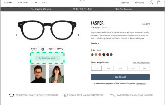
Product Pages Are Meant to Be Informative
You don’t just showcase your products.
I never thought of that before; I thought we just needed to add catchy images and highlight our offers if we have any.
But what I found out is that you have to inform to sell.
When you provide customers with what they need to know, then you’re sold.
Here are a few tips I came up with so far:
- Add a brief and straightforward product description.
- Use direct headlines.
- List out your products’ benefits.
- Use social proof to prove to the user that you’re credible.
Make Your CTAs Stand Out
Your CTAs (Call-To-Action) are what make visitors convert.
That’s why you need to:
- Make the wordings clear. You have to let people know where they are about to go or what action they will take.
- Make them apparent; bigger if you want people to notice them.
- Add them above the fold. You don’t want people to keep scrolling down to buy if they in the first place.
- Use colors to highlight them to stand out.
Avoid Cluttered Pages
One thing Ayat keeps saying is “declutter.”
Cluttered web pages lead to a negative user experience and decrease user engagement.
This means visitors will abandon your website. Which, accordingly, means no buying and no conversions.
Remove anything on your website that does not serve a specific purpose.
That can mean distracting images, way too much content, too many ads, etc.
Here are a few tricks I have learned on decluttering:
1- Clean Up Top Navigation
Don’t overcrowd the navigation bar with tons of pages and elements.
This can overwhelm visitors as they have to go through many clicks to get where they want.
Here is what you can do:
- Try to limit your top navigation to a maximum of 6 – 7 elements.
- Move items with low priority (like social media icons, privacy policy links, etc.) to the site’s footer.
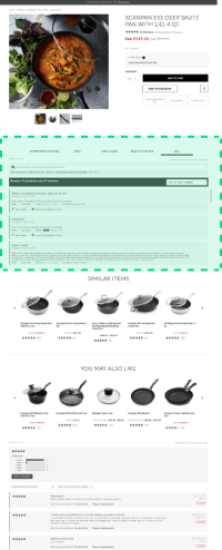
2- Use Tabs to Organize Your Page
Decluttering means organizing, and what is a better way to do so than using tabs.
If you want to have multiple pieces of information and elements on a page that will assist visitors in making a decision, keep those elements accessible in tabs.
This can especially work with Q & A (Questions & Answers) and customer reviews sections.
Check the example below:
3- Use More Negative Space
Have you ever looked at a landing page without a free inch, and you felt irritated?
The whole page space is cramped up.
You barely see the background!
Well, that’s why this tip came in handy.
Use more negative space.
This means going for simplicity when it comes to design, which in return means a better user experience.
Why?
- It helps visitors relax, puts them at ease, and navigate freely.
- It will help them focus easily on the areas you want them to.
- Also, it will help increase the average amount of time they spend on the site.
Wrapping Things Up
This blog is not the end of my lessons learned from case studies.
There will be some more coming up this quarter.
Stay tuned!