

Understanding how your users view, interact and navigate your website is the foundation that you need to build a solid conversion optimization roadmap.
While analytics might give you a hint of what is happening – numbers don’t show you all there is to know about your website visitors.
And so comes the need for visualizing and knowing exactly how users interact with your website.
Enter heatmaps!
You’ve probably seen heat maps being used on weather channels and sports shows. But in this article, we’re going to focus on different types of website heat maps.
We will dive into more details about what website heatmaps are, how to analyze them,
And that’s what we’re about to discover in this blog, and we’ll start with the biggest questions you have now…
- What’s a website heatmap?
- Different types of website heatmaps
- Click maps
- Scroll Maps
- Mouse movement maps
- How to read, understand and analyze a heatmap?
- What are the benefits of using website heatmaps?
- How do I create a website heatmap?
- How do multi-page heat maps work?
- The top heatmap tools: how to choose the best heatmap tool for your site
- Conclusion
- Heatmaps FAQs
What’s a website heatmap?
A website heatmap is a data visualization tool that shows you a map of what users or visitors do on your site.
They aggregate user behavior, providing an at-a-glance understanding of how people interact with a website.
Usually, there are 3 major types of heatmaps that every website heat mapping tool offer, these are:
Scroll Heatmaps
Click Heatmaps
Mouse Movement Heatmaps
And we’ll cover them in detail in an upcoming section but in summary, scroll heatmaps show you how far your users scroll down your page.
Click heatmaps show you where your users click on your page.
And lastly, Mouse movement heat maps (sometimes called eye-tracking heatmaps) show you where your users’ mouse cursor hovered the most.
Website heat maps use a warm-to-cold color scheme to show how visitors interacted with the website.
Warm colors indicate areas where there is high user engagement on your site, whereas cold colors reflect the opposite.
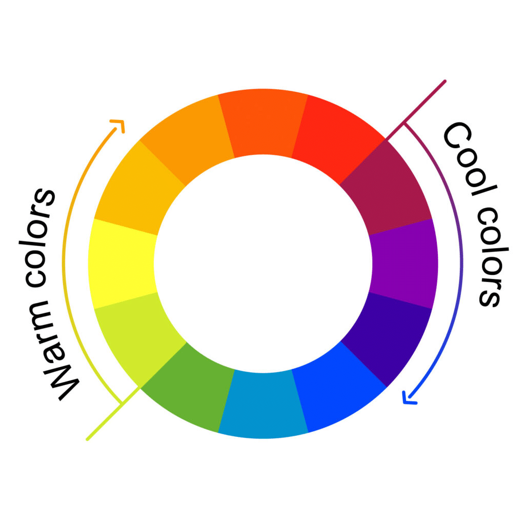
Source: Colors Explained
The changes in colors let you know if that particular area got clicks, movements, scrolls or not.
Red means that this area or element got a lot of interaction (whether it being clicks, scrolls, or hovering with the cursor) that was higher than most of the website.
Yellow means it got lesser interactions, Green means little to no interactions, while blue means no interactions.
And blue means it got little to no interactions at all from your users.
Website heatmap tools capture visitor clicks, mouse movement, and scroll depth for all devices in one report.
Most importantly heatmaps are great for figuring out things like:
- Which section of a page has the highest visitor engagement
- Where visitors are clicking the most
- Whether or not they are clicking an on-page element you want them to click on
- Whether they reach the bottom of the page or not.
- And many other insightful aspects of user behavior.
But how do they work you might ask, let’s dive deeper into how they work.
How do website heatmaps work?
As visitors interact with a page on your site by moving their mouse, clicking on elements, and filling out forms, the website heatmap captures that interaction data and send its to its processing server that collects and analyzes every visitor interaction.
Heatmap platforms typically capture visitor data as follows:
- The heatmap records visitor clicks when they happen, capturing the cursor’s position relative to the clicked element.
- The tool records the visitor cursor position and scroll position at regular short intervals that vary from one heatmap platform to the next. The more frequently these captures happen, the more accurate the heatmap data is.
- Heatmap software sends the data to the heatmap processing server using WebSockets or XHR requests at regular intervals.
The more visitors interact with the page, the more the heatmap stores visitors’ interaction with every element.
By comparing and contrasting the visitors’ interaction with different page elements, the software can now create a visual representation showing different interaction intensities.
Different types of website heatmaps
There are mainly three different types of heatmaps:
- Click Maps
- Scroll Maps
- Mouse Movement Map
Let’s start with the click maps first, since they’re the most popular type of heatmaps.
Click maps
Click maps are the best way to understand how your users interact with your website.
This heatmap provides data visualization of how users click on different elements on your website, even if they’re not clickable elements.
It tells you how many clicks an element on your website got and will color it accordingly.
As we explained at the beginning of the blog, it uses a warm-to-cold color scheme to show how visitors clicked on certain elements on your website.
Warm colors indicate a higher number of clicks, and the colder colors indicate a lower number of clicks.
How useful is a click heatmap?
A click heatmap is useful whenever you’re trying to figure out why certain areas within your website don’t perform well in conversions.
Because you can easily see if CTAs in that particular area are getting enough clicks or not, without using any other kind of analytics tool.
Let’s say you have an area on your website that get below-average clicks on its CTAs compared to other CTAs on your page.
That draws your attention to the area to test different hypotheses about why isn’t it converting as it should.
Maybe it’s the copy, message, or CTA placement.
And so you start testing different approaches based on what you gathered from the heatmap analysis.
The bottom line with click heatmaps: Any element that gets lower than average clicks is an opportunity to improve and increase your overall conversion rates.
When do you use a click heatmap?
You’ll want to use a scroll heatmap to see:
- Where users click the most and the least.
- What call-to-action buttons get the highest conversions
- Are users clicking where they shouldn’t?
Scroll Maps
Scroll maps are all about understanding how visitors move through content on your site.
This heatmap provides data visualization of how far down a page visitors scroll (scroll depth), the average scroll movement per page, and the total number of scrolls across different regions on each page.
Scroll maps are helpful when trying to determine where you should place content or discovering what percentage of users see specific content on the page.
Scroll heatmaps allow you to see your pages’ “average fold height.”
Anything above the fold is visible and seen by everyone visiting your page. Only a small percentage of your site visitors will see anything below the fold.
How useful is a scroll heatmap?
A scroll heatmap is useful to figure out if people view what you might consider an important piece of content on your site.
Let’s say you notice that some of your important messaging is placed below the fold, where only 10% of the visitors view it.
This data visualization will tell you that you should move that content to a higher location on the page.
Scroll maps allow you to see if all of your content gets viewed or only some of it— and how far down the page are visitors scrolling.
It might also tell you where they stop reading– this can help in both writing more compelling copy and figuring out what type of images are best for each piece of text.
The bottom line with scroll heatmaps: anything above the fold should have an important message; everything else should support those messages but not contain any major information or calls to action.
When do you use a scroll Heat map?
You will want to use a scroll map to see:
- How far are users scrolling down your web page?
- Is the content on the page engaging enough for the user to keep scrolling?
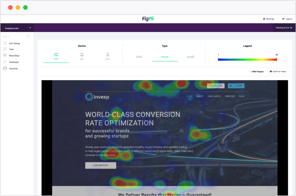
Mouse movement maps
Mouse movement maps are the best way to understand how your users navigate and view your website.
This heatmap provides data visualization of how users move around with their mouse cursor on your website.
It tells you which designs, messages, and content got the most hovers on it, and it gets colored accordingly.
As we explained at the beginning of the blog it uses a warm-to-cold color scheme to show how visitors navigated your website.
Warm colors indicate a higher number of users hovering over a specific area, and the colder colors indicate a lower number of hovers.
How useful is a mouse movement heatmap?
A mouse movement heatmap is useful whenever you’re trying to figure out why certain areas within your website catch users’ attention the most.
Because users navigate with their mice, especially when they’re reading a message or a copy that caught their attention.
Let’s say you have a strong message in your hero section, you’ll find that it’s much hotter than other places on your website because of people hovering over it and reading it.
And not just messages that catch users’ attention, it could be copy, design, or CTA placement.
And so if you have a strong message make sure to have it in the area that gets the most hovers on your website to make sure it gets noticed thus increasing your conversion rates.
The bottom line with mouse movement heatmaps: Optimizing your website according to how your users see it, not how you think your user navigate it.
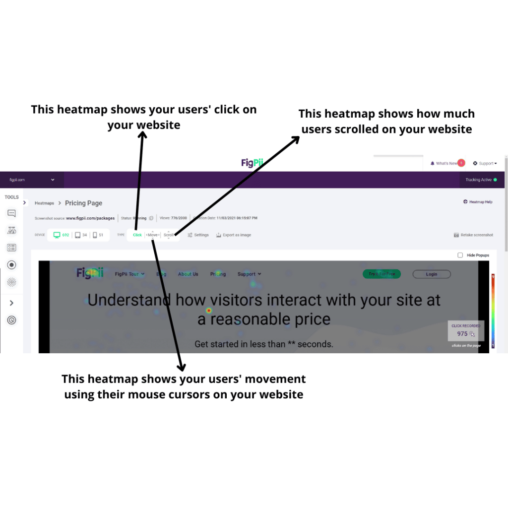
How to read, understand and analyze a heatmap?
It’s rather a simple task once you’ve got the hang of it. As mentioned earlier, there are three heatmap engagement types, scroll map, click map, and mouse movement map. Here’s how you can read, understand and analyze each type:
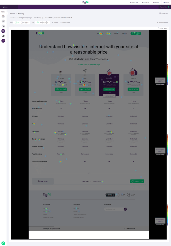
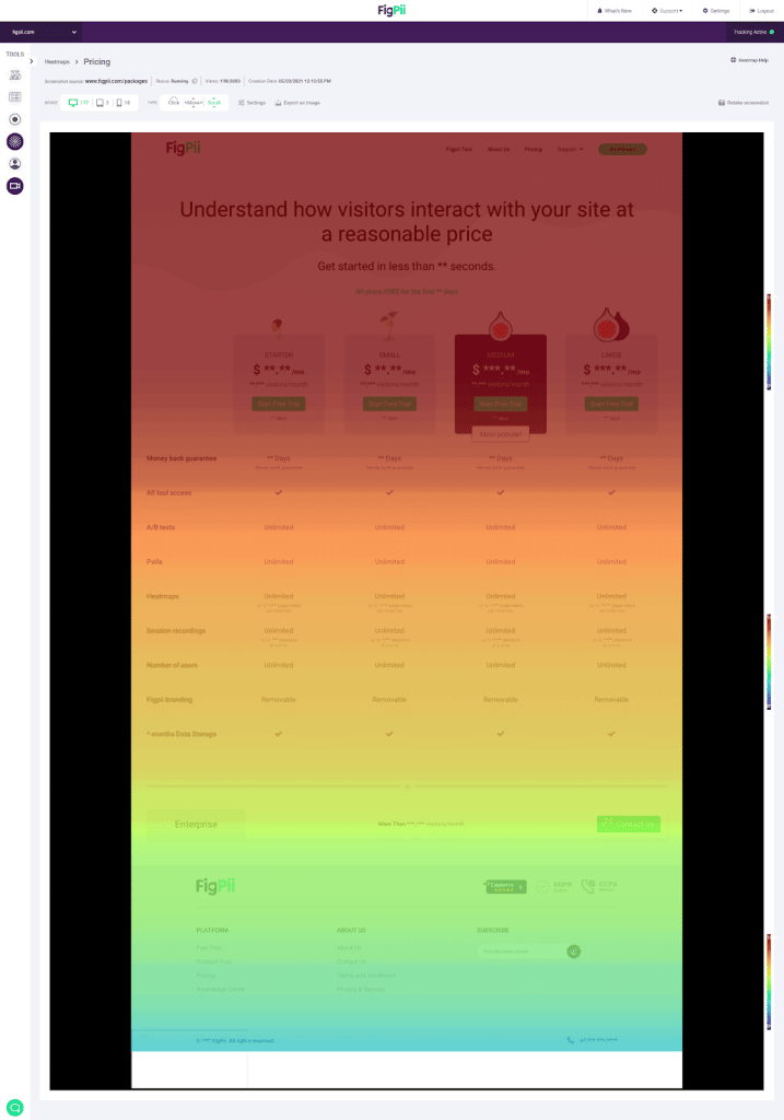
Scroll Map

As you can see from this screenshot, the above-the-fold (top half) part of our pricing page is seen by the most visitors, the bottom half of the page is seen by far fewer visitors based on the color depicted.
That means if you have important information to display for your customers, you need to keep that information as high on your page as possible because if you put it too far down on the page, there’s a strong chance your visitor won’t see it.
Let’s take a look at a click heatmap next.
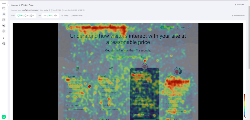
Click Map

Like the scroll heatmap above, The warmer the color depicted on the heatmap, the more clicks an element got.
If there’s no color appearing on certain elements, then that means your visitor didn’t click on this element or this part of the page at all.
Mouse Movement Map

As you can see movement heatmaps show you where your users hovered the most with their mice.
It looks similar to clicks maps but rather than clicks it is hovering that are being tracked.
Based on your mouse movement heatmaps you’re easily able to know how your users navigate your website.
Now you understand the essential elements and guidelines of how to read any type of heatmap that you might use to get more insights from your website.
Obviously, you will get better at gaining insights and drawing conclusions from heatmaps the more you use them over time, but the basics really are that simple.
What are the benefits of using website heatmaps?
Marketers and designers alike need to capture user behavior to understand their needs better, wants, and demands.
Each heatmap type can have multiple uses cases for different professionals.
Take for example click maps.
Click maps can help you learn from your users:
For marketers click maps reveals if users like a certain message or don’t.
Based on interactions with the CTA below it leads the user to take action.
If your user or visitor isn’t convinced by your copy or message he won’t make a move, or in this case, a click.
Also, the CTA button might be positioned wrong, it might be blending too much with the background, or it’s too small.
And that’s just 1 use case for one professional who’s using heatmaps.
Take another example for designers.
Improve your website’s conversion rate by improving UX:
If we go back to the same use case, where we’re testing CTAs, we can easily see that designers use heatmaps, especially click maps to test CTA buttons.
As Marwa, a senior UX – Product designer at Invesp told me
“I use click maps primarily to test out hypothesis proposed by our CRO specialists, we use all kinds of design trick like fake doors to see whether users interact with the button like we thought or not.”
And that’s just one example from the designing front.
Here’s another example I personally use
Help you understand numeric values by providing a visual approach
I’m very data and number-oriented when it comes to marketing and doing campaigns and analytics.
But I also love approaching data from a visual perspective; that’s why I used heatmaps alongside Google Analytics.
Because I can see data from Analytics in numbers and dashboards, I open my heatmap and start visualizing my users’ journey using different heatmaps.
I use a combination of heatmaps, click maps to know which CTAs did better, scroll maps to see if they were engaged enough with my content to scroll, and movement maps to see their navigation path.
Benefits are endless when we talk about heatmaps.
Here’s a quick recap of how do heatmaps benefit your website.
- When you’re trying to figure out if your content is engaging enough or not.
- If you’re trying to figure out messages/elements that resonate with different traffic sources.
- Figure out the best messaging placement on the site.
- See how Desktop vs Mobile users interact with your website
- Test multiple hypothesizes with your web page design
- Enhancing the overall user experience on your website.
How do I create a website heatmap?
Check out our guide on how to create a heatmap if you want to use FigPii as your tool of choice from here.
But generally installing a website heatmap tool falls into the category of 2
- Install JavaScript Code
For JavaScript, any analytics tool including website heatmaps gives you a code that you insert into your website.
You’ll need to add the code to all of your website pages by inserting them in the head section in your code.
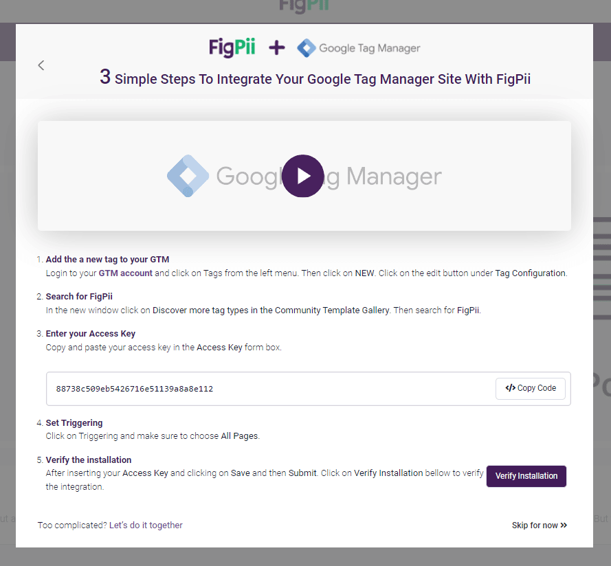
Alternatively, if you’re using something like Google Tag Manager you’ll add the code once in your dashboard and it’ll be automatically inserted into your websites page
- Install Marketplace plugin
For Marketplace plugins all you have to do is to head over to their marketplace for apps, for example, if you’re on Shopify you’ll head to the Shopify Marketplace.
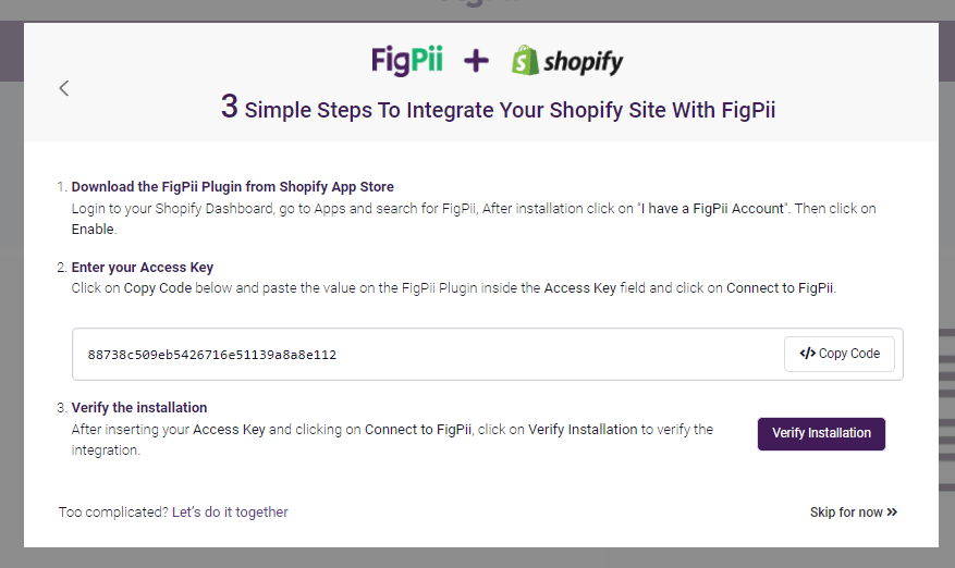
You’ll find either an official plugin released by the software developer himself, or some other developers creating a plugin that makes adding the code a piece of cake.
In case non of those scenarios happen, you can resort to the JavaScript method as all CMS and Ecommerce Management Systems are built on JavaScript.
How do multi-page heat maps work?
A multi-page heatmap captures the data from multiple pages on your site and displays it over a single page representing all of these pages.
Let’s say that you run an e-commerce website and want to see how users interact with the site’s different product pages.
Unfortunately, you do not have enough users coming to all the different product pages, so it would be great to create a heatmap that shows how users interact with ALL of your product pages.
That is what a multi-page heat map does.
It combines the visit clicks from all the product pages and displays it as a single page.
Different heatmap tools handle this situation differently.
In the FigPii heatmap tool, we provide two options:
At first, FigPii shows the heat map data on the first page a user comes to from the group of pages.
So, if you create a heat map for 1,000 product pages, we will show the data on the first product page that a user landed on after you created the heat map.
FigPii allows you to change the page on which the data is displayed.
If for some reason, you do not like the page on which the data is displayed on, then you have the option to select a different page.
The top heatmap tools: how to choose the best heatmap tool for your site
Tools that allow you to create a heat map or evaluate heat maps include:
Crazy Egg
Hotjar
FigPii
Mouseflow
Google Analytics Heat Map
We have written an article on the best heatmap tools to compare the best heatmap tools available and the pros and cons of each.
Conclusion
Website analytics are extremely important for any business; that’s why online business has google analytics installed, for example.
They want an overview of what’s happening on your website, and that’s what website heat maps help you do best.
Heat maps are a valuable tool if you’re looking for ways to increase your website’s conversion rates and engagement.
Heat maps can help determine what are successful pages on your site by tracking where people click on different parts of it.
By using this information, you can make changes that result in more conversions. The best way to start implementing these strategies is with an eye-catching heat map!
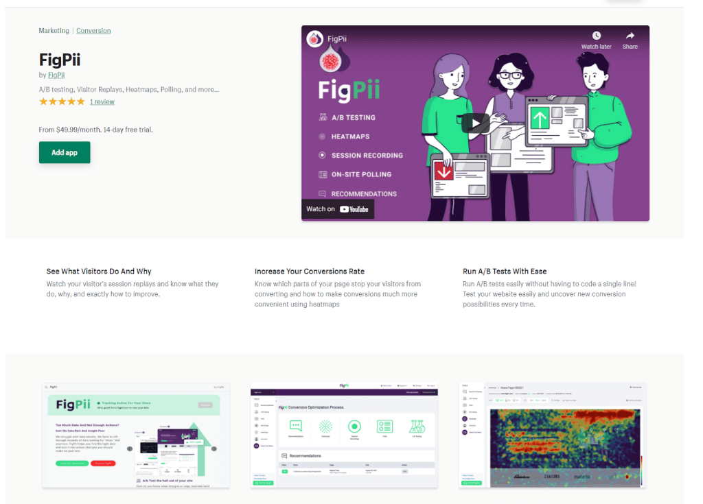
FigPii specializes in providing high-quality web analytics tools such as heatmaps, user polls, A/B testing, and session recordings so signup today for 14 days free trial period and see how we can grow your business together!
Heatmaps FAQs
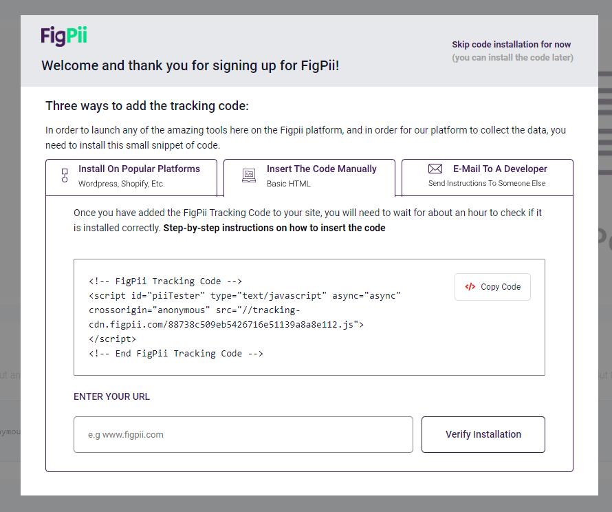
How Do I Install FigPii On My Website?
1- Log in to FigPii.
2- Click On Tracking Inactive On The Top Right Corner
3- Click on “copy code”
4- Paste the FigPii Tracking Code into the <head> section of your website. FigPii integrates with major CMS and e-commerce websites, check our full list of integrations right here.
How Do I Create A Website Heatmap?
1- Log in to FIgPii’s dashboard, and go over the heatmap section from the side menu.
2- Press on “Create a heatmap”
3- Name your heat map
4- Choose the number of recordings that you want
5- Choose which platform you would like to record, you can choose mobile or desktop.
6- Choose which page or pages you would like to track with your heatmap.
7- Configure your map with advanced options that help you create more accurate data
Which Pages Should You Use On Heatmaps For On A WordPress Site?
Homepage
Posts Pages
Contact us Page
Which Pages Should You Use On Heatmaps For On A Shopify Store?
Homepage
Category Pages
Product Pages
Cart Page
Checkout Page
Can You Create Heatmaps For The Checkout Page On Shopify?
Recently, Shopify limited the ability of non-Shopify plus members to insert javascript in the header of the checkout pages. As a result, you will NOT be able to create a heatmap for checkout pages without inserting the heatmap code into the header of the checkout pages.
Which Pages Should You Use On Heatmaps For On an E-commerce Site (Magento, bigCommerce, Woocommerce, etc.)?
Homepage
Category Pages
Product Pages
Cart Page
Checkout Page
Do Heatmaps Cause A Slow Down For The Website?
Every JavaScript code you add to your site can affect it and will most likely cause performance degradation.
So, yes, there is some impact to using heatmap script on your site.
Heatmaps are designed to have a minimal impact on your site performance.
This is primarily because heatmap scripts ONLY work in modern browsers, which execute JavaScript efficiently.
Like most other analytics tools, they all require a modern browser to run.
That is why data analysis has shown that some heatmap software causes page load times between 300 to 500 milliseconds.
Also, you might need to optimize your web pages to minimize the effects of the heatmap javascript code, and you also need to optimize your images and the structure of your web pages, make sure that your code is optimized, etc.
Why Does My Page Speed Test Tell Me My Pages And Website Are Slower When Using A Heatmap Platform?
One of the more popular ways to test page speed load time is to use front-end performance evaluation tools such as Google PageSpeed Insights, Web page test, or GTmetrix.
There are a few things you should consider when using these tools to measure the impact of the heat map script on your page load time:
Some of the tools, such as Google’s page speed tool, use a “mobile-first” approach for their scoring, and it is designed to measure the load time of pages on mobile devices first before desktop or laptop computers.
When looking at the reports from these pages, you should distinguish between page interactive time and page load time.
The page interactive time is all about how long a user spends on a page and what they do while interacting with elements that are not loading. You can find the page interactive time using Google Analytics reports as well.
On the other hand, page load time is the time it takes for all elements on a page to load. The users can interact with the page while the browser is still loading its element.
Remember that a heatmap tool will have to send visitor data back to the processing server. That means the connection between your page and the processing server is still open.
So a tool such as Google page speed insights reports that the page document is still loading while the document loading is complete in reality.
How Do You Make Sure That Your Heatmap Tool Does Not Slow Your Site?
Make your JavaScript load asynchronously so that it doesn’t block the rendering of your page.
Use a content distribution network (CDNs) to serve the end-users on behalf of the origin servers.
Make proper use of the browser cache.

